
Corporate Typography Presentation Hierarchy Using Canvas Font Formatting Tools
I’m more concerned about the psychological damage caused by typical business presentations than almost anything else in digital design. We have all sat through them, those agonizing, 40-slide corporate decks where every screen is a gray wall of tiny, unreadable Arial bullets jammed together like sardines. I used to be that exact same professional, blindly relying on standard pre-made templates and wondering why my audience looked completely glazed over within five minutes of me speaking. I was refreshing my project files one evening during a high-stakes client review and realized the layout wasn’t just dull; it was actively burying my message. That was the moment I stopped treating text layers like casual placeholders and engineered the method of How I Style Professional Fonts so Corporate Slides Aren’t Boring In 2026.
A side-by-side typographic structure comparison within the Canva dashboard showing a typical, tight corporate slide on the left versus an optimized, high-contrast headline layout on the right.
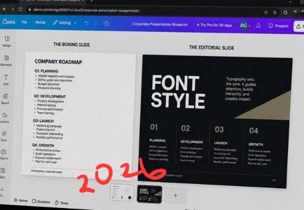
These two setups side by side clarifies why traditional business slides fail to hold a boardroom’s attention. The slide template on the left is a complete walls-of-text nightmare, every line uses the same safe, boring default weight, making it impossible to read under time pressure. On the right, the typography layout shifts completely. By scaling the title header to an aggressive bold size and optimizing the line spacing across the body section, the slide morphs into a premium editorial brief that communicates instantly.
The missing element isn’t adding flashy animations or goofy clip art to your slides. It is spatial command. Once you master the mechanics of letter spacing, scale contrast, and intentional white space, your corporate slides shift from looking like an outdated data spreadsheet to a premium editorial presentation. I also analyzed The Quick Way I Flip and Mirror Images for Better Layouts In Canva.
The Massive Mistake of Safe Typography Choices
Let’s be completely honest for a second. The corporate world has a severe addiction to generic typography. We are conditioned to believe that using standard, uniform sans-serif typefaces like Calibri or basic Helvetica is the only way to appear serious and credible. But in 2026, when every company uses the exact same digital document tools, choosing those default styles makes your pitch deck look exactly like a generic terms-of-service agreement. When your text lacks structural variety, your audience’s eyes cannot establish a clear reading path, causing them to completely tune out.
However, I learned this reality during a major venture capital pitch presentation early in my consulting career. My slides were perfectly accurate, but the text styling was flat, safe, and utterly monotonous. The investors spent the entire meeting looking at their watches because nothing visually commanded their focus. Implementing the strategy of How I Style Professional Fonts so Corporate Slides Aren’t Boring In 2026 completely fixed my presentation performance. Proper styling functions exactly like a visual roadmap, automatically telling a viewer’s eyes which data point is a critical takeaway and which is just secondary support detail.

Image by Greg Montani from Pixabay
The Minimal Menu Workflow for Extreme Contrast
You don’t need a complex graphic arts degree to make structural data look visually stunning. The core formatting adjustments take less than thirty seconds to set up inside your workspace toolbar, provided you bypass the generic templates and build your type architecture with real intent.
Here is the exact layout workflow I use on every master slide edit:
Enlarge the anchor hook: Select your main category title and scale the font size up to an aggressive, heavy weight.
Open spacing properties: Click the text formatting menu icon on your top editor panel to adjust letter tracking.
Execute the spatial split: Expand the letter spacing on titles for breathing room, while keeping body blocks tight and highly legible.
The instant you manipulate these specific dimensional values, your layouts break away from the generic word-processor grid and lock into an expensive, custom look.
As a reader, you will like to see at least the practical aspect of how it’s done. I didn’t record my own process but you can watch this video from a fellow designer on YouTube to gain more. knowledge.
A Massive Reality Check with Over-Styling Data
When I first unlocked the custom typography settings panel, I went through a completely delusional phase. I thought that if clean typography was powerful, then using five different experimental, highly stylized typefaces across a single presentation deck would make me look like an absolute creative genius. I was matching heavy, vintage serifs with technical monospaced fonts and chaotic scripts on a single status report.
That experimental disaster taught me a harsh lesson about business presentation realities. My operations team couldn’t read the financial charts, the regional manager thought the layout was broken, and the slide deck looked like a messy indie rock poster rather than an executive summary. It was incredibly embarrassing.
The lesson I carried out of that chaotic mess is that corporate presentation styling requires extreme restraint. True font styling isn’t about making your text look pretty or artistic; it is about protecting the reading flow of the information. You can use a highly expressive display face for your massive data anchors, but your main explanatory sentences must remain anchored in a crisp, hyper-legible sans-serif like Montserrat or Roboto to maintain functional trust.
Checking the readability scale and tracking parameters on my laptop monitor using an atmospheric, low-exposure workspace configuration.
This angle lets us critique presentation visuals from the exact perspective of an audience member sitting at a conference table. Notice how lower screen exposure emphasizes the extreme contrast of the layout rules on the right canvas, keeping the headline legible even when viewed from a sharp side angle on a physical monitor. A standard, flat slide template turns into a muddy blur under real office lighting. Building your typography around deliberate hierarchy and breathing space ensures your data retains its structural impact across any corporate display environment.
My Definitive Hot Take on Slide Text Count
Here is where my philosophy completely diverges from typical corporate presentation advice, and it will likely irritate traditional middle managers who love deep documentation.
If your slide contains more than twenty-five total words, it shouldn’t be a slide at all. It is a document. Print it out or email it as a PDF instead of reading it out loud to a room full of people.
Slides are meant to function as high-impact visual anchors for your spoken concepts, not a cheat sheet for a lazy speaker to read word-for-word off a projector screen. When you shrink your sentences down into minimal, punchy statements, you gain the freedom to blow your typography sizes up to massive, dramatic proportions. That contrast forces compliance and keeps your audience glued to the layout architecture.
The Corporate Font Pairings that Sell in 2026
Let’s break down the exact design frameworks I execute every week to make financial metrics and technical roadmaps feel completely modern and dynamic. When executing How I Style Professional Fonts so Corporate Slides Aren’t Boring In 2026, structural contrast is everything.
- The Modern Executive Blueprint (For Board Meetings)
This layout balances deep corporate authority with sleek, contemporary digital design values.
Slide Header Font: An expansive, bold geometric sans-serif (like Montserrat or custom Inter) scaled to 48pt+, all-caps, with letter-spacing set to 15%.
Body Copy Font: A crisp, neutral light sans-serif scaled down to 14pt, kept at normal casing, with wide line spacing set to 1.4x to optimize long-range screen legibility.
Color Profile: High-contrast charcoal text placed over a clean linen background to completely prevent projection glare.
- The Disruptor Pitch Deck Blueprint (For Sales & VC Meetings)
This layout works beautifully when your goal is to challenge market assumptions and command aggressive attention.
Slide Header Font: A high-contrast, premium editorial serif (like Playfair Display or Fraunces) scaled to a massive 60pt weight to serve as a deep graphic element.
Body Copy Font: A highly structured, geometric sans-serif scaled to 16pt, tracking set to 0%, ensuring sharp technical clarity.
Color Profile: High-contrast crisp white typography layered over a deep, dark navy or espresso background canvas.
The Billboard on a Formula 1 Track
Think of your presentation slide layout like a commercial billboard standing right along the edge of a high-speed racing circuit. Your audience is the racing car, blasting past your message at two hundred miles an hour. If that billboard is packed with tight paragraphs of small text, the driver can’t decipher a single word before they blur past it.
Using How I Style Professional Fonts so Corporate Slides Aren’t Boring In 2026 is the equivalent of ripping down that block of fine print and spray-painting a single, massive, perfectly spaced three-word command onto the billboard. The passing driver can digest your point effortlessly in a millisecond because the typography has been optimized specifically for high-speed absorption.
Frequently Asked Questions
Why do my custom presentation fonts change to basic Arial when I export to PowerPoint?
If you build a layout using a premium font web file inside Canva and then download it as an editable .pptx file format, PowerPoint will default back to standard local system fonts if your laptop doesn’t have that exact font file installed locally. To preserve your pristine typography layout perfectly across any external corporate machine, always export your final presentation slides as a flattened PDF document or high-quality static PNG image slides.
How do I use script or italicized accent fonts without looking unpolished?
In a professional corporate environment, handwriting or loose script fonts should almost never appear on a slide. They are incredibly difficult to scan quickly on a projector. If you want to emphasize a specific emotional anchor word or user quote, switch that individual phrase to a clean, elegant italic variant of your primary serif font.
Does adjusting line spacing really affect how long people look at my slides?
Absolutely. When text lines crawl too close to each other, it creates an intimidating block of color that triggers visual fatigue. Expanding your vertical line spacing parameters to 1.35x or 1.4x opens up the layout, making the slide feel light and approachable, which drastically reduces the viewer’s subconscious urge to look away.
Final Thoughts On Corporate Style
A boring, text-heavy slide presentation isn’t a sign of professionalism; it is a clear symptom of a creator who lacks the confidence to cut out the unnecessary clutter. Relying on default templates and unformatted paragraphs means hoping your audience will do the heavy lifting of sorting through the data noise for you.
Integrating the strategy of How I Style Professional Fonts so Corporate Slides Aren’t Boring In 2026 completely changed how clients respect my project delivery. It stripped away the tedious administrative feel and turned my slide decks into high-impact communication engines.
Stop forcing your team to endure standard, uninspired walls of bullet points that kill engagement. Open up your current deck draft, zoom straight into your primary text blocks, expand your spatial boundaries, and let your headers truly command the room. Your audience’s attention span will reward your effort.
Sources and Citations
Official text formatting manual and spatial hierarchy controls detailed on the Canva Typography Support Guide.
Strategic analysis on selecting high-impact fonts for corporate digital screens published by Prezent AI Presentation Blog.
Industry trend breakdown on minimalist sans-serif typography systems in corporate design via the Kittl Design Blog.

Udeichi Miracle Chinaza is a digital creator and graphic designer who specializes in creating clean, visual content. Passionate about making design accessible to everyone. I share practical Canva tutorials, layout tips, and creative shortcuts to help beginners and small businesses build stunning graphics with ease.