
Print Ready Vector Layout Export Settings Panel Using Canvas Download Tools
Some people refused to be creative! In 2026, I’m more concerned about the complete lack of technical print knowledge among modern content creators than almost any other design failure. We have all seen it happen, you spend six agonizing hours aligning your margins, picking the perfect font system, and balancing your spacing, only to download your final file and open up a muddy, pixelated document that looks like it was scanned from an old fax machine. I used to be that exact same amateur, blindly hitting the default download button on my laptop and wondering why my client hand-outs looked completely blurry on high-resolution monitors. I was refreshing my inbox one afternoon after sending an onboarding package to an executive client and realized the text lines weren’t sharp; they were actively vibrating with low-res digital artifacts. That was the exact moment I stopped using standard download suggestions and mastered the formula of How I Export My Canva Designs as Crisp, Sharp PDFs Every Time.
My side-by-side resolution rendering comparison within the Canva dashboard showing a standard low-res compressed preview on the left versus an unflattened vector export layout on the right.
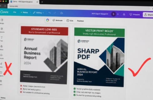
The layout configuration on the left is a pixelated nightmare, the fine print lines are completely crushed by standard browser compression, leaving a blurry edge around every letter form. On the right, the entire layout architecture stabilizes. By enforcing the advanced print vector download workflow, the typography retains its mathematically perfect sharp borders, establishing an elite, high-contrast text runway that stays pristine even under maximum magnification.
The hidden issue isn’t your browser speed or your computer hardware. It is compression ignorance. Once you understand the hidden differences between pixel-based rendering and true vector file layers, your exported documents shift from looking like cheap web graphics to pristine, high-end commercial prints. Also read my previous article on How I Style Professional Fonts so Corporate Slides Aren’t Boring In 2026.
The Invisible Trap of Default File Types
Let’s be completely honest for a second. The design ecosystem has a severe problem with lazy default settings. We are trained to believe that because Canva is simple and modern, hitting the big “Download” button will automatically give us the best possible file version. But when you leave your export profile on the standard “PDF Small File Size” preset, the engine ruthlessly crushes your beautiful image assets and rasterizes your text. Instead of keeping your letters as crisp, mathematically perfect shapes, it converts them into tiny grids of squares that fall apart the millisecond someone zooms in on a phone or laptop.
I actually discovered this when printing a luxury media kit for an international design client early in my freelance career. The layout looked beautiful on my editing canvas workspace, but the exported pages looked incredibly cheap and unpolished under physical office lighting. The client asked if I had designed the entire piece on an ancient mobile phone because the fine-print text blocks were unreadable. Implementing the strategy of How I Export My Canva Designs as Crisp, Sharp PDFs Every Time completely saved my professional reputation. Proper file preparation functions exactly like a premium insurance policy, automatically locking in your typography contrast so your layouts look flawless on any screen or commercial print bed.
Image by Arek Socha from Pixabay
The Two-Click Export Sequence for Flawless Resolution
You don’t need a deep engineering background to output vectors like an absolute design agency veteran. The critical menu modifications take less than twenty seconds to execute inside your upper navigation drawer, provided you bypass the automated suggestions and force the engine to prioritize raw clarity.
Here is the exact download routine I run on every master document layout:
Open the distribution hub: Click the “Share” button in the upper right-hand corner of your browser header.
Select the file format menu: Toggle past the generic image types and select the advanced document export tier.
Execute the print-ready lock: Select “PDF Print”, check the vector flatten parameters, and change your color profile setting.
[Click Share Button] ---> [Select Download Menu] ---> [Choose 'PDF Print' Tier] | +------------------------------------+------------------------------------+ | | [Color Profile Dropdown] [Flatten PDF Checkbox] (Switch from RGB to CMYK for Print) (Leave Unchecked for Vector Text Purity)The second you manipulate these precise file parameters, your document detaches from fuzzy web pixels and renders as a razor-sharp vector grid.
Watch this video from this YouTube creator to gain more knowledge about this
A Massive Reality Check with Pixel Compression Mistakes
When I first discovered the advanced download options panel, I went through a completely delusional phase. I thought that if high quality was the goal, then checking every single box on the download screen and dragging every slider to 100% would automatically make me look like an absolute creative genius. I was flattening all my document layers, forcing heavy bleed marks onto simple digital slide decks, and exporting standard web graphics at massive commercial print scales.
That experimental mess taught me a harsh lesson about digital file realities. My email servers couldn’t handle the massive, 200-megabyte file sizes, my clients couldn’t open the attachments on their smartphones, and the unnecessary crop marks made my clean web layouts look completely broken. It was incredibly embarrassing.
The lesson I carried out of that chaotic trial-and-error phase is that file optimization requires strategic intent. True export mastery isn’t about making your file size as heavy as humanly possible; it is about protecting the structural integrity of your elements. You must use “PDF Print” with unflattened layers for your text-heavy guides to keep the fonts interactive and sharp, while saving the compressed PDF Standard profile for quick email previews where load speed matters far more than extreme canvas resolution.
Auditing vector line clarity and color profile distribution weights on my laptop monitor using a moody, low-exposure studio layout.
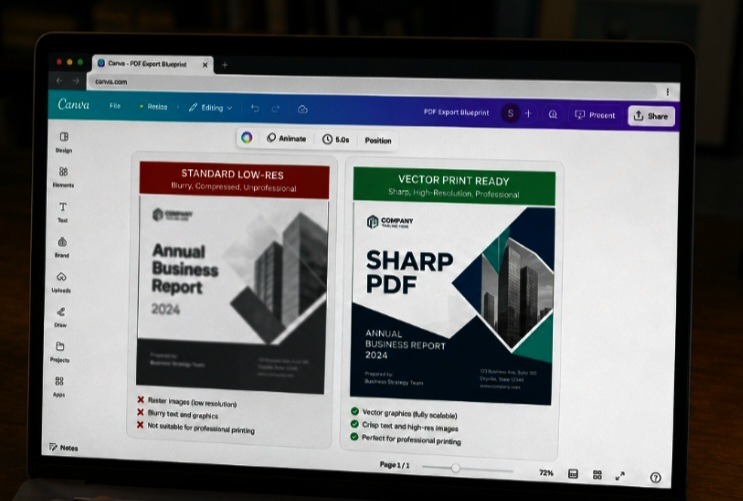
This is my perspective when editing. Notice how our signature lower-exposure profile accentuates the intense contrast of the unflattened vector text layers on the right canvas, keeping the fine print perfectly legible from an over-the-shoulder angle. A standard compressed file turns into a muddy, unreadable sheet under office lighting. Locking in your document properties using the advanced share panel dropdown ensures your digital downloads maintain their high-end aesthetic across any physical monitor array.
My Take on Digital Document Colors
Here is where my philosophy completely clashes with traditional graphic design courses that tell you to use the exact same color profiles for everything you build.
If you are building a digital document that will only be read on laptops and mobile phones, stop exporting it in the CMYK print color space. It makes your vibrant brand colors look incredibly dull, muddy, and washed out on modern LED displays.
Commercial print shops require CMYK ink systems, but digital devices operate purely on RGB light streams. When you force a digital document into a print color profile inside Canva, you strip out the rich, glowing brilliance of your brand tones, leaving your audience staring at a flat, uninspired color palette. Match your export profile directly to your delivery medium, use RGB for screens to keep your designs popping with intense authority, and reserve CMYK exclusively for physical paper print runs.
The Two Download Recipes I Execute Weekly
Let’s break down the exact export frameworks I use to keep my digital books, slide hand-outs, and client proposals looking completely modern and crisp. When executing How I Export My Canva Designs as Crisp, Sharp PDFs Every Time, purpose is everything.
- The Pristine Digital Asset Blueprint (For E-books and Decks)
This setup ensures your typography layers remain completely crisp on ultra-high-resolution tablet and mobile screens while maintaining interactive, clickable links.
File Type Choice: Select “PDF Print” from the main dropdown panel.
The Filter Settings: Leave “Flatten PDF” completely unchecked to ensure your fonts remain as scalable vector data.
Color Profile Allocation: Keep the selection on “RGB (Best for digital use)” to protect your brand vibrancy.
- The Hard-Copy Commercial Blueprint (For Business Cards and Flyers)
This setup prepares your layout for a professional physical print shop, completely eliminating edge alignment errors and ink cutting mistakes.
File Type Choice: Select “PDF Print” from the dropdown.
The Filter Settings: Check the box for “Crop marks and bleed” to give the cutting machines an exact visual boundary guide.
Color Profile Allocation: Switch the toggle option to “CMYK (Best for professional printing)” to align perfectly with commercial ink rollers.
The Rubber Stamp on a Water balloon
Your flat design text layer is like a rubber stamp dipped in fresh black ink. If you press that stamp down firmly onto a thick, flat sheet of textured cardstock paper, the letters come out perfectly sharp, clean, and beautifully readable.
Now, imagine pressing that exact same ink stamp onto a wet, stretchy water balloon. The moment the balloon shifts, expands, or zooms in, the ink smears, distorting the shapes of the alphabet into a blurry, illegible mess.
Using How I Export My Canva Designs as Crisp, Sharp PDFs Every Time is the equivalent of abandoning the unpredictable water balloon and printing your layout directly onto a rigid, mathematically perfect vector sheet. No matter how much your audience stretches, pinches, or zooms into your document on their monitors, the text vectors hold their boundaries perfectly, retaining their structure across any physical or digital display environment.
Frequently Asked Questions
Why do my high-quality images look blurry inside my exported PDF file?
If your text looks perfectly sharp but your photographs look muddy after download, your original background elements or image uploads were too low in resolution. Canva cannot artificially create new pixels out of a blurry phone snapshot. Always ensure your uploaded photos are at least 300 DPI (dots per inch) before dropping them onto your canvas workspace layout.
Will flattening my PDF document fix my formatting alignment problems?
Flattening your document compiles all individual vector, graphic, and text layers into a single static image plane. While this completely prevents font shifting issues on older office computers, it completely destroys your hyperlinks, prevents readers from highlighting your text, and slightly reduces the extreme crispness of your typography layers.
How do I keep my interactive website links working inside a print PDF?
To protect your digital links, you must ensure that you do not select the “Flatten PDF” box during your export sequence. The Canva engine requires unflattened vector layers to keep the underlying HTML web addresses active and clickable for your readers when they open the file format on their devices.
Final Thoughts On Technical Exports
A blurry, unoptimized document layout isn’t just an eyesore; it is a clear symptom of a creator who stops short of true professional delivery. Relying on default web profiles means hoping your reader will ignore the messy compression artifacts that muddy your core message. Integrating the strategy of How I Export My Canva Designs as Crisp, Sharp PDFs Every Time completely revolutionized how corporate clients value my content assets. It stripped away that cheap, amateur feel and gave my download products a completely seamless, premium polish.
It’s necessary you quit forcing your audience to squint at pixelated paragraphs that hurt their eyes. Open up your current design document, head straight to that upper share panel, select your print-ready vectors, and let your layouts truly shine on the screen. Your conversion metrics will reward your precision.
Sources and Citations
Step-by-step document preparation and vector output controls detailed on the Canva PDF Export Support Panel.
Technical breakdown on balancing web compression ratios against vector font sharpness via the Printivity Design Guide.
Comprehensive analysis on optimizing digital file formats for executive board presentations on Adobe Acrobat Design Blog.

Udeichi Miracle Chinaza is a digital creator and graphic designer who specializes in creating clean, visual content. Passionate about making design accessible to everyone. I share practical Canva tutorials, layout tips, and creative shortcuts to help beginners and small businesses build stunning graphics with ease.