
Contrast Ratios For Pastel Design Layouts Inside Canvas Workspace
As a graphic designer who loves to make research and learn new things, I am completely obsessed with breaking down why certain visual layouts instantly crash and burn on a live feed. Just last night, I was analyzing a popular lifestyle brand’s profile, and I hit a graphic that made me physically pause in frustration. The creator had paired a soft mint green headline directly against a pale lavender background element. It was a complete trainwreck for human readability. My eyes were literally straining just trying to decipher what her caption was saying. I used to be trapped in that exact same design loop, falsely believing that an aesthetic pastel look meant making every single layer on the screen washed-out, milky, and pale. It took an incredibly embarrassing client rejection to force me to map out My Ultimate Cheat Sheet for Pastel Color Schemes in Canva, injecting real contrast physics back into my creative process.
A clean side-by-side contrast ratio breakdown inside the Canva dashboard comparing an illegible pale layout against an anchored, high-contrast pastel framework.
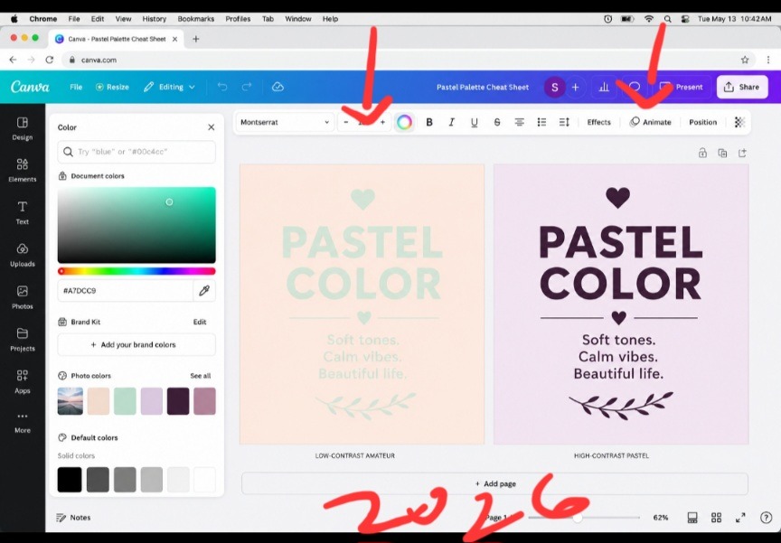
This my direct screen capture highlights exactly why so many aesthetic feeds suffer from completely dead engagement metrics. The canvas configuration on the left is a total contrast failure, using pale text on top of a pale backdrop renders the words completely invisible under normal viewing conditions. On the right, the layout shifts completely. By anchoring the exact same soft lavender backdrop with a rich, dark plum text weight, the layout retains its clean, airy feel while ensuring the copy leaps off the screen with crisp authority.
The massive structural error in modern pastel styling isn’t the softness of the shades themselves. It is a total absence of tonal hierarchy. The second you learn how to anchor light base layers with a heavy, deeply saturated typography anchor, your designs immediately stop looking invisible and command an expensive editorial presence. Checkout this article on How I Export My Canva Designs as Crisp, Sharp PDFs Every Time.
+--------------------------------------------------------------------------+ | THE 60-30-10 PALETTE FRAMEWORK | | | | [ 60% Background Tint ] ---> [ 30% Secondary ] ---> [ 10% Anchor ] | | (Milky / Pastel) (Soft Contrast) (Deep / Saturated)| +--------------------------------------------------------------------------+ Stopping the Visual Anemia Killing Your Conversion Rates
Let’s drop the polite design theory and call this what it is: the internet is currently drowning in a sea of visual anemia. Content creators have become so incredibly terrified of looking “loud” that they are making their text completely invisible to the human eye. When you place a light peach headline over a soft cream canvas background, you are committing an absolute design crime. Your reader’s brain has to exert massive conscious effort just to process your words. If a passing scroller cannot read your hook within a single millisecond of glancing at their device, they are going to skip your profile entirely.
The Day My Workbook Flops Opened My Eyes
I learned this lesson through absolute failure during a digital product launch. I had designed a gorgeous 30-page blueprint using nothing but very light sage green backgrounds and pale coral text frames. On my premium laptop screen in my dark studio, it looked flawless. But the absolute second my community downloaded the file onto standard mobile phones out in the real world, the support emails started piling up. Readers were complaining of actual eye strain. That humbling experience completely shattered my old styling approach. Turning to My Ultimate Cheat Sheet for Pastel Color Schemes in Canva repaired my metrics instantly because it treats colors as structured blocks of visual weight rather than random pretty swatches.
How to Pull Raw Hex Values from the Manual Canvas Dashboard
You do not need to rely on the generic, pre-made color swatches that everyone else is copying from Pinterest. True visual control happens when you step away from the automated search bars and craft your hex profiles manually inside the left-hand toolbar editor.
Step 1: Select your primary background canvas and flood it with a light, milk-infused pastel tint.
Step 2: Open up your custom color wheel square to activate the manual coordinate field.
Step 3: Select your primary typography block, grab the cursor node, and drag it directly down into the darkest, most saturated corner of that color family.
By grounding an airy background plane with a heavy, deeply saturated font variant, you instantly break away from the muddy text trap and establish an elite visual runway.
If you want to watch the real-time workflow to see exactly how these custom palette adjustments operate inside a live design dashboard, check out this direct walkthrough from a fellow designer on YouTube.
Ditching the Monotonous “Oatmeal Feed” Phase
For an entire year, I restricted my brand to what I now call my “delusional beige-and-cream bubble.” I was so deeply afraid of making an accidental design mistake that I forced the exact same three muted, neutral sand colors onto every single document, slider template, and pitch deck I built. My entire portfolio began to look like one giant, boring cloud of oatmeal.
What I passed through during that creative drought taught me that true minimalist authority requires unexpected contrast. Softness is never an excuse for boredom. The breakthrough happened when I realized that utilizing My Ultimate Cheat Sheet for Pastel Color Schemes in Canva isn’t about running away from dark tones; it’s about deploying them with intense tactical precision. You keep 90% of your canvas feeling open and spacious, but you strike your core keyword hook with a heavy, deeply saturated color anchor to capture absolute attention.
A Blunt Take on the Death of Rigid Brand Kits
Here is where my operational workflow completely breaks away from traditional corporate branding agencies who tell you that you must use the exact same five swatches until the end of time.
Fixed brand color palettes are completely dead. If you are forcing your content to live inside an unchanging five-swatch prison for every single post, you are actively making your grid look incredibly stale.
Audiences experience severe visual boredom when they see the exact same repetitive color loops on their feeds day after day. Your brand identity should be carried by your layout margins and typography rules, not an unyielding color cage. Give your graphics permission to adapt. Use different pastel variations depending on the direct emotional tone of your text, lean into cold mints for analytical tutorials, and switch to buttery vanilla creams for raw, personal storytelling.
Three High-Contrast Palettes Ready to Copy
Let’s pull back the curtain on my actual design vault. These are the exact high-contrast pastel configurations I execute on my screen weekly to keep my content looking clean, crisp, and deeply professional.
- The Editorial Plum Matrix (For Premium Books)
This combination balances a dream-like, soft backdrop with an intensely heavy text weight to guarantee maximum readability on mobile displays.
The 60% Foundation: A soft, milky lavender cream tint (#F1E9F5).
The 30% Layer Accent: A muted, clean mist gray for graphic borders and frames (#E4E7EB).
The 10% Core Anchor: An incredibly rich, deeply saturated plum tone for text lines (#2A1A30).
- The Deep Coastal Slate (For Presentation Decks)
This palette brings a fresh, professional corporate-friendly energy to business slide decks without feeling sterile or boring.
The 60% Foundation: A crisp, refreshing sea-foam mint blush (#EAF4F2).
The 30% Layer Accent: A clean, solid linen white for content backing boxes (#FFFFFF).
The 10% Core Anchor: A dark, authoritative midnight navy for primary headers (#122333).
- The Roasted Vanilla Sunset (For Social Carousel Layouts)
This setup utilizes warm, inviting earth tones that feel deeply human and organic, making it perfect for narrative text posts.
The 60% Foundation: A buttery, soft vanilla peach (#FFF3E8).
The 30% Layer Accent: A muted, dusty rose dividing line (#EAC7C1).
The 10% Core Anchor: A heavy, dark roasted espresso brown for absolute contrast (#2B1E17).
- The Whisper in a Roaring Subway
Think of an un-optimized, low-contrast pastel design like a person trying to whisper a critical warning while standing inside a chaotic subway station during rush hour. No matter how incredible, deep, or valuable their message is, the sheer volume of the surrounding environment completely swallows the words.
Executing My Ultimate Cheat Sheet for Pastel Color Schemes in Canva is the exact equivalent of stepping into a soundproof room. Your soft, pastel base background clears out the digital noise, creating an oasis of quiet space. Then, your heavy, dark typography functions as a clear, perfectly spoken statement that slices through the silence effortlessly. You never need to scream with aggressive neon colors to win attention; you simply need to build enough empty space for your message to be clearly heard.
Frequently Asked Questions
Why do my soft pastel background choices look dirty or muddy when printed?
Standard commercial and home printers operate on ink-based CMYK systems that naturally lack the glowing backlight capabilities of an RGB digital screen. If your pastels look dark or muddy on paper, you must open your canvas color wheel picker, pull the brightness slider up by an extra 10%, and ensure your background mixes lean toward pure white-based tints rather than gray-heavy undertones.
Can I save these custom palette hex codes directly inside my account workspace?
Absolutely. If you operate on the pro tier, you can log into your Brand Kit menu and organize your hex values into dedicated, custom sub-palettes. If you are using a free account, a brilliant shortcut is to create a single master reference document page, drop three shapes with your codes typed out inside them, and duplicate that file every time you launch a new creation workspace.
How do I use white text layers on top of a light pastel background layout?
To be completely direct: you don’t. White text dropped onto light pastel backgrounds creates an absolute contrast violation that kills readability. If you are completely determined to use white text layers, you must manually darken your background pastel choice until it drops down into a deep, rich jewel tone to provide a safe, accessible reading experience.
Tonal Architecture Over Decorative Hype
A blurry, unreadable aesthetic layout isn’t a sign of high-end design; it is a clear symptom of a creator who values decoration over functional communication. Leaving your text contrast ratios to chance means hoping your audience will do the hard work of deciphering your message for you. Integrating My Ultimate Cheat Sheet for Pastel Color Schemes in Canva into my daily publishing workflow completely altered how fast I can launch high-converting visual assets. It stripped away that unpolished, amateur wash and gave my digital products an incredibly clean, authoritative edge.
Stop publishing invisible content that blends into the background details of the feed. Open up your current active design file, select your primary text boxes, pull your cursor straight down into the deepest zones of your color picker wheel, and give your pastels the heavy contrast structure they deserve. Your analytics click counter will show the difference.

Image by andreas160578 from Pixabay
Sources and Citations
Professional guidance on color matching and palette generation from the Canva Color Palette Tool Hub.
Deep dive scientific study on text contrast ratios and screen accessibility guidelines via the WebAIM Contrast Accessibility Group.
Design layout breakdown on leveraging soft tones for modern luxury brand identity on Vectornator Style Guide on Pinterest.

Udeichi Miracle Chinaza is a digital creator and graphic designer who specializes in creating clean, visual content. Passionate about making design accessible to everyone. I share practical Canva tutorials, layout tips, and creative shortcuts to help beginners and small businesses build stunning graphics with ease.