
Deploy High-Contrast Structural Text Systems Within Canva Web Browser Book Workspace
A prospective buyer requested a full refund for my digital guide within ten minutes of opening the file link. I was pacing around my room, staring down at my smartphone while reading a brutal email notification from a customer. They weren’t complaining about the information or the strategy. The text read: “I really want to learn this topic, but your book layout is so incredibly painful to look at that I get a literal headache after reading two pages.” I was absolutely mortified.
I opened my digital master file inside my active design workspace and zoomed out to take an honest look at the pages. It looked like a total text disaster. I had set my entire book layout in a heavy, decorative sans-serif font family, stretching it into massive walls of text across every single page. It felt tight, suffocating, and impossible to skim. That devastating critique forced me to burn my old formatting templates to the ground and run experiments with my favorite serif and sans-serif mixes for readable e-books.
If you are still combining your fonts based on what looks pretty in a tiny thumbnail box, you are actively destroying your retention metrics. If your body text requires manual zooming or strains the eyes of your reader, they will close your file and never buy from you again. Let’s talk about how to protect your audience from mental exhaustion and implement my favorite serif and sans-serif mixes for readable e-books straight inside your Chrome browser canvas so your digital manuals read like premium publications. Also read How I Use the Layers Panel In Canva.
Classic editorial font combinations inside the typography management panel within your browser editor.
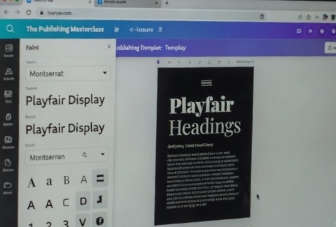
My experiment and the result. This screenshot demonstrates how separating your traditional narrative title weights from your light paragraph layers removes visual clutter from the reader’s digital view path. It provides clean proof that premium book design depends entirely on enforcing strict, high-contrast text systems rather than relying on random font trends.
My Font Clashing Wasteland Experience
Let me pull back the curtain on the huge document design problem I had to fix before my digital storefront could become profitable. When I first started publishing self-help manuals online, I assumed that any standard font choice would work fine as long as the page contrast was black text on white paper. I was mixing loud modern headers with sharp geometric paragraphs, thinking it looked futuristic and stylized.
I launched an eighty-page comprehensive industry masterclass document. I had selected a sharp, high-tech geometric typeface for the main structural paragraphs. On a giant desktop display screen, it looked okay. But the moment the file was downloaded onto mobile tablets or small reading apps, the characters blurred into a messy sea of gray ink.
The letter spacing was so uniform that the reader’s eyes couldn’t easily track the starting points of new sentences. My email inbox quickly filled up with complaints from readers who were completely losing their place on the page while scrolling. It was a massive wake-up call for me. Long-form document building is completely different from designing quick social media graphics. A social post needs to grab attention for two seconds, but a digital book layout has to sustain focused human attention for hours. True editorial authority requires a calculated balance between traditional structure and modern screen fluidity.
The Secret Formula: Structuring Your Structural Text Matrix
Let’s skip the basic font list ideas and look at the exact typographic engine configurations that establish instant visual relief across your pages. To construct a textbook that reads effortlessly on a smartphone screen, you must build an unyielding spatial division between your decorative title banners and your core body paragraphs.
The human brain processes these two font styles through completely different psychological lenses. A serif font features small structural anchor lines at the tips of the characters, which creates an aura of tradition, authority, and deep storytelling. A sans-serif font strips those lines away, offering clean, uniform geometric strokes that allow digital screen pixels to render the letters crisply without creating text noise.
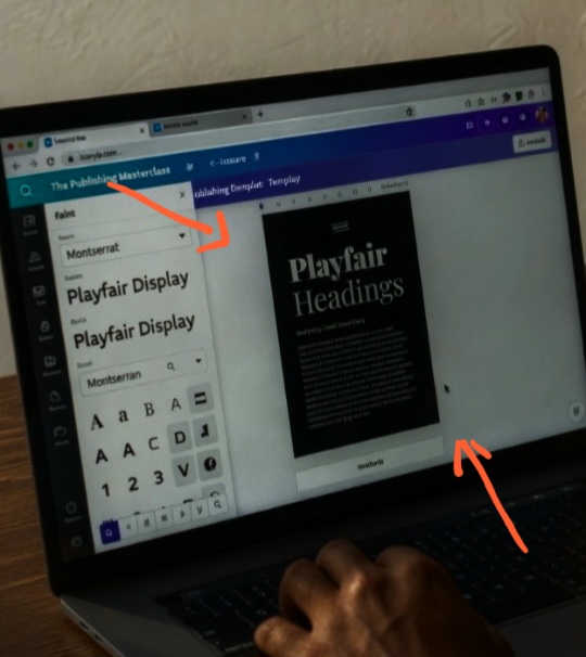
Analyzing paragraph readability contrast values inside Chrome to protect long-form digital assets from reader eye fatigue.
My View on the No-Serif Trend
Many modern interface designers insist that serif fonts are completely dead and outdated for digital monitors. They claim that everything online should be set in uniform, sleek, flat geometric letters. That perspective is a massive trap when it comes to publishing long-form text files.
When you force a reader to process ten thousand words written entirely in a minimalist sans-serif layout, their eye muscles tire out rapidly because there are no visual landmarks to anchor onto.
To break away from that lazy approach and master my favorite serif and sans-serif mixes for readable e-books, you must bring traditional publishing wisdom back to your canvas. Use a rich, historic serif layout to announce your main structural concepts, then swap to an ultra-readable sans-serif setting to handle the heavy reading lifting inside the paragraphs. This combination keeps your presentation looking incredibly high-end, while ensuring the layout reads flawlessly down to the last page.
Watch this excellent, rapid presentation tutorial on How to Pair Fonts in Canva for Professional eBooks by a YouTube creator.
The Top Three Layout Pairings You Need to Type Into the Search Menu
Open up your typography selection toolbar inside your Chrome window right now and bookmark these exact text combinations. They are completely free, open-source, and pre-loaded into your active project library.
The Editorial Blueprint (Playfair Display + Montserrat): Set your main chapter headers in Playfair Display at 32pt weight, then drop your body paragraphs into Montserrat at 11pt weight with a line-height spacing parameter of 1.4. This creates a high-fashion, premium magazine texture that works perfectly for business or lifestyle guides.
The Academic Masterpiece (Cinzel + Lato): Use Cinzel for short, high-impact titles, then pair it with Lato for your long text blocks. Lato features subtle rounded characteristics that prevent large paragraphs from feeling rigid or clinical on mobile device screens.
The Modern Classic (Lora + Open Sans): Lora is a beautiful, contemporary serif font that looks exceptionally crisp on low-resolution mobile displays. When you pair its headers with Open Sans for your body text copy, you create an incredibly accessible reading path that minimizes cognitive load.
Fatal Document Formatting Mistakes to Drop
Setting paragraph line-heights below 1.3 parameters: If your text lines are squeezed too close together to save space on the page, sentences will bleed into each other, causing immediate reading confusion. Always set your paragraph properties line spacing to a minimum of 1.4 to let the layout breathe.
Using highly decorative cursive options for titles: While handwritten cursive or heavy display fonts look beautiful on a cover page, using them for your main internal chapter titles makes your layout look incredibly messy and hard to navigate. Stick to clean, unyielding serif structures for all your internal heading properties.
Forgetting to adjust margin padding fields: If your text boxes sit too close to the outer edges of your document canvas, your reader’s thumbs will physically block the text when they hold their devices. Keep a minimum 0.75-inch margin safety buffer zone completely empty around all four layout corners.
Frequently Asked Questions
What is the ideal font size scale to ensure perfect readability on mobile displays?
For high-density long-form digital publishing assets, keep your primary section headings scaled between 28pt and 36pt. Your subheadings should sit comfortably at 16pt to 18pt, and your main body text paragraphs must never drop below 10pt to 11pt weight boundaries to prevent layout squinting.
Should I apply a pure jet-black color code to my body text layers?
No, placing pure black text (#000000) directly over a stark, pure white background canvas creates a harsh visual contrast that accelerates eye fatigue on glowing screens. Soften your document look by styling your body fonts in a deep charcoal tint (such as #222222 or #2D2D2D) to create a premium reading atmosphere.
How do I apply a uniform font change across an entire multi-page document file?
Open up your font drop-down panel on the left edge of your workspace window. Select your new typeface choice, and look down at the very bottom of the sidebar column matrix for a large option button that reads “Change All.” Click it to instantly update that specific text layer class across every single page layout simultaneously.
Structuring the Path of Least Resistance
Using my favorite serif and sans-serif mixes for readable e-books is about moving past chaotic formatting choices and using calculated typographic design to elevate your brand value. Your online credibility depends entirely on how effortlessly your target reader can absorb your premium information. When you blend traditional editorial weight with modern digital screen geometry, your assets instantly stand out from the sea of lazy self-published manuals cluttering the web.
Open up your most complex multi-page document folders inside your project library. Launch your typography positioning properties, strip away the noisy styling elements, lock in these balanced text pairings, and transform your flat document layouts into highly authoritative digital publications that readers love to consume from cover to cover.
Sources and Citations
Canva Design School Manual on long-form document typographic hierarchy rules: Canva Help: Font Pairings and Document Typography Guide.
Adobe Type Architecture Portal on cross-platform screen readability data models: Adobe Typography: Readability and Text Hierarchy in Digital Media.
W3C Digital Document Accessibility Standards for text spacing and layout font mechanics: W3C Accessibility Manual: Designing Text for Screen Readability.

Udeichi Miracle Chinaza is a digital creator and graphic designer who specializes in creating clean, visual content. Passionate about making design accessible to everyone. I share practical Canva tutorials, layout tips, and creative shortcuts to help beginners and small businesses build stunning graphics with ease.