
Stop Guessing: Is Your Canva Design Actually Readable?
Introduction
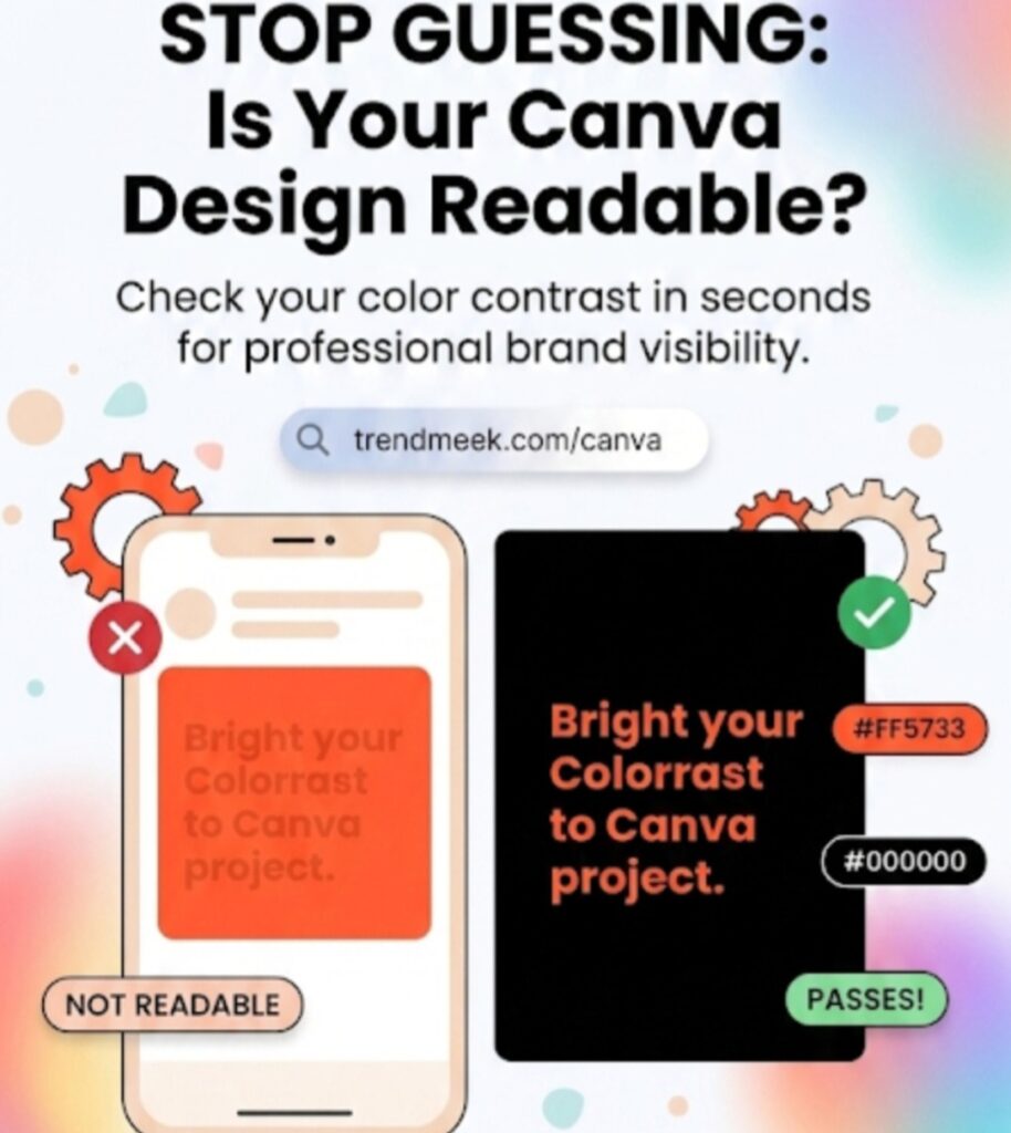
We’ve all been there: you spend hours on a Canva design, but when you finally look at it on a phone screen, the text is impossible to read against the background. Using beautiful colors is important, but if your audience can’t read your message, your design fails. To fix this, I built a free Color Contrast Checker to take the guesswork out of your design process.
Why Contrast Matters for Your Brand
Design accessibility is about ensuring everyone can consume your content comfortably. High contrast between your text and background is the single most important factor for readability. When you match colors that clash or are too similar in brightness, you lose your audience in seconds.
How to Use the Contrast Checker
I wanted to make this process easier for you. Instead of guessing, just use the tool below to visualize how your text will look before you commit to a color scheme:
- Step 1: Enter your background color hex code.
- Step 2: Enter your text color hex code.
- Step 3: Instantly see a live preview of your chosen combination.
Pro Tip for Canva Users
Aim for high-contrast pairings (like dark text on a light background or vice versa) to ensure your posts look professional on any device. If the preview looks “blurry” or hard to read on your screen, it will definitely be hard to read for your followers!
Conclusion
Consistency and clarity are the foundation of a great brand. Bookmark this page so you can run a quick check on color contrast checker for canva every time you start a new Canva project.