
The Typography Sin We All Commit
Not making research and trying to learn new things is a sin in the creative world, yet most of us are completely guilty of it every single time we open a fresh project file. We log in, create a blank artboard, immediately head to the font dropdown box, and click on the exact same three popular text styles we always use. It is a lazy cycle that turns every single piece of branding on social media into a boring, repetitive copy of a copy. I used to be stuck in that exact rut until I decided to actually search through the deepest corners of the asset catalog. After hours of scrolling past generic modern blocks and digging up forgotten design layers, these 5 Gorgeous Retro Fonts I Found Hidden in Canva completely completely rescued my digital layouts from the curse of the average template.
Image by renemilone from Pixabay
My Observation: The Generic Poster Fiasco
A few months ago, a local record store owner asked me to design a limited-edition promotional poster for a vinyl release night. They specifically requested an authentic, nostalgic 1970s music festival aesthetic, something with grit, character, and soul. Also checkout this article on How I Instantly Blur Busy Backgrounds In Canva to Make My Images Pop
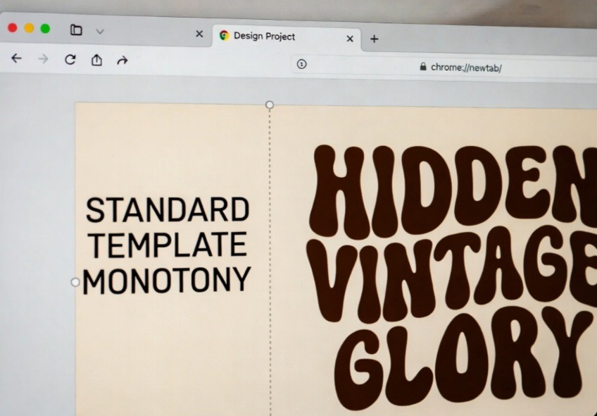
THE LAZY POSTER (Sterile)             THE RETRO REBEL (Authentic)

   +----------------------------+         +----------------------------+


   |                            |         |                            |
   |      HEAVY HELVETICA       |         |     GROOVY SUNSHINE        |
   |   Looks like a tax form    |         |    Pure nostalgic rhythm   |
   |                            |         |                            |
   +----------------------------+
Instead of doing deep font research, I rushed the project. I picked a standard, heavy geometric sans-serif that everyone uses, added a standard distressed texture filter over the top, and thought I had nailed the vintage brief.
When I brought the proof into the shop, the owner took one look at it and sighed. He didn’t yell; he just told me it looked like a billboard for an insurance corporation trying to play dress-up. The text carried absolutely no human warmth or historical rhythm. It was a massive wake-up call. I went straight back to my workspace, opened the app, and forced myself to ignore the trending font lists entirely. That was the night I built an exclusive inventory of hidden gems that completely change how a layout communicates history.
I made a comparison of the standard corporate monotony of default font selections (left) vs. the undeniable grit, flavor, and soulful character of hidden retro typefaces (right).
What do you think about this my design improvement?
The Illusion of the Overused Aesthetic
The internet is currently drowning in a flood of identical designs because the platform’s search algorithm deliberately pushes the same top twenty typography styles to everyone’s dashboard. It creates a psychological illusion that those are the only tools available for the job.
True vintage character doesn’t live in the automated suggestion panels. It relies on imperfect geometries, heavy ink-trap styles, and exaggerated ligatures that mirror real, historical printing presses. If you want your visual identity to carry an authentic human soul, you have to actively reject the front-page recommendations and dig deeper into the library.
- The Bold Woodstock Vibe: Nectarine
If you want a layout that instantly screams late-60s vinyl records, vintage surf culture, or psychedelic festival flyers, this asset is an absolute masterpiece.
Why This Style Works
Nectarine is an incredibly thick, fluid display font with heavy, melting letterform shapes that feel completely handmade. It instantly commands absolute attention on a busy digital feed.
This isn’t a text style you use for long sentences. It is an assertive display asset meant for short, heavy, two-word headlines. Pair it with a completely blank canvas background and plenty of negative space to prevent the organic letterforms from feeling too cluttered on mobile screens.
- The 1930s Paris Cafè: Vintage Heritage
If your design aesthetic leans more toward old-world luxury, vintage hotels, or traditional editorial book covers, this hidden gem is an absolute mandatory addition to your library.
- Why This Style Works
Vintage Heritage balances clean, sharp vertical stems with highly artistic, sweeping decorative loops on the capital letters. It looks like it was plucked straight off an antique menu bar in Western Europe.
To make this look entirely human-designed, avoid alignment perfection. Let a subtitle using a thin, modern sans-serif cross over or sit slightly tucked into the bottom tail loop of this font. The overlapping layer breaks the predictable digital grid lines that make automated AI graphics look so sterile.
- The Funk & Soul Baseline: Bright Groovy
This selection captures the high-energy, nostalgic rhythm of late-70s television show titles and classic funk album covers.
Why This Style Works
Bright Groovy features an integrated soft drop-shadow illusion built right into its vector silhouette. It has a beautiful forward-leaning slant that gives your text blocks an immediate sense of motion and human dance.
I can tell you for free, using this font like wearing a pristine vintage leather jacket over an understated modern outfit. It has instant attitude. Use it for lifestyle brand titles, bold sticker graphics, or podcast cover artwork to build immediate authority.
- The Mid-Century Travel Guide: Retro Signature
Nostalgia isn’t just about bold curves; sometimes it is about the elegant, clean geometry of the 1950s post-war print era.
Why This Style Works
Retro Signature is a beautifully balanced, medium-weight serif font with wide, relaxed spacing and subtle, sharp serifs. It mimics the look of old luggage tags and vintage luxury travel magazine advertisements.
Avoid making this mistake
Do not use this font with tight tracking. The entire vintage luxury aesthetic of Retro Signature depends completely on breathing room. Go to your spacing panel and increase the letter spacing setting by at least 15% to let the historical layout shine.
- The Rare Ink-Trap Classic: Belgrad
This is the ultimate secret weapon for modern brands that want a hint of vintage industrial grit without looking cartoonish or over-styled.
Why This Style Works
Belgrad features deep, geometric cutouts at the intersections of its letters, a classic print technique designed to stop ink from bleeding on rough newsprint paper. On a modern digital screen, it creates a highly unique, structural aesthetic.
My Hot Take on This
Standard design advice tells you to always use soft scripts for lifestyle branding. That is completely outdated. Using a heavy, structural ink-trap serif like Belgrad paired with a warm, earthy tone palette builds a much deeper, more authentic feeling of rugged premium craft than a generic cursive loop ever could.
If you want to see the exact dropdown screens and filter selections click by click rather than reading names on a screen, this excellent walkthrough by a seasoned creator breaks it open.
The video below shows you exactly how to access advanced ligatures, glyph alternates, and hidden formatting styles that completely change how type settles on your artboard.
Frequently Asked Questions
Are these hidden fonts free to use for commercial projects? Yes, all five of these selections are included within the standard font directory. If you are using a free account, check the small icon next to the name to verify if it requires a premium tier or is open for immediate public commercial license use.
Why can’t I find these names when I search my dashboard? Make sure you are typing the exact name into the search field inside the text editing panel, not the global elements search box. The font engine can be highly sensitive to specific spelling configurations.
What body text goes best with retro display fonts? Always pair an expressive, heavy vintage headline font with an incredibly clean, neutral sans-serif body text style like Montserrat, Helvetica, or Glacial Indifference. This protects readability while keeping the spotlight completely on your headline.
The Research Habit That Sets You Apart
At the end of the day, your typography choices reveal exactly how much care you put into your business presentation. Settling for the default, front-page templates tells your audience that you are running a generic, automated operation.
The next time you sit down to build a digital asset, break the sin of creative laziness. Force yourself to explore the hidden depths of your asset library, pick a typeface that carries a distinct historical rhythm, and balance it with ample empty space. Your graphics will immediately feel more authentic, your brand identity will command real premium value, and you will completely stand out from the endless digital ocean of robotic clones.

Image by Edar from Pixabay
Sources and Citations
Historical typography evolution and ink-trap printing mechanics via the official Monotype Typography Library Studies.
Visual hierarchy and font pairing principles detailed on the Interaction Design Foundation Typography Guidelines.
Creative research methodologies and asset curation workflows found on the Adobe Create Magazine Design Panels.

Udeichi Miracle Chinaza is a digital creator and graphic designer who specializes in creating clean, visual content. Passionate about making design accessible to everyone. I share practical Canva tutorials, layout tips, and creative shortcuts to help beginners and small businesses build stunning graphics with ease.