
Circular Clipping Mask Tricks Inside Canvas Workspace
No one ever told me this, I learnt to break free from rigid design grid boundaries entirely by myself after spending months building completely stale marketing collateral. I used to think that professional layouts demanded sharp 90-degree boxes for every single profile shot or product graphic. One evening, I was reviewing a live client funnel on my laptop and realized the whole layout looked completely hostile and blocky. The square graphics were literally trapping the text paragraphs, making the information feel incredibly crowded. That exact friction sent me on a deep research loop into visual spatial physics, leading directly to My Favorite Way to Crop Images Into Perfect Circles Using Frames to effortlessly disrupt boring grid architectures.
The core secret here has nothing to do with basic cropping paths or manual eraser brushes. It is an exercise in editing psychology. When you swap defensive rectangles for smooth round containers, the digital screen opens up, completely forcing a visitor to look right at your main subject without getting distracted by harsh outer corners. You can also checkout this interesting guide on My Ultimate Cheat Sheet for Pastel Color Schemes in Canva.
Image 1: Assessing structural canvas weight inside my editor view to compare a heavy rectangular container against a fluid, round frame layout.
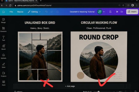
Honestly the first one look awful. The portrait on the left feels blocky and archaic, forcing the surrounding text blocks into an awkward alignment pattern. On the right, the layout completely opens up. Sliding the exact same file into a round vector frame changes the negative space dynamics, allowing the profile to balance perfectly with the adjacent text while providing massive breathing room for a premium digital asset feel.
Breaking the Tyranny of the Rectangle
Let’s be completely transparent for a moment: modern digital media is trapped in an absolute box. We stare at square screens, use rectangular phones, and consume grids of sharp blocks. When you slap a standard square photo directly into a text-heavy presentation slide or website header, you are just adding more rigid lines to an already cramped space. This creates an invisible layer of visual fatigue. Your viewer’s eyes hit the hard corner of the image asset, stop scanning the text, and experience an abrupt break in attention.
I encountered this wall head-on while designing a meet-the-team section for an elite corporate portal. I loaded up eight premium square headshots in a strict horizontal row. It looked absolutely dreadful, more like an uninspired police lineup or an ancient high school yearbook than a dynamic company culture hub. The entire layout felt rigid and completely detached.
The exact millisecond I executed My Favorite Way to Crop Images Into Perfect Circles Using Frames, the layout breathed for the first time. By discarding those heavy corner pixels, I reclaimed massive blocks of clean white space, allowing the human faces to blend seamlessly with the adjacent typography columns instead of fighting them for dominance.
Injecting Assets Directly Into Active Mockup Containers
You can bypass complex vector path equations entirely. The actual mechanical setup happens inside a specific placeholder folder tucked away in the left-hand workspace dashboard.
The Access Point: Click the ‘Elements’ icon on your dark sidebar menu, completely skipping the standard shape lines.
The Vault Selection: Scroll down past the sticker charts until you reach the ‘Frames’ subsection, choosing the round landscape disk.
The Insertion Drop: Position that open ring onto your live page canvas, fetch your raw photo file, and drag it directly over the center of the ring until it snaps into place.
[Elements Toolbar] ---> [Frames Folder] ---> [Round Mask Layer]

                                                    |
                                    +---------------+---------------+
                                    |                               |
                           [Hover Raw Picture]            [Asymmetrical Zoom]
                         (Snap Into Disk Center)
The system automatically shears away the outer borders, translating your flat photograph into a mathematically fluid vector curve.
The Massive Failure of Building Fake Layer Masks Manually
Before I unlocked this automated workflow shortcut, my editing process was a complete joke. I was literally dragging solid white square blocks onto my photos, cutting out a circular hole with external transparency tools, and re-importing the file as a crude cover mask.
That manual workaround completely destroyed my project deadlines. If a client requested a minor adjustment, like shifting a consultant’s face two millimeters to the left to show more of their profile, I had to delete the entire setup, re-crop the original asset in an external app, re-upload, and try to line everything up manually again. It was a massive time sink that made me feel incredibly amateurish.
What I carried out of that trial-and-error phase is that visual layouts require absolute fluid flexibility. True design freedom means utilizing active clipping frames that allow adjustments on the fly. With a native canvas frame layer, you just double-click the circle to scale, rotate, or shift the image position inside the perimeter without ever throwing off your master grid margins.
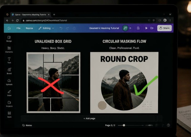
This is how it looks from my own view direct from my laptop screen. This physical display perspective lets us check our masking choices under real-world ambient conditions.
Why Balanced Cropping Looks Deeply Unprofessional
Here is where my execution completely splits from traditional photography schools that demand you place a user’s eyes dead-center in the middle of a cropped circle frame.
Perfectly centered circular headshots look like a cheap, low-budget government passport photo or a driver’s license scan. Stop centering faces perfectly inside your circle frames.
When you center a nose perfectly inside a round element frame, you create a static, stiff graphic that completely lacks visual energy. To make an avatar look elite and high-end, you need to execute asymmetrical scaling. Double-click the frame, scale the image up until the subject’s hair or shoulders expand past the circular boundary line, and position the eyes slightly top-right or top-left of the true center. This calculated imbalance infuses kinetic movement into the circle, converting a boring icon into an editorial portrait that feels alive and custom-crafted.
Three Brand Layout Upgrades You Can Steal Today
Let’s look at three fresh ways to deploy circle frames across your content channels to break up repetitive layouts. When exploring My Favorite Way to Crop Images Into Perfect Circles Using Frames, shape diversity is your main asset.
- The Dynamic Review Bubble
This approach replaces old-school block testimonials on landing pages, transforming text boxes into editorial callouts.
The Structure: Anchor a medium circle frame directly inside the left boundary of a text container block.
The Content: Insert your customer’s profile picture, scaling it tightly around their jawline.
The Finish: Run your italicized review sentences directly along the right edge of the frame, using the natural curve of the round boundary as your text margin guide.
- The Multi-Speaker Overlap Layer
Perfect for podcast banners, workshop ads, or panel discussion slides where multiple faces must share space without cluttering the screen.
The Structure: Line up three identical circle frames horizontally across your workspace canvas.
The Content: Snap your individual expert portraits into each placeholder container.
The Finish: Use your position panel to overlap the rings slightly, sliding the center avatar forward and the flanking circles slightly backward to build an engaging three-dimensional tier.
- The Focal Metric Accent
An incredible layout for data-heavy pitch decks, digital reports, or infographical pin designs where a physical product shot needs to back up a heavy percentage point.
The Structure: Expand a single circle frame until it dominates roughly half of your layout grid.
The Content: Drop a hyper-detailed, high-resolution product close-up into the vector ring.
The Finish: Overlay a massive, bold statistical typography hook (like 94%) right across the edge of the circle frame line using intense color contrast.
The Lens of a Camera
Think of a standard, boxy graphic layout like a heavy wooden window shutter slammed shut. It blocks your line of sight, feeling restrictive and cutting off the flow of light between the inside of the room and the world outside.
Using My Favorite Way to Crop Images Into Perfect Circles Using Frames is the exact equivalent of opening up a clean, polished camera lens through that barrier. The round lens doesn’t attempt to reveal the entire landscape at once; it captures one specific, vital subject with absolute clarity. Because the container is round, your eyes process the boundary naturally, sliding past the edges effortlessly to lock onto the central face without getting tripped up by sharp architectural lines.
This YouTube creator explained the practical way. Take your time to watch after reading. No knowledge is a waste!
Frequently Asked Questions
Why does my photograph warp or stretch when I drop it inside a circle? Canva frames protect your asset proportions automatically. If your graphic looks warped or distorted, you likely used an outdated shape fill tool rather than an actual native ‘Frame’ container layer. Make sure you are choosing your templates from the dedicated ‘Frames’ folder inside your left element panel.
Is there a quick way to attach a clean colored border around my circle crops? Canvas frames do not have a built-in border width slider. To build a sharp frame border, drop a solid circle shape onto your page canvas, apply your brand tone, scale it roughly 5% larger than your picture container, and slide it directly behind your cropped image using your layer position tools.
How do I eject an image out of a frame if I want to swap it? To clear the placeholder layer, right-click on your circular graphic asset and tap ‘Detach Image’ from the dropdown menu. The raw photograph will immediately release back onto your canvas as a standard square file box, leaving your circular frame intact and ready for a new upload.
Visual Flow Over Monotonous Grids
Sticking blindly to rectangular blocks isn’t a sign of structural organization; it is a clear sign of creative complacency. Forcing your audience to scroll through endless rigid boxes and hard corners creates a repetitive reading path that actively drains user engagement metrics. Weaving My Favorite Way to Crop Images Into Perfect Circles Using Frames into my publishing system completely revolutionized how fast I can generate high-converting digital assets. It shattered the standard corporate box layout blueprint and gave my content a completely organic flow.
Stop boxing your visual assets into aggressive rectangles that crowd your typography text layers. Open up your active presentation or landing page draft, delete those harsh square edge photos, slide a clean circular placeholder into your workspace, and let your subjects truly command the frame. Your conversion metrics will reflect the change.
Technical Sources and Citations
Step-by-step frame utilization guidelines and element masking instructions from the Canva Elements Help Hub.
Strategic breakdown on leveraging geometric circles to improve interface accessibility layouts on UX Collective Design Journal.
Technical case study on visual scanning paths and eye-tracking movements across structured frame barriers published by the Nielsen Norman Group Research.
Udeichi Miracle Chinaza is a digital creator and graphic designer who specializes in creating clean, visual content. Passionate about making design accessible to everyone. I share practical Canva tutorials, layout tips, and creative shortcuts to help beginners and small businesses build stunning graphics with ease.