
Typography Contrast Pairing For High Converting Landing Page Hero Sections
I care so much about details that a single poorly paired font combination on a homepage hero section can completely ruin my mood for the entire day. Walking through the digital landscape, it feels like almost every second startup banner is suffering from a massive formatting identity crisis. I used to be that exact same sloppy designer, picking two random fonts from a drop-down list because they both individually looked “cool,” then throwing them together and praying they would magically make sense. I was refreshing a live client project file on my laptop late one evening and realized the header layout didn’t feel sleek; it felt chaotic, crowded, and loud. The title font was actively choking the secondary subtext layer. That exact frustrating baseline forced me to step back and engineer the system of How I Mix Bold Headlines and Minimal Fonts for Website Banners to bring extreme contrast and structure back to digital front pages.
The absolute mastery of high-impact banner design isn’t about finding a secret, magical typeface that nobody else knows about. It is an exercise in managing weight tension. When you pair an aggressively thick, loud title layer with a completely stripped-back, thin monospaced or clean sans-serif secondary row, you instantly create a visual spark that locks your visitor’s attention to the page before they can scroll away. You should also learn How to Use Canva Frames for Round Image Crops.
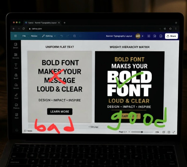
Personally did made this edit to reference it in this article. Assessing structural weight contrast ratios inside the Canva dashboard to compare a flat, uniform header stack against an optimized bold-and-minimal layout matrix.
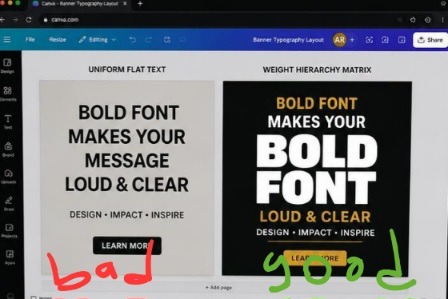
The canvas mockup on the left is a total structural wash, using the same uniform text weights completely hides the main headline hook, making the text look like a boring email block. On the right, the screen snaps into focus. By pulling the main title into an extra-black font scaling line and matching it with an ultra-light, wide-tracked minimal subhead, the typography functions like an executive billboard, locking in high-end design authority instantly.
Breaking the Monotony of Uniform Text Blocks
Let’s look at this straight: human eyes are incredibly lazy scanners. When a user lands on a site, their brain calculates whether the page is worth reading in less than half a fraction of a second. If your website banner features a medium-weight headline sitting right above a medium-weight subheadline, you are committing a silent conversion crime. Because both text layers carry the same visual volume, the reader’s eye perceives them as a single gray box of data. There is no hook, no starting line, and absolutely no urgency.
I hit this wall hard when rebuilding a digital agency header layout early last year. I used a standard clean sans-serif for the giant title and the exact same font system in a slightly smaller size for the explanatory paragraph underneath. The page looked unbelievably flat, safe, and entirely forgettable, like a template you could buy for three dollars on a cheap marketplace.
The minute I applied the exact blueprint of How I Mix Bold Headlines and Minimal Fonts for Website Banners, the interface transformed into a premium storefront. By amplifying the weight contrast, I forced a distinct hierarchy onto the screen, allowing the core headline hook to hit like an absolute sledgehammer while the clean minimal subtext delivered the vital context smoothly underneath.
The Manual Line-Height Split Protocol
You can completely abandon the pre-made headline blocks that clutter your left-hand element drawer. True layout alignment happens when you build your type stacks using individual text blocks so you can manipulate their tracking and leading properties independently.
The Blueprint Entry: Type your core hook phrase into a single text block container, then aggressively crank the size handle up past 64pt.
The Line-Height Squash: Click the formatting spacing tool on your upper panel bar and drop your line spacing parameter down until the letters are practically kissing.
The Minimal Release: Drop a completely separate text box directly underneath, input your secondary line, choose an ultra-light clean typeface, and expand the letter tracking wide open.
This deliberate spatial manipulation creates a beautiful structural squeeze, your headline is incredibly dense and impactful, while your subhead acts as an open, breathing cushion directly below it.
The Day My Creative Over-Styling Broke a Client’s Funnel
Before I figured out this weight-pairing rhythm, I fell into what I call my “delusional typographic art phase.” I convinced myself that if extreme contrast was great, then using an ornate, heavy vintage display font for my header text and an equally complex, sharp geometric slab serif for my body copy would make my banners look like museum-grade fine art masterpieces.
That project turned into an absolute disaster for my client’s checkout numbers. Within forty-eight hours of launching the new site, their conversion rates plummeted off a cliff. Visitors couldn’t read the value proposition on mobile screens, the letters were overlapping into an unreadable knot of ink, and the whole header area looked like a chaotic concert flyer rather than a high-end business service. It was a deeply humbling check.
What I dragged out of that mess is that banner typography is a balancing act of role delegation. You can only have one star on your screen. If your headline is loud, heavy, and full of distinct personality, your subtext font must be completely silent, minimal, and structural to serve as the baseline support.
Evaluating banner reading paths and element density weights from a low-exposure, my studio workstation layout.
A Radical Realignment of Banner Grids
Here is where my direct system completely splits from traditional web design agencies that tell you to place a giant full-width photo directly behind your master header text.
Hot Take: Heavy background graphics behind hero typography are completely dead. If you are overlaying text directly onto busy lifestyle or product photos without a solid shield, you are making your banner unreadable and look completely cheap.
When you try to force text to sit on top of multi-colored images, you create a messy battle for contrast that your fonts will always lose, no matter how much shadow you add. To look premium, your website banner should use an ultra-clean, monochromatic color background plane or an intensely blurred single-tone gradient block. Let your bold text hierarchy serve as the primary graphic artwork itself, rather than trying to mask a messy background photo.
Since I don’t record videos of myself doing this edit, you can watch this video from a fellow designer on YouTube to learn more.
Three High-Converting Font Formats Ready for Your Laptop
Let’s open up my personal layout toolbox. These are the exact combination frameworks I execute on my screen when I need to make a website banner look expensive and completely professional.
- The Ultra-Modern Tech Stack
This pairing brings an aggressive, cutting-edge corporate look to software landing pages or clean product launches.
The Bold Headline Choice: Use an extra-black, geometric sans-serif (like League Spartan or Anton) scaled to a massive weight, all-caps, with line spacing tightly compressed to 0.85x.
The Minimal Support Choice: Use a super-clean, light monospaced typeface (like Space Mono or Courier Prime) scaled down to 12pt, tracking expanded wide to 25%, all-caps, colored in a soft contrast gray.
- The High-End Luxury Editorial
Perfect for lifestyle branding, design consulting portfolios, or premium digital course pages that need to project extreme wealth and authority.
The Bold Headline Choice: Use a high-contrast, elegant serif font with distinct editorial thick-and-thin lines (like Playfair Display or custom Tan Headline) set to normal casing.
The Minimal Support Choice: Use a highly structured, ultra-thin modern geometric sans-serif (like Inter Light or Glacial Indifference) tracking set to 15%, kept completely minimal.
- The Creative Disruptor Layout
An incredible framework for bold blogs, podcast banners, or social media agency homepages that want to look highly energetic and opinionated.
The Bold Headline Choice: Use an organic, thick display typeface (like Horizon or custom Archivo Black) set to a massive scale, tilted at a slight -2 degree accent angle.
The Minimal Support Choice: Use a simple, crisp standard utility sans-serif (like Roboto or Open Sans Condensed) running in a clean, tight line directly beneath the master tilt block.
Uniform website banner layout is like a standard piece of gray rope dropped into a lake. It floats aimlessly, carries no weight, blends into the surrounding water tones, and completely fails to grab anyone’s attention.
Implementing How I Mix Bold Headlines and Minimal Fonts for Website Banners is the exact equivalent of rigging up a massive, heavy iron anchor and attaching it to a thin, razor-sharp nylon fishing line. The heavy anchor headline drops straight through the screen, crashing through the user’s scanning habits and forcing their focus to stop dead on the page. Meanwhile, the thin minimal line subhead runs perfectly smooth directly behind it, holding the whole communication stream together without adding a single ounce of unnecessary visual bulk to the presentation.
Frequently Asked Questions
Why do my fonts look crisp on my monitor but blurry when viewed live on a mobile screen?
If your typography edges look soft or pixelated on high-resolution displays, you likely exported your banner graphic as a standard low-quality JPEG file format. Web banners should always be exported as a high-resolution PNG file format, or ideally, kept as raw live vector text layers inside your website builder code to protect absolute border sharpness.
How do I choose the right color contrast for my bold headers?
The fastest rule is extreme polarity. If you are using a light linen or soft cream background, your massive bold headline must be an incredibly rich charcoal or dark espresso shade. Save your single bright accent color exclusively for the tiny minimal subhead line or the primary call-to-action button to draw immediate clicking attention.
Can I mix a bold serif and a bold sans-serif headline together inside one banner?
To be completely direct: absolutely not. Placing two heavy, competing display fonts inside a single visual field creates a chaotic visual clash that instantly cheapens your branding architecture. Stick to the rule of single dominance, one font carries the heavy weight volume, and the other remains entirely light, crisp, and functional.
Layout Hierarchy Over Monotonous Text Stacks
Settling for default font pairings and safe, uniform typography choices isn’t a sign of professional web layout design; it is an open admission of creative complacency. Forcing your site visitors to filter through flat, unformatted layers of text means running a dull homepage that actively leaks click-through traffic. Weaving the strategic methods of How I Mix Bold Headlines and Minimal Fonts for Website Banners into my production pipeline completely changed how fast I can launch high-impact digital real estate assets. It destroyed that generic template look and gave my web frames an undeniable, premium authority.
Stop throwing flat rows of safe text onto your landing page hero sections. Open up your current active workspace draft, select your primary headline frame, blow the font scale up to an aggressive weight, drop a ultra-light minimal line directly underneath, and let your typography truly run the screen. Your website conversion analytics will show the impact.
Technical Sources and Citations
Official font pairing matrices and text weight guidelines from the Canva Typography Calibration Support Portal.
Scientific analysis on headline weight readability thresholds and digital consumer landing page retention published by UX Planet Design Systems.
Industry case study on minimalist typographic hierarchy systems for maximum conversion tracking on Smashing Magazine Layouts.

Udeichi Miracle Chinaza is a digital creator and graphic designer who specializes in creating clean, visual content. Passionate about making design accessible to everyone. I share practical Canva tutorials, layout tips, and creative shortcuts to help beginners and small businesses build stunning graphics with ease.