
Find free organic script typefaces inside canva chrome browser interface
I used to be that kind of person that spent three hours scrolling through a font dropdown list, completely paralyzing my workflow because everything looked like an ugly, robotic mess. I wanted my social media graphics and eBook covers to feel warm, organic, and deeply human. Instead, every single text box I generated looked like a stiff, corporate tax document or a tacky, pixelated greeting card from the early nineties. I was so desperate for that perfect, effortless cursive look that I actually pulled out an iPad, tried to hand-write my own headers with a stylus, and ended up with a crooked, shaky mess that looked like it was drawn by a toddler. That embarrassing night forced me to dig through the absolute depths of the software font library to build my curated list of the best free handwriting fonts in Canva.
My interface browsing through the free handwriting and script typeface directories inside the Canva browser panel.
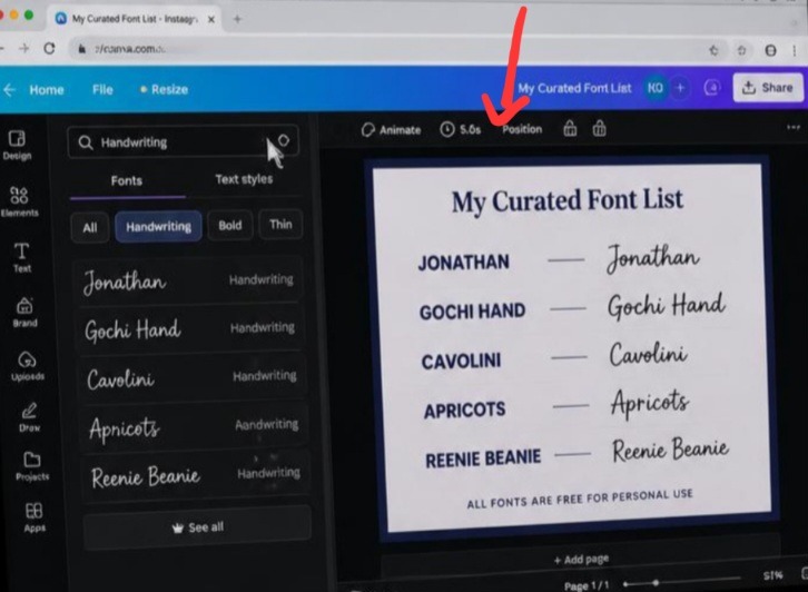
My aim is to breakdown the visual illusion of font choice by exposing the layout side options bar directly to the reader. The design demonstrates how keeping your workspace clean allows you to compare font weight and character link connections effortlessly. It shows that professional layout building isn’t about collecting thousands of external files, but about organizing native assets to maintain crisp, readable contrast boundaries.
If you are still using generic fonts like Comic Sans or standard Arial because you can’t find a script style that doesn’t look completely fake, you are destroying your brand’s personality. Bad script choices make your content look cheap and lazy. Let’s talk about how to stop scrolling aimlessly and instantly upgrade your visual identity using my curated list of the best free handwriting fonts in Canva directly inside your active browser project canvas. Also read The 2-Second Trick I Use to Align Text Perfectly on the Screen In Canva.
What I Passed Through in the Font Overload Trenches
Let me break down the painful lesson I learned while trying to navigate the chaotic world of digital typography. When I first started out as a creator, I was completely delusional about how font choices impact human psychology. I thought that if a font looked fancy or had a lot of loops, it would automatically make my graphics look premium.
I was building a series of Pinterest graphics for a high-end wellness brand. I picked a highly decorative script font that I thought looked incredibly elegant on my desktop computer screen. I pushed the graphics live, sat back, and watched my traffic completely tank.
A close friend finally sent me a direct message that read: “Hey, your new graphics look nice, but I literally cannot read what the text says on my phone.” My heart sank. When I pulled up my own Pinterest feed on my mobile screen while sitting in a brightly lit coffee shop, the text looked like a jumble of unreadable black lines. It was a massive wake-up call. A great font isn’t just something that looks pretty; it has to be readable at a microscopic scale on a moving screen. True professional formatting balances human texture with flawless legibility.
The Secret Five: The Only Script Styles You Need to Know
Let’s skip the endless scroll and look at the exact typography names you need to type into your search bar right now. These five choices are completely free, do not require a premium subscription, and stay perfectly crisp when exported.
Jonathan: This is the king of elegant, fluid cursive. It looks like real ink flowing from a premium fountain pen, making it perfect for signature blocks or high-end quote graphics.
Gochi Hand: If you need a look that feels completely natural, friendly, and unpretentious, this is your go-to. It has thick, rounded strokes that mimic a clean felt-tip marker.
Cavolini: A masterclass in modern, casual handwriting. It has a slightly compact structure that gives it a clean, handwriting-expert vibe without looking messy or disorganized.
Apricots: This style brings an organic, artsy, and youthful energy to your layouts. It works beautifully for lifestyle blogs, recipe layouts, or cozy community announcement graphics.
Reenie Beanie: The ultimate minimalist sketch font. It uses very thin, loose strokes that give your design an authentic, quick-journal-note aesthetic that instantly breaks up stiff layouts.
My Unpopular Opinion on Paid Premium Fonts
Here is my controversial opinion that will probably annoy a lot of independent type designers: you are completely wasting your money if you are paying for premium font packages. The internet has gaslit creators into believing they need to spend fifty dollars on a custom font file to stand out from the crowd.
That is a total lie. The built-in library inside your browser editor already holds world-class open-source typefaces that are identical to expensive luxury fonts. If your graphic looks bad, a paid font is not going to save it. The magic isn’t in the price tag of the file; the magic is in how you style it, how much breathing room you give it, and how well you pair it with your background imagery. Save your money and master the free tools already sitting at your fingertips.
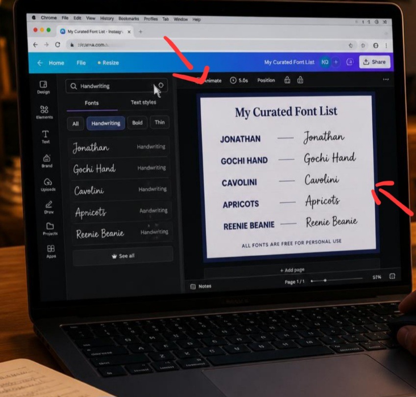
Look at the organic typography pairings on my laptop screen inside Chrome to maximize mobile content legibility.
The Perfect Pairing Formula to Keep Layouts Clean
You cannot build a cohesive asset using handwritten typefaces alone. If you try to make your headlines, subheadings, and body paragraphs all look handwritten, your document will look like a chaotic diary entry from a horror movie.
To make my curated list of the best free handwriting fonts in Canva actually work for your brand, you must pair them with rigid, clean geometric anchors.
Use your chosen script typeface strictly for short, high-impact emphasis words (like “Secrets,” “Free,” or “Warning”).
Set your main contextual sentences in a bold, uppercase sans-serif font family like League Spartan or Montserrat.
Keep a massive contrast gap between the two styles so the handwritten word pops off the screen like a natural, intentional sticky note.
Common Typography Traps to Sidestep
Tracking out cursive letters: Never increase the letter-spacing or tracking on a cursive handwriting font. Real cursive is designed to connect character by character. Spacing them out breaks the anchor loops and makes your text look like a broken typewriter glitch.
Using script for long paragraphs: Keep handwritten styles completely away from body copy. If a block of text is longer than three or four words, your readers’ eyes will tire out instantly, causing them to click away from your page.
Ignoring background contrast noise: Handwritten lines are often thin and irregular. If you place them directly over a busy, colorful photograph without a clean solid color backing or a dark overlay filter, the characters will dissolve into the background noise completely.
Frequently Asked Questions
How do I find even more free handwriting options inside the platform?
Open your typography drop-down selection menu panel on the left side of your browser screen. Instead of searching for a specific name, simply type the broad keyword categories “Handwriting,” “Script,” or “School” into the search field to unlock hundreds of hidden free choices.
Can I legally use these free styles for commercial client work and eBooks?
Yes, the free typefaces provided inside the native core catalog are licensed for both personal and commercial use projects. You can safely use them to build client mockups, sales pages, social media promotions, and digital download assets without worrying about copyright infringement notices.
How do I add a natural hand-drawn highlight line under my font?
Go into your elements side panel menu and type “hand-drawn underline” or “sketch line” into the graphics search engine. Filter by free assets, match the color of the vector line to your text hex code, and place it gently beneath your handwritten emphasis word to complete the organic look.
Watch this great visual guide on The Best Free Canva Fonts and Pairing Secrets to watch a professional designer on YouTube match free script selections with clean background geometry to build beautiful, balanced marketing assets.
Intentional Style Wins the Game
Utilizing my curated list of the best free handwriting fonts in Canva is about injecting real human warmth back into a cold, automated digital world. Your audience wants to connect with a person, not a sterile machine interface. By choosing clean, readable, and organic script accents, you give your content an immediate voice and a distinct point of view. Stop overcomplicating your layouts with heavy decorative borders or flashing colors. Let a clean, well-paired handwritten note do the emotional talking for you.
Take a few minutes during your next editing window inside Chrome to swap out your rigid titles for one of these five curated free alternatives. You will be amazed at how quickly your templates transform from a standard corporate draft into an authoritative, lifestyle-ready presentation.
Sources and Citations
Canva Official Type Design Directory for library license parameters: Canva Help: Font Licensing and Usage Terms. Premium script typography pairing templates in chrome browser canva.
Google Fonts open-source typography repository for web optimization metrics: Google Fonts: Open Source Script Library. Find free organic script typefaces inside canva chrome browser interface.
The Bureau of Internet Accessibility standards on mobile font readability scales: BOIA: Text Readability and Accessibility Standards

Udeichi Miracle Chinaza is a digital creator and graphic designer who specializes in creating clean, visual content. Passionate about making design accessible to everyone. I share practical Canva tutorials, layout tips, and creative shortcuts to help beginners and small businesses build stunning graphics with ease.