
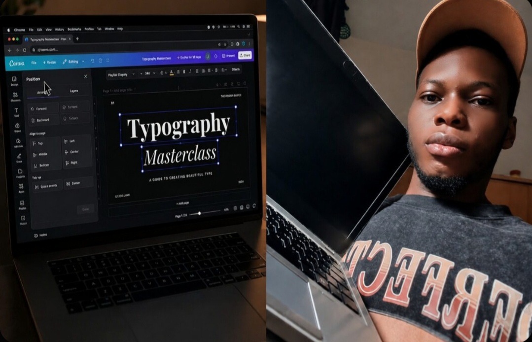
My Eyes Blurted Out the Truth When a High-Paying Client Asked Me to Zoom In to 400% On a Presentation
I can still remember the absolute humiliation of a live Zoom presentation with a premium corporate client last winter. I was pitching a fresh brand kit, confidently scrolling through my sleek presentation slides, thinking I was an absolute layout god. Suddenly, the creative director stopped me mid-sentence. “Hey, can you go back to slide four and zoom in to 400% on that heading?” he asked. I moved my cursor, zoomed in, and my heart instantly dropped into my shoes. The main title was exactly three pixels too far to the left, completely overlapping the margin boundary. It looked sloppy, uneven, and incredibly amateur. I had spent two hours manually dragging that text frame around with my mouse, relying entirely on my tired eyes to guess the center point. That painful call forced me to abandon my sloppy habits and discover the 2-second trick I use to align text perfectly on the screen in Canva.
If you are still manually moving your typography blocks around and hoping the pink smart guides are saving your design, you are playing a dangerous game with your professional reputation. Slanted, uneven text blocks instantly break the visual trust of your audience before they even read a single word. Let’s talk about how to completely fix your workflow using the 2-second trick I use to align text perfectly on the screen in Canva so you can export flawless, crisp layouts every single time without losing your mind. Checkout my article on 5 YouTube Thumbnail Layouts That Actually Get Clicks.
Accessing the advanced coordinate position controls inside my Canva browser setup to eliminate layout errors.
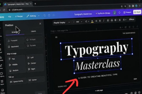
This my interface snapshot cuts right to the heart of clean digital formatting by showcasing the raw mechanics of the sidebar options menu. The layout highlights how utilizing precise, code-driven layout tools instantly replaces the unreliable human habit of manual dragging. It is clear proof that premium content design relies heavily on leveraging native system controls to enforce strict, unyielding visual balance across your canvas.
What I Passed Through in the Manual Dragging Wasteland
Let me pull back the curtain on the massive design struggle I went through before I finally figured this system out. When I first started creating content online, I was completely delusional about my visual accuracy. I thought I had a built-in internal ruler in my brain. I would drop a massive block of text onto my canvas, grab the side handles, and shift it around until it looked sort of centered.
I was working on a 50-page digital workbook for an online course launch. Because I was rushing, I manually placed every single chapter heading using my mouse pointer. On my small laptop screen, everything appeared totally fine. But when the printed proof copies arrived in the mail, the book looked like absolute chaos.
The text on page five was huddled too close to the top border. The text on page twelve was sagging toward the bottom right. It looked like a total mess. My hands were shaking as I realized I would have to manually open all fifty pages just to adjust the positioning lines. That was the exact moment I realized that human eyes are inherently flawed tools for calculating digital spatial relationships. You cannot rely on muscle memory or a steady hand to build clean graphics; you have to let the underlying software grid do the heavy math for you.
The 2-Second Trick That Destroys Layout Messes Instantly
Let’s skip the fluff and look at the exact button configuration that completely changed my production speed. Most creators spend forever trying to line up multiple text layers by tapping their keyboard arrow keys over and over again. Stop doing that immediately.
Here is the exact pattern to execute inside your workspace:
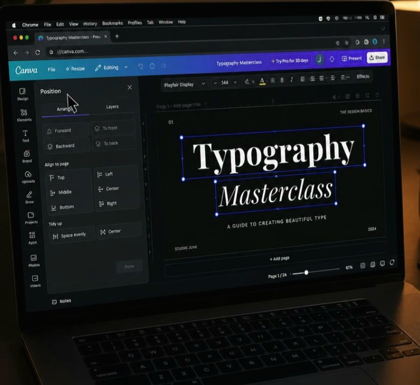
[ Select Multiple Text Boxes 🖱️ ] ➔ [ Click "Position" Layer Tool ⚙️ ] ➔ [ Hit "Tidy Up" or "Center" 🎯 ] All you need to do is click and drag your cursor over every single independent text frame on your active canvas to select them all at the exact same time. Look up at the top options toolbar running across your browser window and click on the Position button. A side menu panel will instantly fly open on the left edge of your screen. Look under the space distribution settings and hit the magic button called Tidy Up or Center.
In exactly two seconds, the software instantly analyzes the exact dimensions of your text blocks, calculates the mathematically perfect mathematical center of your file, and snaps them into absolute alignment. It eliminates every single pixel of human error instantly.
Locking in perfect typographic alignment margins inside my Chrome before exporting final presentation assets.
My Unpopular Opinion on the Smart Guide Hype
Here is my unpopular opinion that might ruffle some feathers in design forums: Canva’s pink smart guides are actually making your graphics look worse. Everyone praises those little automatic pink lines that pop up when you move things around, but relying on them blindly is a total trap.
Those smart guides only align your bounding text boxes, not the actual alphabetical characters inside them. If you have a massive invisible border padding space on the right side of your paragraph, the smart guide will center the invisible box, leaving your actual written text looking completely off-center and lopsided.
Stop trusting the pink lines. If you want to know the 2-second trick I use to align text perfectly on the screen in Canva, you must force yourself to jump into the advanced position properties matrix. Mathematical grid entries always beat visual guesswork, every single day of the week.
Breaking Free from Single Axis Restrictions
Another massive hurdle I see people trip over is trying to align objects along multiple axes one by one. They will align the text to the top, then move it to the middle, then try to center it manually. You are completely wasting your time.
Inside that same advanced layout menu window, you can use the coordinate input fields to command your layers to sit exactly where they belong.
Select your main heading block.
Go to the Position tab in the sidebar menu panel.
Tap the Middle button to fix the horizontal placement, then instantly tap the Center button to lock the vertical alignment.
By combining those two specific clicks, your text hits the exact dead-center bullseye of your graphic canvas file. It takes less than two seconds, and it looks identical whether you are viewing it on a massive ultra-wide monitor or a tiny mobile phone screen.
Crucial Alignment Errors You Need to Dodge
Forgetting about internal alignment styles: If your text frame is set to left-align inside the typography toolbar, using the position panel will only move the boundary frame, while your actual words stay pushed to the left side. Always match your core paragraph formatting to your structural placement goals.
Grouping elements before aligning them: If you lock multiple layers into a group folder before using the coordinate tools, the software will treat the entire cluster as one solid shape instead of aligning the individual rows inside it. Always align your elements first, then group them later to preserve the spatial balance.
Ignoring font baseline metrics: Some decorative script or handwriting typefaces have long, sweeping descenders that hang far below the actual character baseline. This extra invisible spacing tricks the software into thinking the box is taller than it really is, which can make your text look slightly sagging even after a perfect system calculation.
Watch this incredibly helpful, quick layout demonstration on How to Align Text and Elements Perfectly in Canva from another youtube creator to see exactly how to navigate the sidebar position menus, utilize the tidy up feature, and clean up messy layouts in seconds
Frequently Asked Questions
Why does my text still look off-center even after using the position tool?
This almost always happens because you have an accidental empty space or extra line break at the very bottom of your text box. Double-click inside your text layer, highlight everything, and delete any hidden spaces or blank rows that might be inflating the outer borders of the frame.
Can I use this same fast alignment method for photos and icons?
Absolutely. This layout trick functions perfectly across every single asset type inside your workspace. You can select an icon vector shape, a profile picture cutout, and a text block together, and use the exact same alignment tools to space them out evenly across your layout canvas.
How do I align text to a specific background shape instead of the whole page?
Select both the text frame and the background shape container at the same time. Open your positioning menu, and the software will automatically limit its alignment adjustments to the borders of the larger background shape instead of shifting things across the entire document page.
Precision Over Guesswork
Mastering the 2-second trick I use to align text perfectly on the screen in Canva is all about moving past the messy habits of amateur content creation. True design authority doesn’t come from spending five hours tweaking a single graphic; it comes from understanding the hidden structural controls that let you create flawless layouts in seconds. Once I embraced the mathematical positioning menus inside my browser editor, my entire asset library transformed. My presentations looked sharper, my Pinterest pins looked incredibly premium, and I never had to sweat through another live client zoom review ever again.
Take a few short moments today to open up your current active template folders, select your core headers, and apply these rapid organizational menu tools. You will instantly notice a massive difference in how clean, balanced, and authoritative your final blog assets appear to your readers.
Sources and Citations
Canva Official Support Guide on positioning and arranging assets: Canva Help: Arrange Elements on Canvas.
Adobe Typography guidelines on grid system alignment properties: Adobe Design Systems: Typographic Alignment Principles.
W3C Web Accessibility guidelines on text spacing and layout metrics: W3C Layout and Typography Standards.

Udeichi Miracle Chinaza is a digital creator and graphic designer who specializes in creating clean, visual content. Passionate about making design accessible to everyone. I share practical Canva tutorials, layout tips, and creative shortcuts to help beginners and small businesses build stunning graphics with ease.