
The 60-30-10 Color Rule I Use: How to Choose Balanced Canva Palettes

If you want to know how to fix messy, chaotic layouts and finally create clean, cohesive designs, mastering the 60-30-10 color rule is the absolute fastest shortcut you can take. To put it simply, this classic design principle dictates that you should use a dominant color for 60% of your asset, a secondary color for … Read more
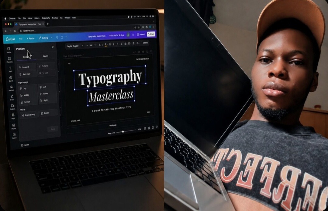
The 2-Second Trick I Use to Align Text Perfectly on the Screen In Canva

My Eyes Blurted Out the Truth When a High-Paying Client Asked Me to Zoom In to 400% On a Presentation I can still remember the absolute humiliation of a live Zoom presentation with a premium corporate client last winter. I was pitching a fresh brand kit, confidently scrolling through my sleek presentation slides, thinking I … Read more

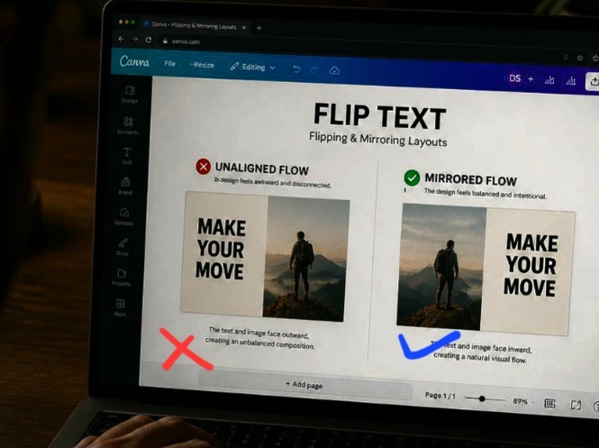
The Quick Way I Flip and Mirror Images for Better Layouts In Canva

Directional Visual Flow Using Canvas Image Rotation and Flip Settings I’m one of the few designers that actually pays attention to the subtle psychology of how people look at a screen. Most creators just drop a cool stock photo onto their canvas, throw some text next to it, and hit export without thinking twice. I … Read more

5 Aesthetic Canva Font Pairings I Am Obsessed With Right Now

The Typography Trap I Finally Escaped I used to be the kind of designer who would spend three hours scrolling aimlessly through a font dropdown menu, completely paralyzed by indecision. My drafts folder was an absolute graveyard of half-finished graphics that just felt off. I would pair a gorgeous, expensive-looking script with a blocky sans-serif, … Read more