
The Typography Trap I Finally Escaped
I used to be the kind of designer who would spend three hours scrolling aimlessly through a font dropdown menu, completely paralyzed by indecision. My drafts folder was an absolute graveyard of half-finished graphics that just felt off. I would pair a gorgeous, expensive-looking script with a blocky sans-serif, and the whole thing would instantly end up looking like a cheap grocery store flyer. It took me a ridiculously long time to realize that beautiful design isn’t about finding the loudest font in the room; it is about creating a quiet harmony between two different styles. After months of mixing, matching, and aggressively deleting messy text blocks, I compiled the ultimate shortlist of the 5 Aesthetic Canva Font Pairings I Am Obsessed With Right Now that will instantly elevate your brand from basic to editorial boutique.

Image by Firmbee from Pixabay
My Personal Experience: The Great Font Over-Styling Crisis
Last summer, I was hired to design a digital welcome packet for a high-end wellness coach. She wanted a vibe that felt calm, grounded, and deeply luxurious. Naturally, I overthought the entire process. I found this incredibly intricate, looping cursive font and paired it with a heavy, sharp geometric headline. I thought I was being a creative genius. READ PREVIOUS article on how I Finally Figured Out How to Make Perfectly Curved Text in Canva.
When I sent over the first draft, the client sent back a very polite but devastating email. She said it looked like two different people were fighting for control of the page. The cursive was completely unreadable on mobile screens, and the heavy headline felt way too aggressive for a meditation brand.
That project forced me to strip away the clutter. I deleted the fancy, over-styled display text and went back to clean, intentional geometry. That was the moment I realized that typography pairing is like a good marriage, one person can be a bit dramatic, but the other one needs to keep things grounded.
My experiment screenshot: The visual chaos of an unregulated display font clash (left) vs. the balanced, high-end editorial synergy of Tan Headline and Montserrat (right).
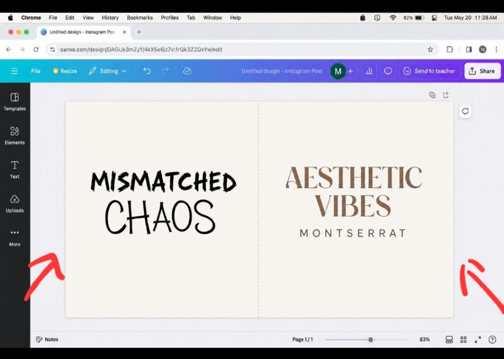
When you look at the comparison above, it becomes obvious why so many automated templates fail the vibe test. The mistake I made on the left isn’t that the individual fonts are ugly, it is that they are both shouting for attention at the exact same decibel. It feels disjointed, messy, and hard for the human eye to process in a split second.
The right side fixes this by creating a clear typographic hierarchy. By pairing the organic geometry of Tan Headline with the clean, wide stance of Montserrat, you give the canvas breathing room. One font is the star, and the other is the stage manager. This deliberate contrast is the exact trick boutique agencies use to make digital assets look incredibly premium without looking overdesigned.
- The Luxury Magazine Look: Tan Headline + Montserrat
If you want your graphics to look like they belong in a high-end architectural digest or a sleek fashion editorial, this is your holy grail combination.
Why This Pair Works
Tan Headline is a gorgeous, high-contrast serif font packed with unique ligatures and retro curves. Because it has so much personality, it needs a partner that knows how to step back and let it shine. Montserrat is an incredibly clean, geometric sans-serif that acts as the perfect anchor.
When you use this combination, you are telling your audience that you care about the finer details. It feels incredibly intentional. Use Tan Headline for short, punchy 3-word titles, and keep Montserrat in all caps with wide letter spacing for the subheadings to give the layout room to breathe.
- The Cozy Indie Boutique: Solis + League Spartan
There is a huge trend on social media right now moving away from cold, sterile minimalism and embracing warm, organic textures. This pairing captures that exact mood.
Why This Pair Works
Solis has a beautiful, retro-modern rhythm that looks incredibly human and soft. When you back it up with League Spartan, a heavy, bold, authoritative sans-serif, it creates an instant visual hierarchy that grabs your attention without feeling loud or obnoxious.
Don’t just center these blocks neatly on a white background. To break the predictable template look, try offsetting them. Let a bold League Spartan subtitle sit slightly behind or overlapping a larger, soft Solis title phrase on an earthy tone canvas. It breaks the grid lines that make automated graphics look so synthetic.
- The Minimalist Corporate Rebel: Horizon + Oyster
This is for the brands that want to look professional but refuse to look boring. It is sharp, clean, and highly sophisticated.
Why This Pair Works
Horizon is an ultra-wide, heavy sans-serif that screams modern tech and forward-thinking design. Pairing it with Oyster, an elegant and slender editorial serif, creates a striking contrast between raw power and delicate grace.
Think of this pair like wearing a tailored, structured blazer over a silk slip dress. The textures contrast wildly, but the overall silhouette is incredibly cohesive and striking. Use Horizon for major announcements or data highlights, and use Oyster to tell the story underneath.
- The Vintage Editorial Nostalgia: Seasons + Glacial Indifference
Retro aesthetics are not going away anytime soon, but the secret to making retro look modern is keeping your body text perfectly clean.
Why This Pair Works
The Seasons is a timeless serif font with stunning, expressive curves that feel like a vintage European postcard. Glacial Indifference is a completely neutral, understated sans-serif that balances out the nostalgia with a modern, clean-cut edge.
Learn From My Own Mistake
Never use a vintage serif like The Seasons for long blocks of text. It causes immense eye strain for the reader. Keep it strictly for your main title words, and let the simplicity of Glacial Indifference handle the heavy lifting for your descriptions.
- The Bold Gen-Z Maverick: Anton + Tenor Sans
If your target audience values high energy, bold statements, and direct communication, you need a pairing that cuts right through the digital noise.
Why This Pair Works
Anton is a massive, compact display font that takes up a ton of visual weight on a screen. Tenor Sans is an open, incredibly legible sans-serif with a slightly wider stance that softens the heavy blow of the headline.
My Hot Take
The common design opinion says you should always pair a heavy font with a delicate serif. I think that rule is outdated. Pairing two sans-serif fonts with entirely different weights and tracking profiles creates a much cleaner, more cohesive modern tech aesthetic than trying to force an old-school serif into a contemporary layout.
If you want to see these exact typographic vibes mapped out in real-time, this breakdown by a fellow designer shows on YouTube exactly how to balance different font weights on a canvas.
They perfectly map out how to balance different font weights on a digital canvas, showing you exactly how these styles respond to varying layouts. It serves as the perfect companion video to the five pairings we just covered.
Frequently Asked Questions (what most of my readers ask me)
How many different fonts should I use in one design? Never use more than two different font families in a single project. Using three or more creates instant visual chaos and makes your graphic look messy, unstructured, and unprofessional.
Can I use these combinations for long-form PDF documents? Yes, but ensure you use the lighter sans-serif options (like Montserrat or Glacial Indifference) for the long body paragraphs. The heavy display fonts should be kept strictly for section titles and main chapter headers.
Why does my text look different when I download it as a PDF? Make sure you are selecting PDF Print instead of PDF Standard inside the download settings. This ensures the design platform flattens the vector typography shapes properly without shifting your tracking or letter spacing.
The Ultimate Typography Takeaway
At the end of the day, your typography choices dictate how people read your words. If your text layout feels chaotic, your message gets completely lost in translation.
[Choose Star Font] --> [Identify Style: Vocal/Bold] --> [Pick Support Font: Quiet/Clean] --> [Increase Tracking 15%]The next time you open a blank canvas, step away from the generic template setups. Choose one vocal font that speaks to your brand identity, pair it with a clean, quiet supporter, and give your elements plenty of white space. Your designs will instantly feel more authentic, cohesive, and remarkably human.

Image by StartupStockPhotos from Pixabay
Sources and Citations
Detailed typography style pairing matrices available on the Canva Font Combination Guide.
Modern digital layout concepts via the Adobe Fonts Typography Principles database.
Visual contrast and hierarchy analysis found on the Interaction Design Foundation Typography Studies.

Udeichi Miracle Chinaza is a digital creator and graphic designer who specializes in creating clean, visual content. Passionate about making design accessible to everyone. I share practical Canva tutorials, layout tips, and creative shortcuts to help beginners and small businesses build stunning graphics with ease.