
The Design Trick I Wish Someone Told Me Months Ago
I was refreshing my feed the other night, casually sipping on a lukewarm cup of coffee, when it finally hit me: I Finally Figured Out How to Make Perfectly Curved Text in Canva. Before this realization, my relationship with the platform’s text bending tools was a toxic cycle of hope and frustration.
Every time I tried to make a circular layout, it ended up looking like a pile of magnetic poetry letters that got caught in a blender. The letters would bunch up at the top, or the spacing at the bottom would stretch out so far it looked like a glitch.

Image by StockSnap from Pixabay
But after a ridiculous amount of trial and error, squinting at my screen until 2 AM, I Finally Figured Out How to Make Perfectly Curved Text in Canva, and I am going to save you from making the exact same mistakes I did. Read other related articles here.
The Illusion of the One-Click Fix
We have all been lied to by software marketing. The platform promises you that you can just hit a button, drag a slider, and boom, you are a graphic design prodigy. When you click on your text box, hit the Effects tab, scroll past the drop shadows, and click Curve, it feels like magic for about two seconds.
Then you see it. If your phrase is too long, the letters smash into each other like commuters on a crowded subway train. If it is too short, it looks like a sad little frown. The fundamental flaw is that the basic tool treats every typeface the exact same way, completely ignoring font weight, tracking, and optical alignment.
It turns out that getting a professional look isn’t about the tool itself. It is about understanding how to trick the system into balanced spacing. If you just slap the default setting onto your text and call it a day, your graphic is going to scream “amateur template” from a mile away.
My Personal Experience: The T-Shirt Catastrophe
Let me tell you about the absolute mess I made last year. I was designing some merchandise for a local community market. I wanted a classic varsity vibe: an outer circle of text that read “Locally Grown, Environmentally Minded” wrapped around a little leaf graphic.
I typed the whole sentence into a single text box, cranked the slider to a positive value, and watched in horror as the words turned into an unreadable spiral of doom. The letters on the outer edge were stretching into parallel universes while the inner letters collapsed into a black hole.
I spent an hour manually typing spaces between letters, trying to eyeball the symmetry. When I printed a test sample on a basic cotton tee, the text looked completely crooked. One side looked heavier than the other because the word “Environmentally” took up twice as much real estate as “Locally.” I was so embarrassed that I ended up scrapping the entire layout and going with a boring, flat rectangle.
That failure broke something inside me. I refused to let a browser-based app win. I spent the next three days dissecting how the software actually handles text paths, and that is when the real secret revealed itself.
My experiment screenshot: The agonizing reality of the single-box curve setting (left) vs. the beautifully spaced, multi-layer victory using the two-box method (right)
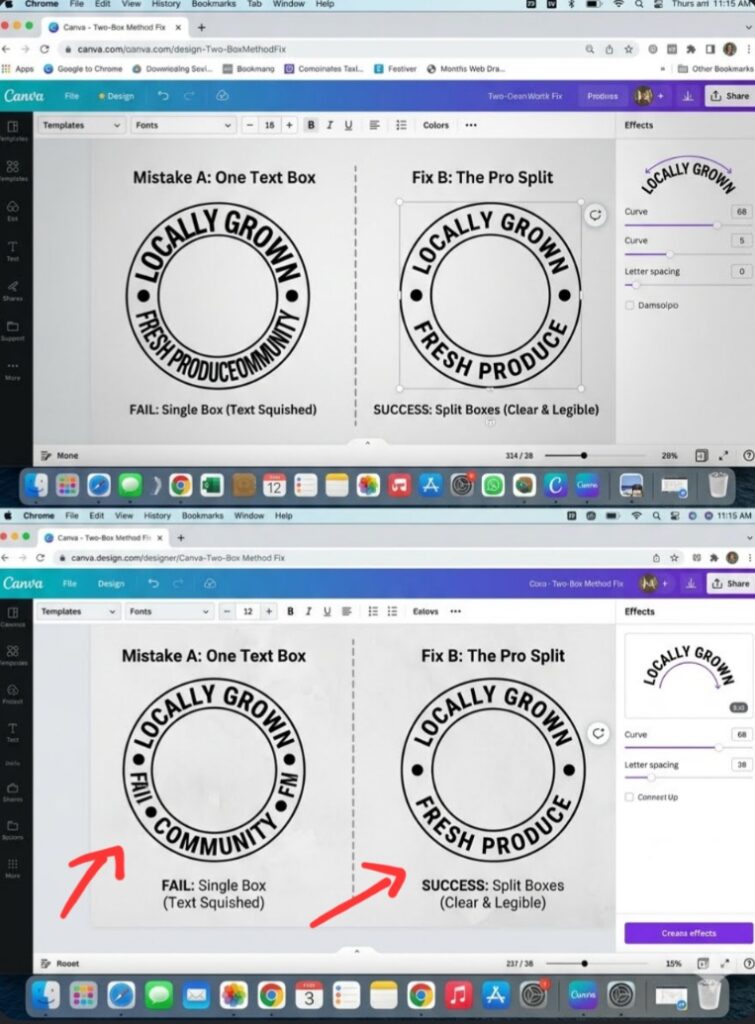
Looking at the split comparison above, the difference isn’t just about text placement, it is entirely psychological. On the left side, your brain instantly flags the graphic as cheap, clunky, and rushed. That is because the default slider warps the actual geometry of the individual characters, crushing the bottom vowels until they look like an accidental ink blotch.
On the right side, the text feels expensive. It breathes. By forcing myself to abandon the convenience of a single text layer and embracing a manual two-box system, I regain absolute control over the tracking. It is a subtle visual trick that mimics high-end typography software, making my audience subconsciously trust my brand before they even read a single word of my copy.
The Golden Rules of Flawless Curving
If you want your graphics to look sleek, expensive, and professional, you have to throw away the notion that one text box can do it all. Here is the actual blueprint to make your typography look like it was handcrafted by a luxury agency.
- The Two-Box Rule for Full Circles
Stop trying to force a long sentence to wrap all the way around a circle in one go. It never works because the app calculates the radius based on the total line length. Instead, split your thoughts into two separate elements.
Box One (The Top Arch): Type the first half of your phrase. Go to Effects > Curve, and slide it to the right (positive value, usually around +50 to +90).
Box Two (The Bottom Arch): Type the second half. Apply the exact same numerical value, but make it negative (e.g., -50 to -90) so it arches upward like a smile.
- Spacing is Your Ultimate Weapon
When you bend a line of type, the tops of the letters naturally spread apart while the bases get squeezed together. To fix this optical illusion, you must use the Letter Spacing tool (also known as tracking). As a rule of thumb, whenever you apply a curve, immediately increase your letter spacing by at least 10% to 20%. This gives the characters breathing room and stops them from looking like an accidental blob.
- Font Selection is Make-or-Break
Some fonts are absolute divas when you try to bend them. High-contrast serif fonts with dramatic thick-and-thin lines look incredibly awkward when warped. Heavy, geometric sans-serif fonts (like League Spartan, Montserrat, or Anton) hold their structural integrity beautifully under pressure. If you absolutely must use a vintage script, keep the arch incredibly subtle, otherwise the cursive connectors will disconnect and look totally broken.
Breaking the AI Design Monotony
Let’s be completely honest for a moment. The internet is drowning in identical, lifeless graphics because everyone uses the same raw templates without tweaking them. If you want to rank on Google or get people to actually stop scrolling on social media, your layouts need a bit of human touch, even a little bit of design madness.
Don’t just make a clean circle because a tutorial told you to. Make it hug an image. One of my favorite tricks is to take an element, like an absolute silhouette of a person or a botanical asset, and use multiple text layers to contour the actual shape of the object.
The Advanced Warp Alternative: TypeCraft
If you are still struggling with the basic effects panel, you are sleeping on the best secret weapon inside the platform: an integrated app called TypeCraft.
Instead of a basic round trajectory, TypeCraft gives you literal editing nodes. You can drag the corners, pull the center up, twist the edges, and mold your phrases into weird waves, banners, or melting psychedelic shapes. It feels much closer to professional vector software, and it completely breaks the predictable geometric patterns that make generic graphics look so sterile.
Frequently Asked Questions
Why does my curved text look blurry when I export it? This usually happens if you scale the asset down too much before exporting, or if you are using a complex font style on a low-resolution canvas. Always design on a canvas that is twice the size you actually need, and export as a high-quality PNG to keep those vector edges crisp.
Can I curve text on the mobile app? Yes, absolutely! Select your text layer, tap the Effects icon on the bottom menu bar, scroll over to Shape, select Curve, and adjust the intensity slider with your thumb. It is a bit more finicky than using a mouse, but the underlying engine is exactly the same.
How do I make an S-shaped wave with my text? To make an S-curve, you need two separate text blocks. Give the first block a positive value (bending up) and the second block an identical negative value (bending down). Then, manually align the end of the first box with the start of the second box to create a seamless wave.
The Lesson I Won’t Forget
The biggest lesson I learned from my long, agonizing journey into typography alignment is that good design is entirely about patience, not automated magic. The software gives you the framework, but your eyes have to finish the job.
[Effects Panel] --> [Shape: Curve] --> [Adjust Slider] --> [Open Spacing Tool] --> [Fix Tracking]Next time you are working on a project and find yourself screaming at your monitor because your letters look lopsided, take a deep breath. Step back from the screen. Split your phrasing into separate boxes, crank up that letter spacing, and use a geometric font that can handle the stress. Your graphics will look cleaner, your brand will look more authentic, and you will completely bypass that generic template look that everyone else is settling for.
Go open your current draft right now and try it out. Trust me, once you see the difference a few manual adjustments make, you will never look at a standard text layer the same way again.
Image by Tobias Albers-Heinemann from Pixabay
Sources and Citations
Official feature guidelines on utilizing the built-in Canva Curved Text Generator to warp and bend lettering paths.
Step-by-step layout strategies via the Skillshare Typography Blog for text alignment and using the circle radius preview marker.
Advanced manipulation workflows detailed in the Canva Help Center for TypeCraft app integration.
Udeichi Miracle Chinaza is a digital creator and graphic designer who specializes in creating clean, visual content. Passionate about making design accessible to everyone. I share practical Canva tutorials, layout tips, and creative shortcuts to help beginners and small businesses build stunning graphics with ease.