
If you want to know how to fix messy, chaotic layouts and finally create clean, cohesive designs, mastering the 60-30-10 color rule is the absolute fastest shortcut you can take. To put it simply, this classic design principle dictates that you should use a dominant color for 60% of your asset, a secondary color for 30%, and a sharp accent color for the remaining 10%. When you apply this specific mathematical balance directly to your Canva palettes, you immediately stop guessing which shades go where, your visual hierarchy falls into place naturally, and your graphics stop looking like a cheap amateur DIY project. It gives the human eye a clear path to follow, which is exactly why top-tier creators use it to keep readers hooked instead of letting them bounce out of sheer visual fatigue.

I was refreshing my shared team feed late last night, reviewing a draft link a client sent over, and I swear my eyes started watering. It was supposed to be a simple promotional flyer, but they had used about five different shades of neon pink, a random muddy green, and thick yellow text boxes all fighting for my soul. It looked like a digital clown suit. They left a comment saying, “I think it just needs to pop a little more, can we add some orange?” I sat back in my chair, rubbed my forehead, and realized for the millionth time that most people do not actually have a color problem; they have a proportion problem. They find a beautiful combination of shades on a random generator, copy the hex codes into Canva, and then spray them all over the canvas like confetti without any sense of restraint.
How I almost lost my sanity over a neon flyer design
Let me tell you about my personal experience with this because I was not always a color minimalist. What I passed through during my early days of trying to build a clean portfolio was a total lesson in design humility. I used to think that if a color palette looked amazing on a blank swatch card, it would automatically look brilliant on a finished template. I would create these complex five-color branding kits in the editor, feel incredibly proud of myself, and then try to build a landing page or a social media carousel.
The result? Total disaster. I would use the primary color for the background, the secondary color for the big headings, a third color for the body text, and then use the remaining two colors for different buttons because I wanted it to look creative. It felt messy, hard to read, and totally unpolished. It was only when I stripped everything back and forced myself to stick rigidly to the 60-30-10 color rule that my templates started looking like they belonged to a high-end agency.
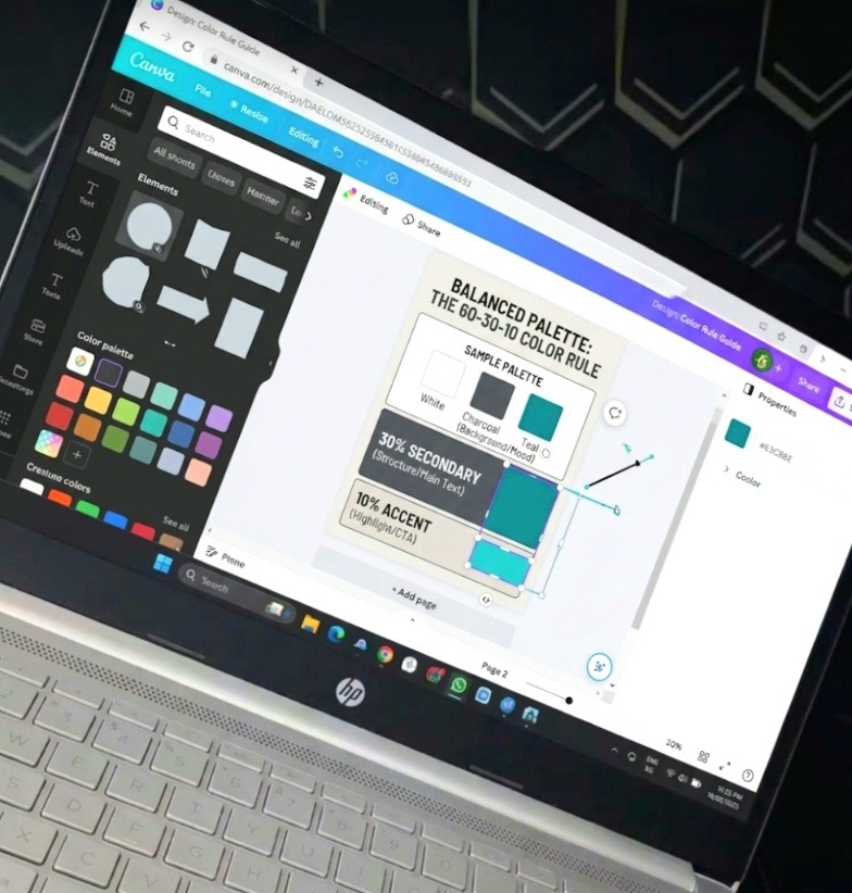
The breakthrough came when I realized that colors need a strict layout hierarchy to function properly. Think about a classic, clean website or blog layout as a real-world analogy: you might have a crisp white background taking up roughly 60% of the visual space, a deep black or charcoal gray used for 30% of the structure and body text, and a sharp, vibrant blue saved exclusively for the remaining 10% on the primary call-to-action buttons. It is clean, it is effortless, and it does not make your brain work overtime to figure out what matters most.
Breaking down the math without making your head hurt
Let’s break down exactly what these percentages mean when you are staring at a blank canvas in Canva, because you do not need to pull out a calculator to get this right.
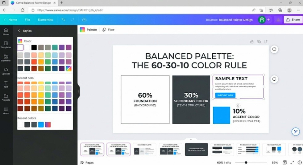
The 60% is your foundation. This is almost always going to be your background color. It sets the overall mood, tone, and atmosphere of the entire piece. If you are designing a clean corporate report, this will likely be white, light cream, or a very muted gray. If you are going for a moody, high-end aesthetic, it could be a dark charcoal or deep navy. The biggest mistake you can make here is picking a super saturated, high-vibrancy color for your 60% foundation. If your background is a piercing neon yellow, you are going to blind your reader before they even read the headline. Keep the foundation calm and spacious.
Next, you have your 30% element, which is your structural secondary color. This does the heavy lifting for readability and form. In a standard layout, this color goes to your main body text, your subheadings, your card backgrounds, or structural borders. It needs to have a massive amount of contrast against your 60% background. If your background is white, your 30% should be something dark and legible like a deep black or navy. If you are using Canva to build out brand assets, you can easily check your contrast ratios using the open-source tools at the WebAIM Contrast Checker to ensure your text meets accessibility standards before you hit publish or you use the dedicated tools I made for my readers here.
Finally, the secret sauce is the 10% accent color. This is your focal point, your spotlight, your loud megaphone. Because it only takes up a tiny sliver of the overall design, it can be as loud, bright, and daring as you want. This is where that vivid blue, electric gold, or hot coral belongs. You use this strictly for the things you want people to click, look at first, or remember. A button, a tiny underline beneath a crucial statistic, or a single keyword inside a massive headline.
The mistake I won’t make again with accent colors
If you start using your 10% accent color on everything, it completely ceases to be an accent color. It just becomes background noise. I used to fall into this trap constantly where I would think, “Well, if this bright blue button looks great, let me make the headers blue too, and maybe the bullet points blue!”
Suddenly, the blue was taking up 35% of the page, the secondary color was squeezed out, and the entire visual balance was ruined. When everything screams for attention, nothing gets heard. You have to be incredibly disciplined with that final ten percent. Treat it like a expensive spice in a meal; a little bit makes the dish incredible, but if you dump the whole bottle in, it becomes completely inedible.
The step-by-step trick I use inside the Canva editor
When you are ready to implement this, do not just eyeball it blindly across twenty different slides. You can use built-in features to force yourself to stay accurate. First, open up your Brand Kit settings. Instead of adding a chaotic list of ten random colors, restrict your main palette selection to just three specific slots that align with the 60-30-10 color rule. Label them in your mind: Foundation, Structure, Accent.
When you start drafting a new template, immediately paint every single background with your foundation color first. Once your 60% canvas is established, select all your text elements, paragraph blocks, and framing shapes, and instantly turn them into your 30% structural color. At this stage, your design should look completely readable, highly functional, but maybe a little bit plain. That is perfectly fine.
Now, go through the document like a strategic editor and apply your 10% accent color only to the absolute highest-value elements. If you are looking for a flawless way to pick these complementary pairings without making a mess, I always recommend playing around with the interactive engine on the official Canva Color Wheel Tool to find exact complementary or monochromatic hex codes that guarantee a smooth look. It takes all the guesswork out of finding that perfect accent shade that will pop beautifully against your structural choices.
Why standard color generators are actually lying to you
Here is my absolute hot take on this topic, and it might upset a few people who love scrolling through aesthetic design mood boards. Those automated palette generator websites that give you five perfectly matched swatches in a neat little row are actually ruining your design instincts. They lie to you by omission. They show you five colors side-by-side in equal-sized vertical rectangles, making your human brain think that those colors should be used in equal amounts on your canvas.
They do not show you the visual weight or the proportional scaling required to make those colors actually work in a real layout. A palette that looks breathtaking as five flat squares on a minimalist generator site will almost always turn into an unreadable nightmare if you try to apply them evenly across a social media carousel. You cannot treat color selection like a democracy where every shade gets an equal vote. It has to be a strict hierarchy, an absolute dictatorship run by your foundation color, supported by your structure, with your accent acting as the rare crown jewel.
You can use my own Canva Color Palette Generator tool for free.
Breaking the generic pattern with raw design instinct
If you follow generic tutorial advice, they will tell you to just choose a pre-made template from the library and hit the shuffle button under the styles tab until it looks okay. Honestly, that is the fastest way to get a generic, soulless graphic that looks exactly like every other low-effort account on the internet. The automated shuffle tool doesn’t understand the nuance of human emotion or strategic focus. It doesn’t know that you want the reader’s eye to land on the price tag or the register button; it just randomly swaps elements based on code algorithms.
You have to break out of that lazy loop. Take control of the color picker manually. If your layout feels flat or boring, do not add a fourth or fifth color to fix it. Instead, play with the tone or shade of your existing 30% structure color. You can drop its transparency or select a slightly lighter tint of that exact same hue to create depth without introducing a brand new color element that disrupts the 60-30-10 color rule. It keeps your design incredibly cohesive while giving you the subtle variations you need to separate different types of information.
The burning questions you are probably whispering to your screen right now
Can I use white and black as my 60% and 30% colors, or is that too boring?
It is not boring at all; it is actually the gold standard of high-end, modern design. Using white for 60% and a deep charcoal or black for 30% gives you the cleanest canvas possible. It makes your 10% accent color look remarkably powerful. Think of some of the most iconic luxury brands in the world, their layouts are almost exclusively monochrome with one single, devastatingly effective accent color.
What happens if I need to include real-world photos in my Canva design?
This is a brilliant question that trips a lot of people up. When you drop a photograph into a template, that photo introduces its own set of colors to the page. To keep the 60-30-10 color rule intact, try to use photos that naturally match your accent color, or pull your 10% accent shade directly out of a key element within the image using Canva’s built-in eye-dropper tool. This unifies the photo with the rest of your graphic seamlessly.
Can I swap the rule around and use a dark color for the 60% background?
Absolutely. This is called a dark-mode layout. Your 60% becomes a dark slate, navy, or black, your 30% structure becomes a crisp white or light gray text for legibility, and your 10% remains a high-contrast accent. Just make sure your text stays easy on the eyes so your audience doesn’t strain while reading.
Keeping your palette locked down for the long haul
At the end of the day, your design success comes down to consistency and restraint. Once you find a specific combination that works for you, protect it fiercely. Do not change your accent color every single week just because you get bored looking at your own templates. Remember, your audience is seeing your graphics for a fraction of a second in a fast-moving feed; they need that repetitive, predictable color structure to instantly recognize your content without reading your username.
Sticking to the 60-30-10 color rule inside your Canva workflow will completely transform the way you create assets. It takes away the morning anxiety of staring at a blank screen wondering why your design looks off, and replaces it with a simple, reliable system that delivers balanced, gorgeous layouts every single time. Trust the system, keep your accent colors rare, and watch how much cleaner your brand identity becomes.

Udeichi Miracle Chinaza is a digital creator and graphic designer who specializes in creating clean, visual content. Passionate about making design accessible to everyone. I share practical Canva tutorials, layout tips, and creative shortcuts to help beginners and small businesses build stunning graphics with ease.