
Premium Print Listing Property Template Guidelines Inside Chrome Browser Canva
I had to watch three wealthy prospective buyers walk right out of my luxury listing event because our marketing pamphlets looked like a messy garage sale announcement. I was standing near the pristine marble kitchen island of a gorgeous new suburban property, straightening my tie and adjusting the catering platters before the guests arrived. I had spent thousands setting up live acoustic music, premium staging furniture, and artisanal refreshments to make the property feel like an elite multi-million dollar experience. Everything felt completely flawless until the first local couple walked up to the reception greeting table and picked up our printed marketing hand-outs.
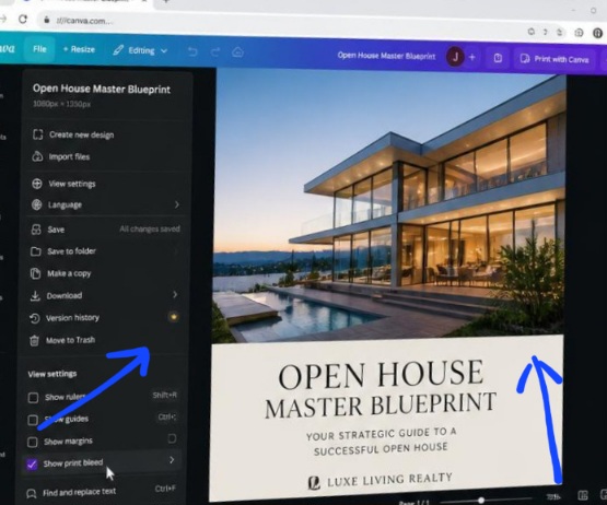
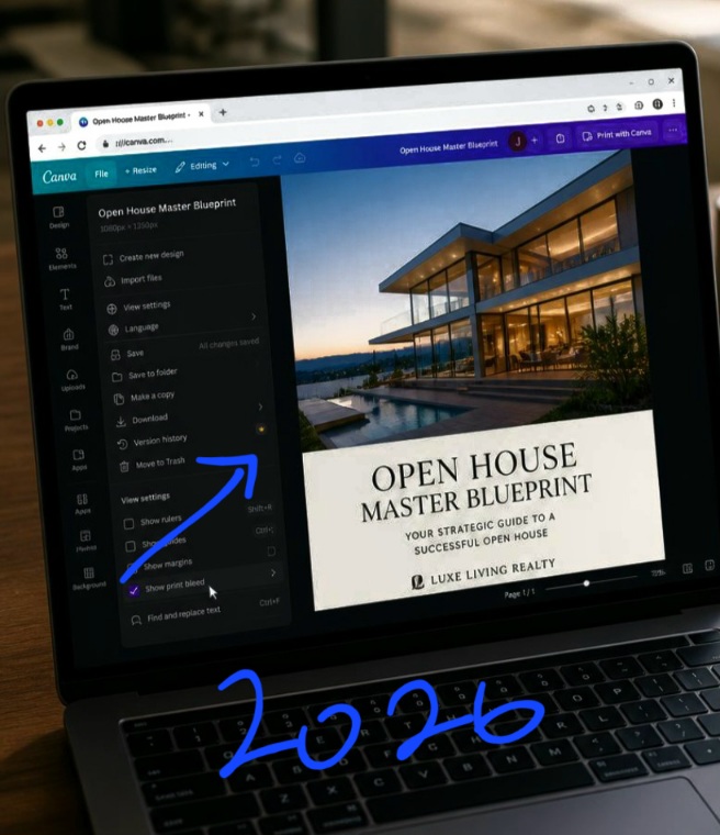
Activating print bleed safety parameters and layout grid lines inside the Canva browser window workspace before executing high-res document exports.
The look of immediate visual disgust on the woman’s face made my chest tighten up instantly. I looked down at the sheets with fresh, objective eyes and realized I had committed a massive design crime. I had rushed through the layout process the night before, cramming six blurry smartphone images into a tight grid, surrounding the borders with screaming neon red arrows, and printing everything out in a basic, unstyled word-processor typeface. It looked cheap, messy, and totally unpolished.
It completely ruined the luxurious, high-end atmosphere of the physical room. That embarrassing open house disaster forced me to delete my generic templates and map out the core blueprint behind how to design a real estate open house flyer on Canva.
If you are still trying to promote your premier listings by dragging random photos into crowded grid layouts, you are actively scaring away your highest-paying client targets. A messy, chaotic marketing sheet signals to the market that the property hiding behind the frame is poorly constructed and overvalued. Let’s talk about how to protect your listings and learn exactly how to design a real estate open house flyer on Canva directly inside your Chrome browser canvas so your print materials command immediate market authority. Also Read previous article on How I Create a Moody, Modern Dark-Mode Look in Canva.
The Text-Heavy Brochure Trenches
There is this huge document formatting struggle I had to overcome before my open house events started breaking local sales records. When I first started consulting for regional brokerage groups, I was completely delusional about real estate presentation physics. I assumed that a successful printed marketing sheet needed to hold every single piece of data possible, the school zones, the roof history, the appliance serial numbers, and a massive corporate logo block.
I designed a marketing campaign for a beautiful modern farmhouse estate. I forced myself to write a literal five-paragraph narrative history essay right across the front page, squeezing the text boxes tightly between four small, compressed thumbnail images.
When the local agents started handing the flyers out at the front door, I noticed a painful trend. Guests would glance at the page for exactly two seconds, fold the paper in half, and drop it straight into the trash bin by the entry walkway. Nobody was reading the walls of text. My data-heavy layout had created a massive wall of cognitive exhaustion that completely killed the natural excitement of the tour.
That humbling feedback taught me that print real estate marketing is about visual curation, not informational dumping. A flyer should function as a high-impact trailer that makes the buyer hungry to explore the house, not an owner’s manual that bores them to tears before they even see the backyard.
The 3-Step Clean Spatial Setup Sequence
Let’s skip the basic introductory filler and look at the exact interface configuration steps that establish instant luxury texture across your print canvas properties. To build a physical marketing sheet that feels premium to the touch, you must stop utilizing standard collage defaults and enforce a rigid spatial grid.
The human eye requires a single clear focal point to process a physical page layout comfortably. If your document is crowded with ten small overlapping frames, the brain can’t find an anchor.
To solve this, let your absolute best exterior or front entryway photograph consume exactly the top seventy percent of your page canvas. Next, drop a solid background container block across the remaining bottom thirty percent of the file sheet, changing its color properties to a soft, sophisticated off-white or premium light beige tint like #F4F4F4.
Inside this clean baseline strip, place your elegant primary typography layers detailing the event address and clear, bold date times. This clean division allows your property’s architectural scale to look incredibly expansive, while keeping your logistical details beautifully legible at a quick glance.
Agent Headshots (my opinion)
Many traditional real estate marketing coaches insist that your personal profile headshot photo must be the largest, most prominent element on your listing flyer to build personal connection. That advice is an absolute trap that instantly makes your marketing look cheap, dated, and incredibly self-centered to modern affluent home buyers.
Placing a giant, heavily edited studio cutout portrait of yourself right over the front yard or the main master suite graphic creates massive visual noise and signals to the market that you care more about self-promotion than the actual property quality.
To break past that outdated pattern and master how to design a real estate open house flyer on Canva, you must relegate your personal branding to a quiet, supportive role. Shrink your profile headshot down to a clean, small circular frame asset, and position it discreetly in the lower right-hand corner of the page baseline alongside your licensing number credentials. Let the home’s interior design assets do the emotional talking for your brand. When you respect the visual real estate of the home, high-end buyers respect your professional authority.
Verifying layout contrast scales and print bleed bounds inside Chrome to protect printed listing flyers from edge clipping errors.
Enforcing Natural Contrast Boundaries for Critical Listing Specs
While the software provides excellent automated layout alignment bars, you must act as the final editorial authority to ensure your text specifications stand out with absolute clarity against the printed paper backing.
- Never use thin, tiny paragraph text to list out your core property characteristics. You must establish bold, geometric structural columns for your spec numbers:
- Go to your elements sidebar column panel, select three clean, identical thin line shapes, and space them vertically to create a neat three-column specification bar grid.
- Center a bold, uppercase sans-serif numeral row representing your core specs (e.g., 5 BEDROOMS | 4 BATHROOMS | 4,800 SQFT) directly within those column lines.
- Keep the line-weight of the text character strokes medium or bold to ensure the ink doesn’t bleed or blur together during mass commercial print runs.
This structural balancing block takes less than two seconds to organize inside your position properties matrix, but it guarantees that high-intent buyers can instantly extract the physical dimensions of the listing without squinting their eyes at the page.
Fatal Print Layout Mistakes to Eliminate
Using a pure white canvas background behind dark interior images: Framing dark, atmospheric interior photography using a harsh, blinding pure white page background causes immediate visual contrast shock. Soften your print materials by matching your background text block panels to a deep, muted charcoal or elegant slate gray to match the photography temperature.
Forgetting to configure the print bleed safety margin layers: If your primary listing photos sit exactly on the raw edge of your canvas grid, the industrial paper cutters at the print shop will accidentally chop off your edges, leaving a sloppy white border artifact around your flyer. Always activate the “Show Print Bleed” safety lines in your file view properties before finalizing your asset positioning.
Overlaying colorful body text blocks across busy granite textures: Typing out address details directly over a high-texture photo asset (like a close-up of a kitchen marble island or pool tile) makes the characters dissolve completely into the background pattern. Always back your typography blocks with a solid, opaque container shape to protect line legibility.
Watch this video from this YouTube creator to understand more on this
Frequently Asked Questions
What is the best file format to use when exporting this flyer for high-res print shops?
Never export your printed real estate marketing sheets using standard JPEG or PNG photo settings. Click the main Share button in your Chrome options bar, open the Download options dropdown menu, and select PDF Print. Ensure you check the system activation boxes for “Crop marks and bleed” to guarantee a flawless, crisp high-resolution print output.
How do I maintain visual layout consistency across a multi-agent team office?
Once you construct an immaculate, minimal real estate open house framework template inside your browser workspace, go to your share panel and select the Template Link generation option. This locks your structural grid layout settings securely, allowing your team members to drop in fresh property photos without messing up the brand margins.
Can I include a live interactive link mechanism onto a physical printed piece of paper?
Absolutely. Go to your left-hand elements menu panel and search for the native QR Code generation application. Paste your property landing page URL address into the input field, and the system algorithm will instantly generate a clean vector barcode image grid that you can place into your footer column so buyers can scan the page with their phones.
Curation Over Clutter
Understanding how to design a real estate open house flyer on Canva is about moving past the frantic, cluttered advertising habits of low-tier markets and stepping into the confident restraint of luxury editorial presentation design. Your professional credibility inside your local market depends entirely on how thoughtfully you treat your visual property assets.
When you anchor your listing print documents using large monolithic hero photos, deep negative space borders, and clean geometric spec matrices, your marketing sheets instantly stand out from the sea of noisy discount flyers cluttering the neighborhood mailboxes.
Open up your most complex real estate project folders inside your digital asset library dashboard today. Launch your canvas positioning panels, strip away the noisy starburst stickers and giant text essays, lock in these clean, architectural grid systems, and transform your flat promotional printouts into an expensive, highly authoritative property portfolio asset that commands immediate market respect.
Sources and Citations
Canva Design School User Manual on commercial print real estate advertising assets: Canva Design School: Real Estate Brochure and Flyer Layout Frameworks.
Adobe Creative Studio documentation on print design formatting rules and bleed safety setups: Adobe Learn: Understanding Document Margins and Bleed Specs for Print Media.
National Association of Realtors research analytics on presentation impact metrics: NAR Research: The Visual Presentation Influence on Luxury Buyer Conversions.

Udeichi Miracle Chinaza is a digital creator and graphic designer who specializes in creating clean, visual content. Passionate about making design accessible to everyone. I share practical Canva tutorials, layout tips, and creative shortcuts to help beginners and small businesses build stunning graphics with ease.