
Configure High-End Obsidian Interface Display Grids Within Canva Web Browser Editor
I opened my brand’s main landing page graphic on an OLED display screen at night and the visual clash was so blinding it looked like a broken neon sign outside a cheap motel. I was lying in bed finishing up some final revisions on a major digital product launch asset kit, feeling incredibly proud of my design speed. My bedroom lights were completely turned off, and my eyes had adapted to the cozy nighttime environment. I exported the file, synced it over to my premium smartphone screen to run a quick live check, and tapped the image file open. My eyes literally started watering from the intense, aggressive visual glare.
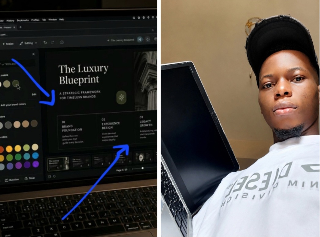
See details of when am configuring advanced monochromatic depth parameters and custom shadow values within my browser design system options.
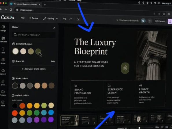
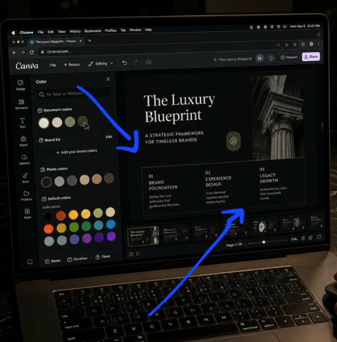
The composition layout shows us how separating soft charcoal base layers from muted metallic text rows completely removes visual glare from the viewer’s reading path. It serves as clean verification that successful modern art direction relies on using careful, code-driven shadow tiers rather than relying on harsh color extremes.
I had built what I thought was a sleek dark graphic, but it looked incredibly harsh, cheap, and completely unpolished. The background was an absolute pure pitch-black abyss, the primary title text blocks were styled in a blinding neon fluorescent green, and the accent boxes were a bright, saturated purple. It felt cold, clinical, and impossible to read for more than three seconds without experiencing immediate cognitive fatigue. That painful midnight reality check forced me to wipe my custom color palettes completely clean and figure out the exact geometric physics behind How I Create a Moody, Modern Dark-Mode Look in Canva.
If you are still building dark-mode digital assets by simply dropping a solid black color code block behind bright white letter shapes, you are destroying your brand’s luxury appeal. True premium dark design is not about turning off the lights on your canvas; it is a calculated study in ambient shadow depth, soft tonal contrast balancing, and subtle luminous text properties. Let’s talk about how to stop blinding your audience and master How I Create a Moody, Modern Dark-Mode Look in Canva directly inside your Chrome browser interface so your content carries an expensive, modern cinematic aesthetic. Also read How I Create Smooth, Animated Text for My Social Media Clips.
The Pitch-Black Pixel Desert
Let me peel back the curtain on the huge palette alignment struggle I had to overcome before my digital asset mockups started looking cohesive. When I first began experimenting with dark-mode presentation files for my site layout grids, I was completely delusional about digital screen color projection. I assumed that the darker the background tone was, the more modern and premium the layout would automatically feel to an active viewer.
I constructed an expansive 40-page digital manual for a high-ticket business masterclass. I set the background value of every single page template to a pure, deep mathematical zero-percent black. On top of that heavy base layer, I dropped fine, lightweight white serif fonts to handle my long-form paragraphs.
The moment the guide went live to my premium beta-testing list, the critical feedback came crashing into my inbox. Readers using standard tablets or laptops reported that the fine white letter lines were actively vibrating and bleeding into the dark background pixels whenever they scrolled down the text boxes.
The extreme, unyielding contrast gap was causing a massive visual blur effect that made the sentences completely unreadable. It was a humiliating lesson for me. Long-form screen publishing requires a deep understanding of ambient eye strain mechanics. A truly moody, premium graphic does not rely on stark contrast extremes; it uses soft, layered twilight shades to guide a reader’s focus effortlessly through the visual hierarchy.
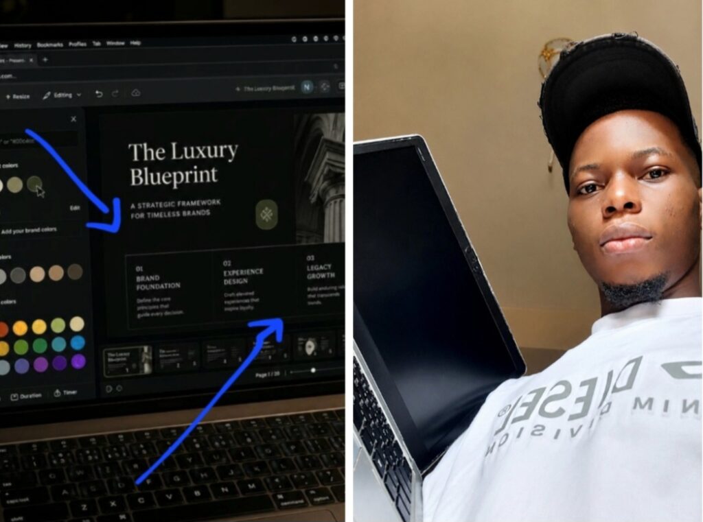
This is me analyzing custom shadow layer contrast ratios inside my Chrome to shield digital media assets from harsh pixel glare.
The 3-Step Tint Separation Layer Trick
Let’s skip the basic color wheel lectures and look at the exact configuration steps that establish instant luxury texture across your dark canvas setups. To build a document frame that looks sleek instead of flat, you must stop utilizing default interface swatches and start layering custom shadow mixtures.
Execute this exact background layering pattern within your system workspace right now:
[ Canvas Base Layer 🎴 ] -> Soft Charcoal Tint (#121212 or #1A1A1A) ⬇️ [ Visual Accent Cards 🗂️ ] -> Elevated Slate Mist (#1F1F1F or #252526) The human eye needs clear depth indicators to process information efficiently in low-light formats. If your background surface is completely flat, your layout text boxes lose their structural spatial context.
To solve this, click your base page sheet and replace pure black with an elegant, soft charcoal tint like #121212 or #1A1A1A. Next, go to your elements sidebar menu column panel, select a clean square container shape, and change its hue properties to a slightly lighter elevated slate tone like #1F1F1F. Place your secondary content text lines directly inside this lighter card box. This tiny color shift instantly creates a stunning, layered multi-dimensional depth grid effect that looks incredibly high-end and keeps your information perfectly organized.
My Unpopular View on White Text Layers
Many self-taught marketing template creators insist that pure white typography is an absolute requirement to guarantee legible text scaling on dark backgrounds. That design practice is a total trap that instantly destroys the premium, moody ambiance of your digital media.
Placing pure, unyielding white characters (#FFFFFF) over a soft dark surface causes immediate pixel bloom, making your letter shapes look fuzzy, uneven, and cheap to a modern audience.
To break past that lazy pattern and master How I Create a Moody, Modern Dark-Mode Look in Canva, you must force yourself to dim your text color settings. Style your primary display headers in a soft, premium warm ivory tint like #E4E4E4 or a sleek metallic silver like #D1D1D1. For your long-form body paragraphs, drop the value even lower into a muted, sophisticated ash gray like #A0A0A0. This subtle reduction in contrast eliminates screen glare entirely, stabilizes character edges during mobile screen scrolling, and wraps your content in a beautifully balanced, editorial atmosphere.
Balancing Accent Pops with Restrained Color Temperatures
The fastest way to ruin a sophisticated dark-mode framework layout is to spray a bunch of loud, high-saturation accent colors across the active screen page. If you throw neon pink arrows, electric blue lines, and bright yellow buttons together, your design instantly reverts back to looking like a chaotic arcade game window.
- Maintain strict emotional color temperature metrics across your vector asset choices:
- Select your primary brand call-to-action button or focus shape element on the page canvas.
- Open your custom color hex input box and choose a rich, desaturated jewel tone accent, such as a deep sage green, a smoky terracotta orange, or a muted plum purple.
- Keep your colorful accents limited to exactly one single active focal element per page view to preserve your luxury design margins.
By keeping your color highlights highly restrained, you make your primary links and key conversion targets stand out with absolute clarity against the quiet charcoal backdrop.
Watch this helpful video from another designer on YouTube to see the practical aspect.
Avoid This Fatal Dark Layout Errors
Using heavy dark drop shadows beneath text boxes: Applying a heavy black drop shadow filter onto typography that sits across an already dark surface creates a muddy, unreadable ink smudge look. Switch your text effects to a clean Lift filter with a light intensity setting to generate a crisp, glowing air-pocket separation boundary instead.
Leaving image background panels raw and unadjusted: Bright, vibrant, highly exposed white lifestyle photos look incredibly jarring when dropped directly onto an obsidian template page. Select your image frame properties, navigate to your adjustment dials, and slide the Brightness down by 10% while lifting the Contrast slightly to blend the art seamlessly with the dark mode aesthetic.
Ignoring ambient workspace light reflection contrast: If your typography strokes are too thin, they will completely dissolve under different screen glare conditions in real-world scenarios. Always double-check your font selections using bold or medium weight profiles to ensure your sentences remain entirely accessible to your platform audience.
Frequently Asked Questions
How do I find high-quality moody graphics inside the element search engine?
Open your left-hand elements navigation side menu panel and input descriptive keyword strings like “minimalist shadow,” “organic grain texture,” or “dark gradient mesh.” Filter the graphics search engine tab settings to display only premium-tier visual assets to maintain an expensive design texture.
Why do my custom dark mode swatches look different when exported to PDF?
This happens because certain display applications convert web-native RGB color profiles into flat printable CMYK values during rendering loops. Ensure your file export settings are set to PDF Standard for screen distribution, and use hex combinations that hold their values across both lighting environments.
Can I apply a global dark mode color transformation to an existing light template?
Absolutely. Open your project sidebar menu column panel and select the Styles tab. Look under your saved brand kits or the system curated palette categories for a deep monochromatic color row, and click it once to force the software algorithm to auto-swap your light layout properties for an obsidian profile in seconds.
Using How I Create a Moody, Modern Dark-Mode Look in Canva is all about moving past basic color switching habits and using calculated shadow depth rules to command high-level visual attention. Your digital brand authority depends completely on how thoughtfully you structure your asset themes across changing viewing environments. When you balance soft charcoal layering grids with muted metallic typography accents, your document assets instantly project a sense of high-end quality and professional sophistication.
Open up your most complex multi-page presentation folders inside your digital asset catalog. Launch your color positioning panels, strip away the blinding neon contrast blocks, lock in these balanced obsidian tint systems, and transform your flat graphic sheets into a beautifully structured, moody digital publication that your audience can comfortably consume for hours.
Sources and Citations
Canva Design School User Manual on palette generation and contrast accessibility lines: Canva Help: Choose and Customize Your Design Color Schemes.
Adobe Spectrum Design System documentation on dark mode luminance scaling and eye fatigue prevention: Adobe UI Design: Architectural Rules for Dark Interfaces.
W3C Web Accessibility compliance guidelines on contrast validation scales for low-light digital environments: W3C Standards: Text Readability and Contrast Metrics.

Udeichi Miracle Chinaza is a digital creator and graphic designer who specializes in creating clean, visual content. Passionate about making design accessible to everyone. I share practical Canva tutorials, layout tips, and creative shortcuts to help beginners and small businesses build stunning graphics with ease.