
The Social Media Trend And How I Got Over It
There is the trend of over-complicating social media design that drives me absolutely insane every time I open my phone. You know exactly what I am talking about, creators slapping neon gradients, chaotic collage cutouts, and three different decorative fonts all onto a single square graphic. I used to be that exact same creator, scrolling through Pinterest and wondering why my profile looked like a digital junk drawer instead of a high-end editorial page. I was refreshing my feed one night and realized my eyes were exhausted from the sheer visual noise. That was the exact moment I threw out my complex templates and committed to the 5 Minimalist Instagram Layouts I Use to Keep My Feed Clean to give my brand breathing room.
My side-by-side layout breakdown within the Canva design workspace comparing a chaotic, over-designed grid on the left against a clean, balanced minimalist framework on the right.
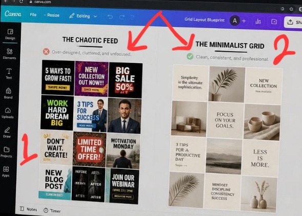
Take a close look at these two setups side by side, it makes glaringly obvious why modern profiles fail to convert casual browsers. The grid layout on the left is pure visual noise, every single square is fighting its neighbor for dominance, resulting in total chaos. On the right, the layout transforms instantly. By prioritizing natural white space and a structured 60-30-10 color allocation, the grid functions like an elite lookbook. It feels high-end, intentional, and expensive, proving that subtracting elements is the fastest way to add luxury to a brand.
The missing detail wasn’t a lack of color or personality. It was restraint. Once you understand how to strip away the clutter and let white space do the heavy lifting, your profile instantly goes from amateur to a high-end digital portfolio. ALSO read my previous article on How I Add Drop Shadows to Make Flat Text Stand Out When Using Canva.
The Brutal Truth About Why Your Current Grid Feels Chaotic
Let’s be completely honest for a second. The internet has a severe problem with visual desperation. We are told by endless marketing gurus that we need to scream louder to stand out in the algorithm. But when every single post on your grid is shouting for attention with heavy borders, massive text, and random stickers, nothing actually stands out. Your viewer’s brain takes one look at your profile, experiences instant decision fatigue, and clicks away.
I learned this lesson the hard way during my first year of serious content creation. My grid was a colorful disaster zone because I treated every single square like an isolated billboard. The moment I shifted to the strategy of using 5 Minimalist Instagram Layouts I Use to Keep My Feed Clean, my profile conversion rate changed dramatically. A clean layout acts like a premium art gallery. It tells the human eye exactly where to look first, making your content feel incredibly premium and effortless to digest.
- Layout 1: The Asymmetrical Alternator (My Go-To Anchor)
If you look up grid tutorials, they always tell you to do a strict checkerboard pattern of quote-photo-quote-photo. It is an absolute chore to maintain, and quite frankly, it looks incredibly dated. Instead, I use what I call the Asymmetrical Alternator.
Here is the basic mental model behind it:
[Row 1: Heavy Visual] ---> [Row 1: Minimal Text] ---> [Row 1: Empty Space/Detail] [Row 2: Minimal Text] ---> [Row 2: Empty Space] ---> [Row 2: Heavy Visual] [Row 3: Empty Space] ---> [Row 3: Heavy Visual] ---> [Row 3: Minimal Text] Instead of a rigid pattern, you simply ensure that two graphics with heavy text or busy backgrounds never sit directly next to or on top of each other. If you post a detailed lifestyle photo, your very next post should be a text block with a massive border of empty background space. This layout works because it tricks the eye into seeing balance without making your feed look like a boring math equation.
My Experience Wrecking My Brand Reputation
When I first decided to clean up my aesthetic, I went into what I call my “delusional minimalist phase.” I thought minimalism meant everything had to be a plain white square with tiny, unreadable black text. I stripped out all my brand personality, deleted my color palette, and made my feed look like an abandoned medical website.
What I passed through during that experimental phase taught me that true minimalism isn’t about hiding your message; it’s about removing the obstacles around it. Your audience shouldn’t have to squint to read your insights. The breakthrough came when I realized that using 5 Minimalist Instagram Layouts I Use to Keep My Feed Clean requires you to lean on deliberate contrast. True cleanliness is about keeping your elements few, but making those few elements highly impactful.
Reviewing spatial padding and typography margins on my laptop display to verify grid balance under realistic workspace lighting conditions.
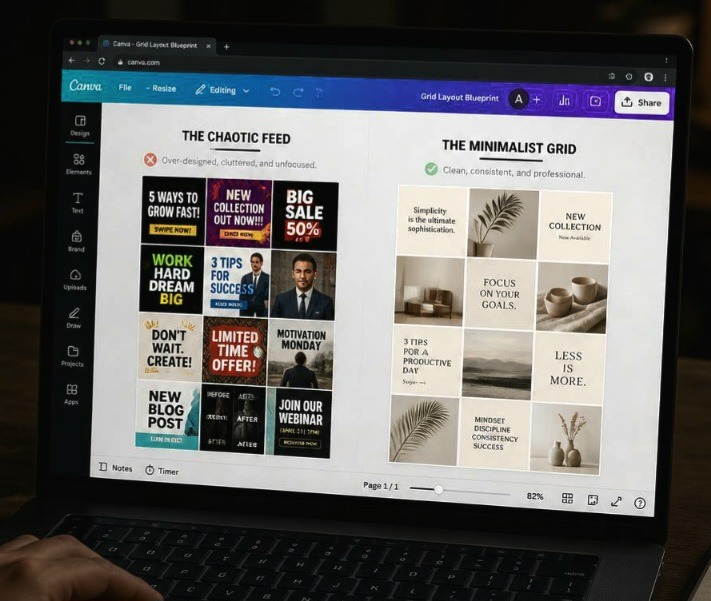
This my exact perspective is how we need to judge our work before it goes live. Notice how lowering the screen exposure brings out the subtle geometry of the layout frames, allowing the minimalist grids to look structured even from a sharp side angle on a physical monitor. In a real-world setting, a bad layout just looks like an accidental cluster of images on a user’s phone. A clean, structured layout like the one on the right canvas here creates an organized visual path that effortlessly guides a scrolling visitor right to your follow button.
- Layout 2: The Row-by-Row Storyteller
This is the ultimate layout for anyone who launches digital products or writes long-form content. Instead of thinking about your grid as individual squares, you treat every horizontal row of three blocks as a single chapter.
Left Square: The Hook (Bold header text, plenty of padding).
Middle Square: The Core Value (A clean screenshot, a simple diagram, or a lifestyle photo).
Right Square: The Conclusion/CTA (A minimal graphic directing them to your link).
The biggest mistake creators make with this layout is trying to make the three images connect seamlessly like a giant puzzle. Stop doing that. It looks awful when you post just one piece and it breaks your entire grid layout for days. Instead, make them match purely through a shared color background and identical typography margins. It keeps the rows cohesive without making your profile look broken during active posting days.
- Layout 3: The Vertical Anchor Line
If you are lazy but still want a flawless aesthetic, this is your holy grail. You dedicate the entire middle column of your Instagram grid to one specific style of post, usually a highly minimal text block with a solid, neutral background color.
The left and right columns are reserved for your spontaneous lifestyle images, behind-the-scenes moments, or detailed graphics. This creates a permanent vertical anchor down the center of your page that locks the eyes in place. No matter how messy or experimental your side columns get, that clean center line forces the entire profile to look curated and orderly at a glance.
- Layout 4: The 60-30-10 Spatial Rule Layout
Here is my absolute hot take on choosing colors for your grid, and it will probably upset the traditional branding experts who tell you to use five different brand colors in every post.
Stop trying to use your entire brand color palette in every single graphic. It creates a chaotic visual static that makes your feed look cheap.
Instead, apply the interior design rule of 60-30-10 across a rotating nine-square grid:
60% of your grid should be your primary neutral background color (like soft linen white, warm beige, or muted charcoal).
30% of your grid should feature your secondary brand tone through font color or muted imagery accents.
10% of your grid should be a deliberate, punchy pop color used exclusively for important callouts or hooks.
When you use this spatial ratio, your feed naturally breathes. The vast abundance of your neutral base color creates a calm, high-end environment that makes your accent colors pop with intense authority when a user scrolls through.
- Layout 5: The Frame and Shadow Blueprint
This layout brings everything we know about premium editorial magazines straight to your smartphone screen. Instead of running your images and text boxes directly to the very edge of the Instagram square, you intentionally scale down every design asset by 15% inside Canva.
This creates a permanent, built-in white border frame around every single post. Inside that frame, you apply a incredibly soft, low-opacity drop shadow behind your central asset layer. This layout technique makes your entire Instagram profile look like a physical gallery of floating prints. It creates a massive amount of artificial white space between your posts, ensuring that even if your individual images contain complex details, your overall grid architecture remains completely pristine and undisturbed.
The Overcrowded Coffee Table
To me, a messy Instagram grid is like a tiny coffee table stacked high with old magazines, three half-empty mugs, loose keys, and a tv remote. Even if the table itself is made of beautiful wood, the entire room feels stressful because there is nowhere for your eyes to rest.
Implementing the 5 Minimalist Instagram Layouts I Use to Keep My Feed Clean is the equivalent of clearing off that table, wiping it down, and placing a single, elegant ceramic vase right in the center. The vase stands out not because it is loud, but because the space around it gives it permission to be important. Give your content permission to be important by clearing out the visual junk.
If you are confused on how to use grid, this video from a fellow creator on YouTube might me helpful to you. Go ahead and watch it.
Frequently Asked Questions
Will a minimalist grid layout hurt my reach on the explore page? Not at all. The Instagram explore page evaluates individual posts based on watch time, saves, and shares. A clean, highly legible minimalist graphic actually performs better on the explore page because users can instantly read your hook without getting distracted by bad design, driving up your click-through and save metrics.
How do I maintain a clean grid if I need to post user-generated content? User-generated content can definitely threaten your aesthetic if the lighting or colors are chaotic. The trick is to never post raw consumer photos directly to your grid. Instead, place that content inside a carousel post behind a clean, minimalist cover graphic that fits your layout rules perfectly.
Should I archive my old, messy posts to start a clean layout? You absolutely do not need to delete your journey. If your old content still drives traffic or holds sentimental value, simply create a three-post transition row, three simple, solid-color graphics with a minimal text statement explaining your new brand direction. This acts as a beautiful visual divider separating your past style from your clean future.
Let’s End This Debate
At the end of the day, a chaotic feed is a sign of a brand that doesn’t know its own core message. When you rely on bright, flashing design tricks, you are hoping the noise will mask a lack of substance. Transitioning to the 5 Minimalist Instagram Layouts I Use to Keep My Feed Clean completely transformed how I show up online. It forced me to refine my writing, clarify my hooks, and trust that my value speaks louder than messy decorative graphics.
Stop cluttering your grid with templates that don’t serve your message. Pick one of these five layout frameworks, open your workspace, scale back the noise, and let your brand finally breathe. Your community will appreciate the clarity.
Sources and Citations
Editorial layout guidelines and grid theories directly from the Canva Design School Platform.
Psychological case study on visual clutter and digital consumer decision fatigue published by Interaction Design Foundation.
Expert breakdown on balancing white space in modern social media marketing layouts on Later Blog.

Udeichi Miracle Chinaza is a digital creator and graphic designer who specializes in creating clean, visual content. Passionate about making design accessible to everyone. I share practical Canva tutorials, layout tips, and creative shortcuts to help beginners and small businesses build stunning graphics with ease.