
The Day My Eyes Finally Opened to Boring Graphic Layouts
I was refreshing my feed the other day, just casually scrolling through a sea of marketing graphics, when I noticed something that made me physically wince. A business owner I follow had posted a promotion with bright yellow text slapped directly over a busy, textured image of a coffee shop. It was unreadable. My eyes were straining just trying to decipher what the discount code was. I used to be that exact same designer, wondering why my titles looked incredibly cheap, like they were cut out of construction paper. That was until I figured out How I Add Drop Shadows to Make Flat Text Stand Out When Using Canva to give my imagery instant depth.
My side-by-side experiment screenshot inside my Canva workspace showing how a flat, lazy text layer on the left compares to an elevated, high-contrast drop shadow execution on the right.
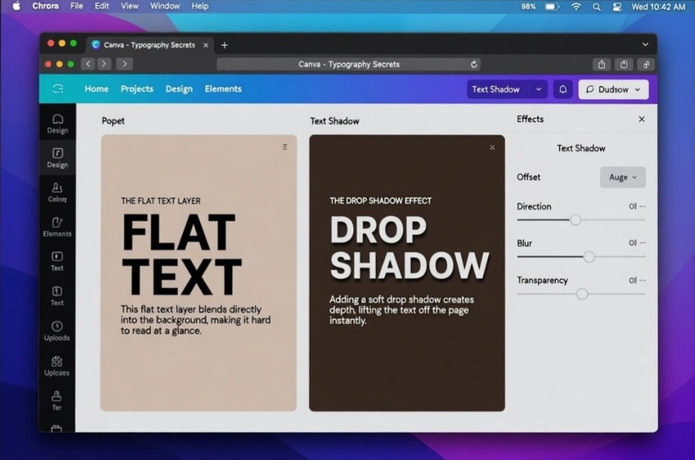
Looking at these two setups side by side makes it glaringly obvious why flat design is failing modern creators. The canvas on the left looks completely dead; the words are literally fighting the background layer for your attention. On the right, the typography completely transforms. By using a deep espresso hue for the shadow instead of raw black, the text feels heavy, intentional, and expensive. It is a subtle shift that instantly moves a graphic from amateur social media template to high-end editorial design.
The missing ingredient wasn’t a fancier font or a subscription to a premium stock library. It was dimension. Once you understand the subtle art of lifting your layers off the page, your graphics instantly morph from amateur to highly professional. Read previous article on the Simple Rule I Use to Pick the Right Background Color In Canva.
Why Flat Designs Keep Failing Your Audience
Let’s be completely honest for a second. The internet has a severe problem with flat design. We were told for years that minimal, flat layouts were sleek and modern. But when it comes to social media graphics, blog banners, or digital products, flat text usually just blends right into the background background context. When you do not separate your text layer from your background element, your reader’s brain has to work twice as hard to process the words.
I learned this lesson the hard way when I ran my first ad campaign with flat, standard typography. The click-through rate was abysmal. People were skipping right past my message because nothing called out to their eyes. The moment I started implementing the strategy of How I Add Drop Shadows to Make Flat Text Stand Out When Using Canva, my engagement metrics shifted dramatically. A subtle drop shadow functions like natural lighting in the real world. It tells the human eye that the text lives on a different plane than the background picture, making it instantly legible.
The Traditional Menu Walkthrough (Without the AI Fluff)
If you look up basic tutorials, they make the mechanics sound like an absolute chore. It is actually incredibly simple, but you have to know where to click without getting distracted by all the sparkly features Canva throws at you.
Here is the exact layout pattern I use every single day:
Select the text box: Left-click on the specific line of text you want to elevate.
Hit the Effects button: This sits right on the top menu bar, right next to your text alignment options.
Choose Shadow: Look over at the left-hand panel that slides open and select the classic “Shadow” style.
Once you click that button, the real magic happens within the adjustments submenu. You are going to see four specific sliders: Offset, Direction, Blur, and Transparency. Most people leave these on the default settings, which is a massive mistake. Default shadows look rigid and fake.
My Personal Experience Wrecking Designs with Bad Shadows
When I first discovered the shadow tool, I went absolutely overboard. I call this my “delusional designer phase.” I thought that if a little shadow was good, a giant, solid, pitch-black outline shadow must be legendary. I turned the offset all the way up to 100, kept the blur at zero, and left the transparency fully cranked up.
The result? My graphics looked like a bad PowerPoint presentation from 1998. It looked muddy, chaotic, and incredibly heavy.
What I passed through during that trial-and-error phase taught me that text shadows are supposed to be felt, not consciously stared at by the viewer. A perfect shadow mimics real-world physics. If you are sitting in a room right now, look at the shadow cast by your laptop or your coffee mug onto your desk. It isn’t a harsh, solid black shape. It is soft, slightly spread out, and carries a hint of the surface color underneath it. The moment I stopped treating the shadow tool like a secondary text copy and started treating it like ambient light, my design quality skyrocketed.
Testing out real-world contrast ratios on my laptop screen to ensure the shadow blur feels natural under realistic studio lighting conditions.
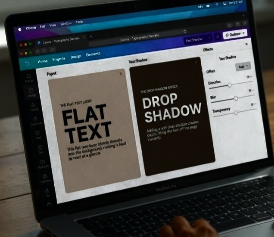
This view is exactly how your audience experiences your work in the wild. Notice how reducing my screen’s exposure allows the text shadows to hold their ground even when viewed on a physical monitor from an angle. In a real-world setting, a bad shadow looks like an accidental smudge on the screen. A good shadow, like the one on the right canvas here, creates a visual optical illusion that physically separates the text block from the digital display, making it incredibly easy for a scrolling user to digest instantly.
My Absolute Hot Take on the Color Slider
Here is where I completely deviate from standard design advice, and it might upset some traditionalists.
Stop using pure black (#000000) for your drop shadows on colored backgrounds. It looks completely unnatural and instantly cheapens your branding.
In nature, shadows are rarely pure black. They are actually deeply saturated dark versions of the color beneath them. If your graphic has an aqua blue background, your text shadow should be a very dark, navy-tinted blue. If your background is a warm beige, your shadow should be a rich, dark espresso brown.
When you use pure black on a bright backdrop, it creates a dirty, bruised effect around your text layers. Next time you open your canvas workspace, click the color wheel picker for your shadow, grab the eyedropper tool, select your background color, and then drag the color cursor straight down into the darker, richer tones. This small trick creates a seamless, high-end look that leaves people wondering how you made your typography look so clean.
- The Secret Recipe: Sliding into Perfection
Let us break down the exact slider formulas that keep my graphics looking crisp instead of messy. When considering How I Add Drop Shadows to Make Flat Text Stand Out When Using Canva, balance is everything.
- The Subtle Lift Formula (For clean, modern headers)
This is my go-to setup for clean blog headers and Instagram carousel text. It creates just enough separation to make the text pop without drawing attention to the effect itself.
Offset: 20 to 30 (Keep it close to the text body)
Direction: -45 degrees (The universal standard for top-left lighting sources)
Transparency: 40% (Light enough to blend, dark enough to create depth)
- The Harsh Editorial Pop (For bold, retro styles)
Every now and then, you want that deliberate, comic-book style shadow that feels intentional and punchy.
Offset: 45 to 55
Direction: 70 degrees
Blur: 0 to 10 (Gives it a sharp, solid look)
Transparency: 70% to 80% (Makes the shadow loud and clear)
If you are dealing with a complex background photograph, like a mountain landscape or a crowded office desk, crank the blur slider up even higher. Think of the blur tool as a fog machine. The more blur you add, the softer the light feels, allowing the harsh shapes of the alphabet to rest on a cloud of dark contrast rather than fight with the details of the picture underneath.
The Billboard in a Rainstorm
Think of your flat text graphic like a cardboard billboard sitting flat on a highway during a massive rainstorm. Everything just turns into a soggy, blended pile of mush. Now, imagine you lift that billboard up on concrete pillars, raising it three feet off the ground. Even if the background stays messy, the physical separation allows passersby to see the billboard clearly because it exists in its own space.
Your drop shadow acts exactly like those concrete pillars. It physically lifts the text away from the digital noise happening behind it. You do not need a degree in complex visual arts to realize that human eyes naturally gravitate toward objects that have dimension.
Watch this video from a follow designer on YouTube. This video also explained what I said here in a practical way.
Frequently Asked Questions
Can I apply drop shadows to individual words inside a single text box? No, Canva applies text effects across the entire individual text layer box simultaneously. If you only want a drop shadow on one specific word for emphasis, you will need to break that word out into its own separate text box, apply the shadow effect, and then visually line it up with the rest of your sentence.
Why does my text look blurry when I add a shadow? If the text itself looks fuzzy, you have likely mixed up your font styling settings or your blur slider is affecting a font that is far too thin. Thin, script, or delicate serif fonts do not handle high shadow offsets well. Stick to bold, clean sans-serif typefaces if you plan on using deep shadow styles.
Will adding drop shadows slow down my page load speed if I download the graphic? Not at all. Once you export your canvas creation as a PNG or JPEG file format, Canva flattens all those custom layers, vectors, and shadow styles into a single static image file. Just ensure you are compressing your final website images properly before uploading them to your host server.
Wrapping This All Up
In a nutshell, bad typography choices will ruin even the most brilliant marketing messages. If people cannot read your graphics within a single millisecond of scrolling past them, they are going to keep moving. Learning How I Add Drop Shadows to Make Flat Text Stand Out When Using Canva completely revolutionized the way I approach content creation. It took me out of that frustrating amateur design loop and gave my brand the polished finish it desperately needed.
Stop uploading flat, hard-to-read headers that hurt your reader’s eyes. Open up your current design draft, head over to that effects tab, experiment with the color matching strategy, and let your text finally breathe. Your audience will thank you for it.
Sources and Citations
Step-by-step styling panel instructions directly from the official Canva Text Effects Help Centre.
Deep dive explanation on adjusting offset, blur, and direction controls by Bean Media Productions.
Video walkthrough covering color matching strategies for natural background blending on YouTube.

Udeichi Miracle Chinaza is a digital creator and graphic designer who specializes in creating clean, visual content. Passionate about making design accessible to everyone. I share practical Canva tutorials, layout tips, and creative shortcuts to help beginners and small businesses build stunning graphics with ease.