

The Artboard Trap We All Fall Into
I was looking over some old marketing graphics from my early branding days, and I realized I used to commit the worst possible visual crime on a blank canvas. Whenever I needed to design a quick promo block, I would throw a beautiful photo onto the screen, open up the upper color tile picker, and choose a background completely at random based on whatever mood I was in. If I wanted the design to feel exciting, I’d pick an intense primary red. If I wanted it to feel calm, I’d grab a bright sky blue. It took a long list of ugly, eye-straining outputs before I understood that picking a canvas backdrop out of thin air is an absolute disaster for your brand authority. Your elements will look detached, your layout will feel unpolished, and your text layers will fight a losing war for visibility. Once I threw out the default color panel wheels and built a disciplined, data-driven alignment strategy, The Simple Rule I Use to Pick the Right Background Color In Canva completely saved my visual systems from looking like a cheap, chaotic pop-up ad.

Image by Lukas Bieri from Pixabay
The Eye-Strain Blueprint Disaster
Let me walk you through a massive formatting failure that forced me to completely re-evaluate my design habits. Last season, I was working on a series of promotional banners for a boutique fitness studio launch. The main graphic featured a crisp portrait photograph of an instructor wearing an olive green workout top, lit by soft, warm studio window sunlight. Also read this important article on how I group elements in canva.
I wanted the layout to look high-energy, so I clicked the default color picker menu and selected a bright, saturated corporate blue background. I thought the contrast would make the post stand out on a smartphone feed.
When the client reviewed the first draft on a mobile canvas, the presentation looked horrifying. Because the bright blue backdrop had absolutely no shared color values with the soft, warm tones in the photo, the boundary edges around the instructor’s portrait looked jagged and vibrating. The text layers blurred right into the background noise, causing immediate visual fatigue. It looked like a terrible copy-and-paste job. I had to scratch the entire canvas, jump back into my dashboard at midnight, and extract a muted, dark slate-sage hue directly out of the shadow details of the photograph’s pixels. That stressful fix taught me that a pristine canvas backdrop should never be a separate choice, it must be an organic extension of the primary image itself.
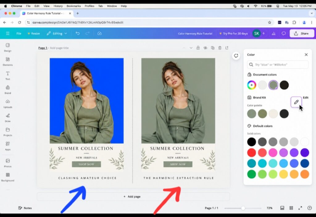
My editing: The amateur edge-clashing of an unrelated default color choice (left) vs. the flawless, editorial unity achieved by extracting background shades straight from your focal image (right).
The 60-30-10 Saturation Matrix
The common layout mistake most independent creators repeat is trusting their emotional instincts over mathematical contrast rules. They select backdrops from the top-right corner of the digital color block selection screen where the high-vibrancy, pure hex codes live.
If you want your graphics to command a premium aesthetic, your background must accept its role as a silent supporter. It should never fight your focal text or your foreground images for attention. This is why The Simple Rule I Use to Pick the Right Background Color In Canva relies entirely on strict color extraction rather than random selection. If your background color is louder than the product or text you are trying to display, your viewer’s brain will register the design as chaotic, unstructured, and cheap.
The Core Eyedropper Extraction Workflow
To guarantee that your page graphics carry a seamless visual harmony, you must utilize the platform’s hidden asset color parsing parameters. Here is the precise step-by-step extraction pipeline to upgrade your layouts:
- Isolate the Document Palette
When you drop a photograph onto your artboard, the application’s engine automatically analyzes the file pixels behind the scenes. Click once on your empty page background, open the upper-left Background Color Tile, and scroll down past the default spectrum swatches. You will discover an automatic section labeled Photo Colors. The system has already stripped away the noise and presented you with the five dominant tonal codes hidden inside your image.
- Deploy the Selective Eyedropper Tool
If the automatic palette generator doesn’t grab the exact subtle shadow shade you want, click the custom color Plus (+) Icon block. Select the built-in Eyedropper Tool icon next to the hex code box. This transforms your cursor mouse indicator into a live magnifying circle lens. Drag this circle over your focal photo and sample a desaturated mid-tone shadow, like the dark wrinkle of a shirt or the muted leaf shadow in a landscape asset.
- Apply the Muted Softness Calibration
Once you click and extract that specific tone, your background updates instantly. To ensure absolute readability for your headlines, open the color picker box window one more time and gently drag the selection node slightly toward the top-left corner to soften the tone into a pastel tint, or pull it directly downward to transform it into a rich, dark matte slate.
Stop the AI Template Trend
Let’s look at content production with complete candor. The main reason your Instagram feed or Pinterest pins feel repetitive is because everyone uses the same default plain white (#FFFFFF) or solid gray canvases right out of the box.
When you anchor your canvas backdrop to a specific extracted tone hidden within your photography assets, you instantly break that synthetic digital template pattern. For example, if you are showcasing a botanical product photo, using the eyedropper to set a soft, desaturated sage-olive canvas backdrop forces the graphic to feel like a premium, interconnected editorial layout.
This custom harmony makes the frame feel completely bespoke, signaling to your audience that a thoughtful human designer arranged the canvas parameters rather than an automated template generator. This structural unity is exactly why The Simple Rule I Use to Pick the Right Background Color In Canva acts as a bulletproof strategy to push your brand’s visual identity past the noise of generic online graphics.
I may not record and post my own editing video but I like to make sure you read and also learn the practical aspect from other videos on the Internet. This video from a youtube creator shows you exactly how to navigate the custom color tabs and pull matching hex codes directly out of any graphic element on your artboard, ensuring your background panels blend flawlessly with your photography assets every single time.
Don’t forget to click and watch directly on YouTube to add views for the video creator. It’s a way of showing appreciation.
Frequently Asked Questions
Why does my text look blurry against my new dark background color? This is caused by a lack of proper luminance contrast. When you use a rich, dark extracted background color, make sure your text layers are switched to a bright contrast shade (like a soft cream or pure white) and increase your font thickness to protect the readability scores on small screens.
Can I apply my extracted background color to all pages at once? Yes, absolutely! Once you use the eyedropper selector to lock in your perfect custom color on page one, look at the very bottom of your left-hand color panel dashboard configuration. Click the prominent purple button that says Change All to instantly sync your entire slide deck or presentation portfolio to the exact same background shade.
Should I use gradient fills for professional corporate presentation backgrounds? Gradients are great if they are subtle. If you want a modern corporate look, avoid high-contrast neon gradients. Instead, use the custom adjustment tool to blend your extracted photo color with a slightly lighter tint of that exact same shade to create a premium, soft ambient vignette effect.
The Visual Discipline Takeaway
At the end of the day, your choice of background color dictates how your entire design balances out on a user’s display panel. A lazy background selection makes your product graphics feel disconnected and messy, while an extracted tone builds an instant framework of professional luxury.
When you open a blank layout file and find it difficult to pick a backdrop shade from scratch, avoid the trap of picking a random trending color wheel. Take a step back, look closely at the existing pixel values inside your main photography elements, use the eyedropper tool to isolate an organic undertone, and gently adjust the saturation node to build an accessible canvas path.
By sticking to The Simple Rule I Use to Pick the Right Background Color In Canva to guide your workflow parameters, you will permanently protect your contrast visibility scores, save yourself hours of manual color matching, and ensure your business projects project a polished, remarkably human presence across every digital channel.

Image by fancycrave1 from Pixabay
Sources and Citations
Core layout design standards and contrast visibility parameters detailed on the official Canva Background Design Guide.
Cognitive visual processing and spatial extraction frameworks analyzed on the Interaction Design Foundation Color Theory Principles index database.
Digital image data layer manipulation and pixel color sampling guides verified on the official W3C User Interface Style Specifications.

Udeichi Miracle Chinaza is a digital creator and graphic designer who specializes in creating clean, visual content. Passionate about making design accessible to everyone. I share practical Canva tutorials, layout tips, and creative shortcuts to help beginners and small businesses build stunning graphics with ease.