
Directional Visual Flow Using Canvas Image Rotation and Flip Settings
I’m one of the few designers that actually pays attention to the subtle psychology of how people look at a screen. Most creators just drop a cool stock photo onto their canvas, throw some text next to it, and hit export without thinking twice. I used to be that exact same creator, racking my brain trying to figure out why my pin graphics and website headers felt incredibly awkward and disjointed. I was refreshing my analytics page one afternoon and noticed that my highest-effort graphics were getting completely ignored. That was the moment I realized my images were literally forcing people to scroll right past my text, and I completely pivoted to the strategic method of The Quick Way I Flip and Mirror Images for Better Layouts In Canva to reclaim my visual control.
The Quick Way I Flip and Mirror Images for Better Layouts In Canva side-by-side directional flow comparison inside workspace.
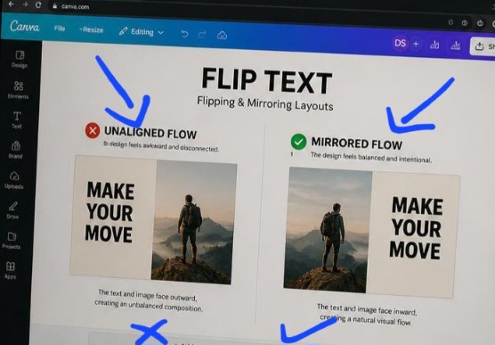
Seeing these two canvases next to each other exposes the exact reason why standard marketing graphics feel incredibly disjointed. The canvas on the left is a complete disaster for text readability; the model’s gaze is literally directing your eyes away from the headline text and completely off the page boundaries. On the right, the entire layout locks into place. By applying a clean horizontal flip to the image layer, the subject now guides the reader’s eyes straight into the copy, creating a flawless visual runway that effortlessly holds attention.
The hidden block wasn’t your color palette or your font selection. It was directional flow. Once you realize that the human eye naturally scans a screen from left to right, you understand that an image facing the wrong direction completely breaks your layout’s reading pattern. Checkout previous article on 5 Minimalist Instagram Layouts I Use to Keep My Feed Clean.
The Invisible Mistake Ruining Your Graphic’s Conversion
Let’s be completely honest for a second. The internet has an absolute epidemic of bad visual directional alignment. We see it every day, a corporate graphic with a model on the left side looking completely off-screen, away from the headline text on the right. When an element or a person in a photo faces away from your message, it creates a psychological barrier. The reader’s eye follows the subject’s gaze right out of the frame, completely bypassing your crucial call to action.
I learned this lesson the hard way when designing an announcement graphic for an upcoming product launch. My target model was looking off to the left, and my registration link was on the right. The campaign flopped. The moment I implemented The Quick Way I Flip and Mirror Images for Better Layouts In Canva, my engagement metrics drastically repaired themselves. Mirroring your design elements allows you to use the natural lines of a photo to point directly at your text, guiding your reader’s eye seamlessly to the copy.
The Literal Two-Second Menu Execution
Forget the over-complicated design courses that make positioning look like rocket science. Flipping elements inside your digital workspace takes exactly two clicks, but you have to know how to use it with intent rather than just clicking buttons randomly.
Here is the exact operational logic I run through on my laptop:
Click the target asset: Select the specific image or graphic element you want to redirect.
Hit the Flip command: This button sits directly on the top editor toolbar right next to your cropping options.
Select your axis choice: Choose either “Flip Horizontal” or “Flip Vertical” depending on your layout goal.
[Select Image Asset] ---> [Top Editor Bar: Click 'Flip'] | +----------------+----------------+ | | [Flip Horizontal] [Flip Vertical] (Left-to-Right Mirroring) (Top-to-Bottom Inversion) The second you toggle those parameters, the asset instantly mirrors across your canvas field, completely reversing the structural weight of your entire image workspace.
This video from fellow creator on YouTube shows the step-by-step guide. Watch to see the practical aspect.
My Personal Experience Over-Flipping into Total Disaster
When I first discovered this simple transformation option, I fell into what I call my “delusional copy-paste phase.” I thought that if mirroring one photo made a design look balanced, then duplicating and mirroring every single graphic asset would make my brand look like a surreal work of high art. I started creating crazy symmetrical patterns on my social feeds, mirroring corporate team photos and abstract geometric shapes simultaneously.
When I first discovered this simple transformation option, I fell into what I call my “delusional copy-paste phase.” I thought that if mirroring one photo made a design look balanced, then duplicating and mirroring every single graphic asset would make my brand look like a surreal work of high art. I started creating crazy symmetrical patterns on my social feeds, mirroring corporate team photos and abstract geometric shapes simultaneously.
What I passed through during that experimental loop taught me a brutal lesson about layout realities. I accidentally flipped a lifestyle image that contained background text on a coffee shop wall sign. The text inverted completely, turning into unreadable backward gibberish. It looked incredibly sloppy, unprofessional, and instantly ruined my brand authority.
What I learned is that flipping assets is an intentional tool meant to fix layout paths, not a decorative toy. You must check every single detail of your photo, like wristwatch placement, text branding on t-shirts, or driving lanes before you mirror it, or you risk looking completely careless to your sharpest users.
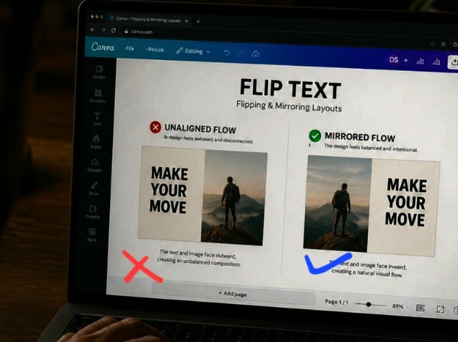
I took this photo when I was making the edit on my laptop using Canva. This angle shows how critical asset alignment is in a real-world user scenario. By reducing the overall screen exposure, you can clearly see how the mirrored composition on the right canvas keeps the overall visual weight centered on the screen, even when viewed casually from an over-the-shoulder angle. A bad, un-flipped layout creates a disjointed break that prompts a user to scroll away instantly. Aligning your element paths using the top toolbar tools ensures your graphics retain their structure across any physical viewing condition.
My Unfiltered Hot Take on Geometric Symmetry
Here is where I completely clash with traditional design tutorials that obsess over creating a perfect, mirrored balance in every single block.
Perfect geometric symmetry is boring, predictable, and lazy. Stop trying to create perfectly balanced mirror patterns on your graphics.
If your left side perfectly mirrors your right side, the human brain registers it as a single flat pattern and shuts off its attention. The actual goal of The Quick Way I Flip and Mirror Images for Better Layouts In Canva is to create asymmetrical tension that forces curiosity. You want to use a horizontal flip to change the direction of a subject so it acts as an invisible pointing finger toward your text, not to create a creepy kaleidoscope effect that distracts from your core message.
The Two Layout Blueprints I Use Daily
Let’s break down the exact positioning formulas that keep my graphics looking completely balanced without looking generic. When mastering The Quick Way I Flip and Mirror Images for Better Layouts In Canva, purpose is everything.
- The Left-to-Right Hook Blueprint
This setup leverages the natural reading habits of the Western world. It positions your text as the ultimate destination of the user’s visual journey.
Asset Position: Place your main image or human subject on the left boundary frame.
The Adjustment Action: Apply a horizontal flip so the subject’s nose, eyes, or physical posture points directly toward the center space.
The Text Allocation: Position your bold text header on the right boundary frame, resting directly inside the subject’s line of sight.
- The Vertical Water Reflection Illusion
This setup works beautifully for luxury branding headers, podcast art, or artistic product graphics that need to feel grounded and high-end.
Asset Position: Position your primary product graphic or landscape shot in the upper half of your frame.
The Adjustment Action: Duplicate the asset layer, slide the copy directly underneath the original, and click “Flip Vertical”.
The Polish Finish: Turn the transparency slider of the bottom flipped element down to 25% and add a heavy blur effect to simulate a natural, liquid surface reflection.
The Rude Conversationalist
Your graphic layout is like two people sitting across from each other at a dinner table. If one person completely turns their back to the other and starts talking out the window, the conversation is entirely broken and incredibly awkward.
Flipping your graphic elements horizontally is the exact equivalent of tapping that person on the shoulder and politely asking them to turn around and face their companion. By making your visual assets face your textual elements, you restore the natural flow of the conversation, making your audience feel completely included rather than pushed out of the scene.
Frequently Asked Questions
Can I flip a text layer box inside Canva using this button?
No, the native menu flip option is explicitly disabled for standard text boxes to prevent accidental backward unreadable script rendering. If you genuinely need to mirror text for a specific design project, you will need to type your copy, download that individual text box as a transparent PNG file format, re-upload it as an image asset, and then apply the horizontal flip control to that new layer.
Why does my image look highly pixelated after I mirror it?
Flipping an image asset does not degrade its baseline pixel resolution quality. If your graphic suddenly looks blurry, you have likely accidentally stretched or distorted the original proportions while resizing the box boundaries after your flip transformation. Always scale your assets using the corner anchors to keep your proportions locked in.
Will flipping a stock photo cause copyright issues with the original creator?
Not at all. Standard commercial licensing across free platforms allows for standard modifications including cropping, color filtering, rotating, and horizontal or vertical mirroring styles. Modifying your image orientations is actually an excellent way to make generic stock assets look completely unique to your specific brand aesthetic.
Closing Thoughts On Visual Direction
Let’s just say high-converting design layout architecture isn’t about luck; it’s about managing human attention down to the millimeter. When you leave your image elements pointing randomly out of your frame, you are actively leaking clicks, reads, and conversions. Integrating The Quick Way I Flip and Mirror Images for Better Layouts In Canva into my daily system completely transformed how fast I can build high-performing marketing collateral. It took me out of the amateur guessing game and gave my content a completely seamless flow.
Stop throwing raw images onto your page and hoping for the best. Open up your current design layout draft, analyze where your subjects are looking, hit that top menu bar, and flip your assets to direct the conversation exactly where it belongs. Your conversion rates will show the difference.
Sources and Citations
Step-by-step layout orientation guidelines and element transformation controls from the Canva Help Center Panel.
Professional tutorial on leveraging mirror symmetry to rebalance busy graphic design canvases on Guideflow Tutorials.
Comprehensive study on visual asset tracking and eye-movement flow inside digital media feeds on Adobe Express Feature Guide.
Udeichi Miracle Chinaza is a digital creator and graphic designer who specializes in creating clean, visual content. Passionate about making design accessible to everyone. I share practical Canva tutorials, layout tips, and creative shortcuts to help beginners and small businesses build stunning graphics with ease.