
The Delicate Balance of Luxury Layouts
As beginner graphic designer, sometimes I get really confused on which font family to commit to when a blank canvas is staring back at me, especially when the project demands an atmosphere of quiet luxury. It is incredibly easy to make a design look cheap when you are dealing with high-end typography rules. I used to think that making an asset feel expensive simply meant scrolling down to the script section and picking the most flamboyant, looping cursive available. But when you mash two highly expressive, decorative styles together on a tiny piece of cardstock, the whole composition collapses into an unreadable, messy disaster. After ruining dozens of mockups and learning the hard way how human eyes read invitations under different lighting, How I Pair Elegant Fonts for Intimate Event Invitations became my definitive visual playbook for turning basic digital text blocks into high-end editorial paper goods.

Image by StartupStockPhotos from Pixabay
The Wedding Dinner Nightmare of 2025
Last winter, I volunteered to design the custom print menus and place cards for an intimate, candlelit anniversary dinner hosted by a close family friend. The venue was a rustic stone wine cellar, and the aesthetic brief was incredibly clear: raw, authentic, historical luxury. Also read How I Change Canvas Sizes for Free without paying for magic resize.
THE UNREADABLE MESS (Clashing) THE LUXURY BALANCE (Crisp) +----------------------------+ +----------------------------+ | ~ Majestic Calligraphy ~ | | ~ Romantic Script ~ | | [ Fancy Ornate Serif ] | | | | Guests squinting in dark | | MINIMALIST ARCHIVAL CAPS | | Looks like a messy scroll| | Perfect legibility | +----------------------------+ +----------------------------+ I completely over-designed the layout on my first attempt. I found this incredibly dramatic, sweeping calligraphy font for the course headers, and then paired it with an ornate, high-contrast serif for the description text underneath. I thought it looked like a royal decree.
When the printed samples arrived, the reality check hit hard. Under the soft, dim lighting of the stone cellar, the intricate loops of the serif blended directly into the tails of the cursive text layers. The text was completely illegible. Guests were literally turning on their smartphone flashlights just to figure out what was in the soup course. It was incredibly embarrassing. I had to rush back to my laptop at 2 AM, strip away the noisy serif ornamentation, and replace it with a clean, widely spaced archival capital font. That stressful night taught me that true graphic elegance requires intense restriction, not extra decoration.
The editing experiment I did on my laptop: The illegible clutter of a multi-script typeface clash (left) vs. the serene, balanced romance of an isolated calligraphy accent anchored by widely spaced archival serif text (right).
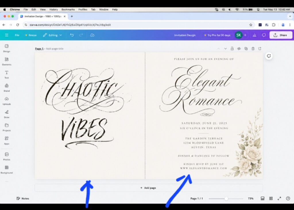
You can already see the difference between the two. This is what I’m talking about. Good use of fonts play a huge role. Don’t just read, do the practical yourself.
The Illusion of the Flamboyant Script
The common design trap most boutique creators fall into is believing that an invitation needs a highly complex script font to feel premium. That is a total optical illusion. When you analyze high-end stationery suites for celebrity galas or luxury fashion houses, you will notice that the script elements are used with extreme discipline.
If your script font is taking up more than fifteen percent of the total page real estate, your layout is going to look childishly cluttered. Scripts are meant to act as isolated emotional anchors reserved strictly for names, words like Welcome, or individual date highlights. The moment you force cursive to carry information-heavy lines like street addresses or RSVP schedules, you break the visual hierarchy and destroy the user experience.
My Three Golden Rules for Intimate Typography Harmony
To build a timeless, romantic layout that looks like it was handcrafted by a luxury letterpress studio, you need to master three fundamental contrast rules.
- The High-Drama Script + Quiet Serif Blueprint
When you select an expressive, sweeping cursive font (like Pinyon Script or Monsieur La Doulaise), its partner must be completely silent. Pair it with a classic, understated Roman serif (like Cinzel or Cormorant Garamond). The structured, straight vertical lines of the serif act as a stable framework that grounds the dancing fluid energy of the script letters.
- The All-Caps Tracking Trick
If your invitation layout still feels a bit generic, look at your supporting text tracking settings. Take your minimalist sans-serif or clean serif font blocks, switch them to all-capital letters, and open the character spacing panel. Increase the letter spacing to anywhere between twenty and thirty-five percent. This wide formatting instantly opens up the canvas area and replicates the airy, high-end look of traditional premium print plates.
- Avoid Font Family Clashing
Never allow two different scripts or two highly decorative serifs to touch the same card layout. If you are using a prominent serif for your date line, use a completely neutral geometric sans-serif (like Montserrat Light) for your location coordinates and timeline details. Keeping your information blocks clean ensures crisp mobile screens scaling and effortless readability.
Breaking the Sterile Digital Grid Pattern
Let’s look at invitation design with absolute honesty. Most digital templates feel cold, flat, and robotic because they center-align every single block of text perfectly inside a predictable bounding box.
To give your invitations an intimate, human soul, try breaking the default grid alignment rules. Let your script names text layer drift slightly off-center, allowing the ascending loops of the letters to gently overlap a beautifully muted botanical line art element or soft background texture. This deliberate asymmetry forces the layout to feel organic and handcrafted, proving to your guests that a real person crafted the asset rather than an automated software engine.
As a beginner, reading text alone without watching a video practical of it might be hard to learn, I will recommend you also watch this video from a YouTube creator. It explains how you can achieve what I did here on how I pair elegant fonts for intimate event invitations, ensuring your physical prints come out crisp and perfectly legible under any lighting condition.
Frequently Asked Questions
What font size is best for invitation event locations? Keep your logistical information text blocks (like addresses and RSVP deadlines) between eight and eleven points. Making the supporting text small not only makes the canvas feel larger and more open, but it also keeps the spotlight securely on the host names.
Can I use these elegant pairings on textured mobile backgrounds? Yes, but you must ensure your font color has enough contrast against the pattern. If you are using a soft parchment or linen background texture, use deep charcoal tones (#2B2B2B) instead of jet black to preserve a soft, elegant editorial appearance. This is the best elegant luxury font combinations for wedding invitations.
Why do script connectors look broken when I change the spacing? Never increase the letter spacing on a cursive script font. Scripts are designed to lock together seamlessly like real handwriting. Opening up the tracking splits the connectors apart, making your lettering look completely broken and unprofessional.
The Editorial Layout Habit
The real secret to high-end event branding is realizing that silence on a page speaks louder than noise. If your layout is crammed with giant fonts from edge to edge, your design loses its premium weight.
[Isolate Main Name Script] --> [Pair with Archival Serif] --> [Set Supporting Text to Caps] --> [Expand Tracking 30%] The next time you sit down to craft an invitation suite for a premium milestone, step completely away from the generic template layouts. Pick one expressive calligraphy asset to inject romance, anchor the remaining details with a clean archival uppercase serif, and give your elements massive margins of empty space. Your cards will instantly carry an expensive editorial texture, your presentation will command real authority, and your layout will tell your guests that your event is an experience they simply cannot afford to miss.
If you have any questions regarding how I pair elegant fonts for intimate event invitations, engage in the comments section.

Image by rawpixel from Pixabay
Sources and Citations
Historical invitation typography standards and printing plate mechanics via the Gutenberg Museum Print History Studies.
Core visual contrast parameters and type matching frameworks detailed on the Interaction Design Foundation Typography Guidelines.
Responsive layout scaling and font readability statistics found on the official W3C Web Design Architecture Matrix.

Udeichi Miracle Chinaza is a digital creator and graphic designer who specializes in creating clean, visual content. Passionate about making design accessible to everyone. I share practical Canva tutorials, layout tips, and creative shortcuts to help beginners and small businesses build stunning graphics with ease.