
The Day I Realized My Brand Looked Cheap
I was staring blankly at a digital mood board last month, completely uninspired by the sea of generic pastel pinks and cold corporate blues flooding my screen. It suddenly hit me that every single independent business profile out there is beginning to look exactly the same. We are all downloading identical templates, using the same default color wheels, and wondering why our graphics don’t stand out in a crowded feed. It took a lot of bad design choices for me to realize that true visual authority isn’t about choosing the brightest, loudest colors on the block. It is about crafting an unexpected harmony between muted tones and deliberate contrast accents. After completely stripping down my design workflow and deleting dozens of messy swatches, I created a definitive list of My Go-To Modern Color Palettes for Clean Branding that will instantly make your projects look incredibly high-end and premium.

Image by StartupStockPhotos from Pixabay
What I Experienced: The Neon Smoothie Disaster
Let me tell you about an absolute mess I made when I first started out with color theory. A local organic juice bar hired me to refresh their Instagram branding. They wanted something fresh, energetic, and clean. My immediate instinct was to crank the color saturation sliders all the way to the right. I combined a neon lime green with an aggressively bright tropical orange, thinking it would make their posts pop on a mobile screen. Also read previous article on My Simple Trick for Transparent Backgrounds Without Buying Canva Pro.
When the client published the first launch post, the feedback was a total disaster. People weren’t looking at the organic smoothies; they were actively complaining that the neon backdrop gave them a headache. The text was unreadable, the colors vibrated when you scrolled past them, and the entire aesthetic looked like a cheap late-night infomercial instead of a wellness brand.
That embarrassing failure forced me to completely rethink how human eyes process color on screens. I deleted the neon swatches and replaced them with a soft, earthy matcha green paired with a warm, milky oat beige. The change was instant. The brand immediately went from looking like a cheap corner shop to looking like an expensive luxury spa. That was the moment I learned that clean branding relies on restraint, not volume.
The visual fatigue of high-saturation neon clashing (left) vs. the immediate calmness and premium authority of desaturated, human-first tones (right). I did this experiment and got the result below.
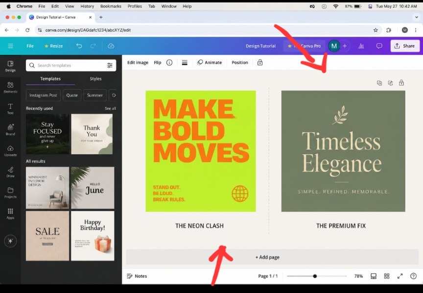
The Visual Vibrancy That Distracts Your Audience.
When you look closely at the side-by-side contrast above, it becomes perfectly clear why default software color wheels destroy branding authority. The neon layout on the left causes an immediate optical phenomenon where the boundary lines between the text and the background appear to vibrate. It is physically fatiguing to look at on a bright smartphone screen, causing users to instinctively scroll away to save their eyesight.
The right side establishes an immediate sensory shift. By leaning into desaturated, muted tones that mimic real-world textures, your screen graphics stop looking like glowing computer pop-ups and begin looking like high-quality matte paper prints. This quiet restraint creates a premium frame that gently pulls the viewer’s eyes exactly where you want them directly onto your content, rather than fighting a noisy war for attention.
The Psychology of the Muted Tint
The common mistake most beginner creators make is choosing pure primary colors straight out of the default software palette. Pure red, pure blue, and pure yellow feel juvenile and sterile. Modern design luxury lives entirely in the muted tints, colors that have a tiny drop of gray, brown, or black mixed into them to soften the blow.
When you desaturate a hue, you instantly make it feel more organic and human. It mimics the natural lighting conditions of the real world rather than the artificial glare of an uncalibrated computer monitor. If you want your branding to feel expensive, stop picking your colors from the outer edge of the color picker. Move your cursor toward the center-left where the dusty tones live.
- The Warm Editorial Studio (Earthy Sophistication)
This is my absolute favorite combination for lifestyle creators, independent publishers, or boutique physical spaces. It feels incredibly grounded and warm.
The Palette: Terracotta Dust (#C38A71), Warm Sand (#EFECE6), and Deep Charcoal (#2B2B2B).
Why This Combination Works
Terracotta provides a rich, tactile human warmth without being as aggressive or alarming as a standard red. The Warm Sand acts as a luxurious, soft alternative to harsh white backgrounds, while the Deep Charcoal provides a sharp, anchoring contrast for body typography.
When you use this scheme, you are telling your audience that your brand values craftsmanship and slow living. It breaks the cold, clinical pattern of internet minimalism by adding a distinct sense of touch and texture to a flat digital screen.
- The High-Tech Minimalist Rebel (Sleek and Industrial)
If you are branding a digital product, a modern podcast, or a forward-thinking tech service, you want to avoid looking like a boring bank while maintaining massive authority.
The Palette: Industrial Steel (#8D99AE), Cyber Matte Mint (#A8DADC), and Midnight Ink (#1D3557).
Standard tech templates love using blinding neon blues. This palette subverts that entire pattern by replacing bright blue with a dusty steel gray and an incredibly soft matte mint. Use the Midnight Ink for massive headlines, the Steel Gray for structural frames, and use the Cyber Mint very sparingly, only for tiny call-to-action buttons or accent stars.
- The Botanical Luxury Spa (Organic Premium)
Wellness brands are everywhere right now, but you don’t have to settle for the same old generic eucalyptus green that everyone else uses.
The Palette: Muted Sage (#7A8B7B), Smoked Cream (#F4F1EA), and Burnt Umber (#4E3629).
Think of this palette like stepping inside a high-end architectural boutique hotel in the middle of a forest. The Sage green brings the outdoors inside, the Smoked Cream softens the structural lines, and the Burnt Umber acts like raw, dark walnut wood trim that grounds the entire space. It is incredibly soothing to look at for long periods.
- The Retro Nostalgia Club (Chic and Playful)
You can absolutely build a brand that feels fun, youthful, and nostalgic without making it look messy or unreadable.
The Palette: Mustard Velvet (#E9C46A), Dusty Coral (#E76F51), and Vintage Navy (#264653).
The Mistake You Won’t Make Again
When dealing with warm, energetic tones like mustard and coral, never let them touch each other directly without a heavy contrast border. Use the Vintage Navy as your primary canvas background, and let the Mustard and Coral act as bright, structural typography highlights. This keeps your text crisp, readable, and highly accessible on mobile devices.
Want a Deeper Dive into Color Psychology?
If you want a step-by-step visual masterclass on how to isolate the perfect brand tones without guessing hex codes all day, I highly recommend watching this practical breakdown by a professional designer on YouTube. In this video, the creator perfectly map out how to build cohesive color harmony systems from scratch, showing you exactly how subtle undertones completely transform a brand’s authority on screen.
VIDEO: A comprehensive walkthrough by a creative agency director explaining how to build cohesive brand color systems using proper contrast parameters.
Frequently Asked Questions
How many colors should be in a clean brand palette? Stick to a maximum of three core colors: one dominant canvas background shade (60%), one supporting tone for structure and readability (30%), and one sharp accent color used strictly for highlights (10%). Adding more names to the list creates immediate visual confusion.
Why do my brand colors look muddy when printed on paper? Computer screens emit light using the RGB model, while physical printers apply ink using the CMYK model. Bright digital shades often lose their luster on paper. Always test your hex codes on a real physical print sample before finalizing your merchandise packaging.
Should my website background always be solid white? Absolutely not. Pure white (#FFFFFF) causes intense digital eye strain over time. Swapping it out for a soft, desaturated cream, off-white, or warm sand tone instantly makes your web pages look more premium, relaxed, and editorial.
The Rule of Contrast Discipline
The bottom line, a color palette is only as good as your layout discipline. You can choose the most gorgeous modern tones on earth, but if your text doesn’t pop cleanly off the screen, your readers will hit the back button instantly.
Next time you start building out a design project, step completely away from the generic, high-saturation color wheels. Choose a palette that relies on desaturated, human-first tones, give your visual elements plenty of negative breathing space, and never let two loud colors compete for the same layout block. Your graphics will look sharper, your business will carry a distinct sense of premium authority, and you will completely stand out from the endless wall of robotic templates.

Image by Nejc Soklič from Pixabay
Sources and Citations
Full color contrast accessibility matrices and layout standards via the W3C Web Content Accessibility Guidelines (WCAG).
Psychological perception studies on desaturated tones from the Interaction Design Foundation Color Theory Studies.
Modern design system color mapping strategies found on the official Adobe Color Trends database.

Udeichi Miracle Chinaza is a digital creator and graphic designer who specializes in creating clean, visual content. Passionate about making design accessible to everyone. I share practical Canva tutorials, layout tips, and creative shortcuts to help beginners and small businesses build stunning graphics with ease.