
5 Minimalist Instagram Layouts I Use to Keep My Feed Clean
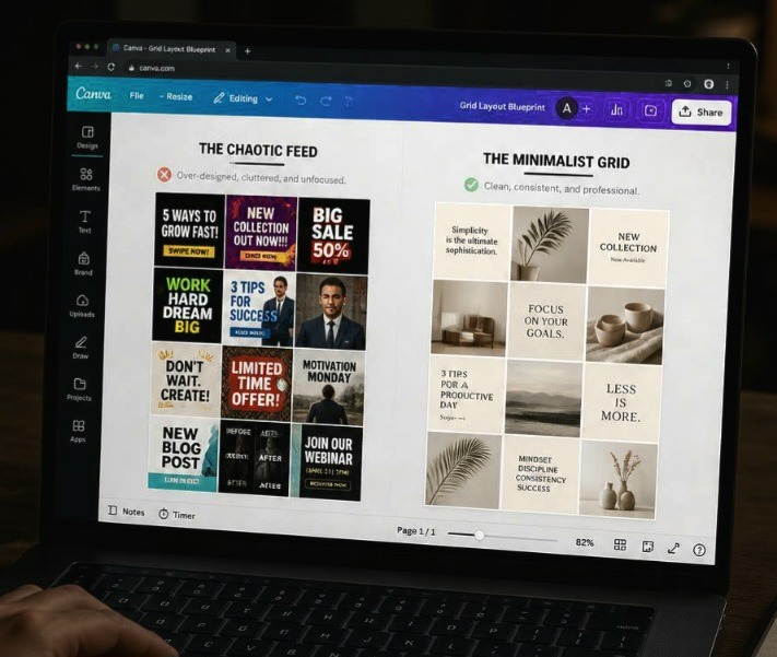
The Social Media Trend And How I Got Over It There is the trend of over-complicating social media design that drives me absolutely insane every time I open my phone. You know exactly what I am talking about, creators slapping neon gradients, chaotic collage cutouts, and three different decorative fonts all onto a single square … Read more
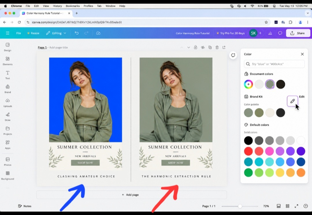

The Simple Rule I Use to Pick the Right Background Color In Canva (My Trick)

The Artboard Trap We All Fall Into I was looking over some old marketing graphics from my early branding days, and I realized I used to commit the worst possible visual crime on a blank canvas. Whenever I needed to design a quick promo block, I would throw a beautiful photo onto the screen, open … Read more

How I Pair Elegant Fonts for Intimate Event Invitations Recently

The Delicate Balance of Luxury Layouts As beginner graphic designer, sometimes I get really confused on which font family to commit to when a blank canvas is staring back at me, especially when the project demands an atmosphere of quiet luxury. It is incredibly easy to make a design look cheap when you are dealing … Read more

5 Gorgeous Retro Fonts I Found Hidden in Canva (Discovery)

The Typography Sin We All Commit Not making research and trying to learn new things is a sin in the creative world, yet most of us are completely guilty of it every single time we open a fresh project file. We log in, create a blank artboard, immediately head to the font dropdown box, and … Read more

My Go-To Modern Color Palettes for Clean Branding

The Day I Realized My Brand Looked Cheap I was staring blankly at a digital mood board last month, completely uninspired by the sea of generic pastel pinks and cold corporate blues flooding my screen. It suddenly hit me that every single independent business profile out there is beginning to look exactly the same. We … Read more